Configuration
| Name | Type | Default | Description |
|---|---|---|---|
| type | string | Required | custom:room-card |
| entity | string | Required | Entity ID (domain.my_entity_id) |
| attribute | string | Show an attribute instead of the state value | |
| hide_title | bool | false |
Hide the title |
| title | string / template | The title of the card | |
| name | string/bool | friendly_name |
Override entity friendly name |
| unit | string/bool | unit_of_measurement |
Override entity unit of measurement |
| icon | string | icon |
Override entity icon or image |
| show_icon | bool | false |
Show the icon instead of the text based state |
| image | string | Show an image instead of icon | |
| toggle | bool | false |
Display a toggle (if supported) instead of state |
| show_state | bool | false |
Set to false to hide the main entity state |
| state_color | bool | false |
Enable colored icon when entity is active |
| styles | object / template | Add custom CSS styles to the state element | |
| card_styles | object / template | Add custom CSS styles to the card | |
| format | string | Formatting | Format main state/attribute value |
| entities | list | Entity Objects | Additional entity IDs or entity object(s) |
| rows | list | Rows | Define rows with can contain entities |
| info_entities | list | Entity Objects | Custom info_entities entity |
| tap_action | object | Actions | Custom tap action on entity row and state value |
| double_tap_action | object | Actions | Custom double tap action on entity row |
| templates | object | Templates | Templates to apply recurring properties on entity |
| cards | list | Cards | Show other cards inside room card |
| content_alignment | string | left |
Set the alignment for the entities row (left, center or right) |
Similarly as the default HA entities card, each entity can be specified by an entity ID string,
or by an object which allows more customization and configuration.
If you define entities as objects, either entity, attribute or icon needs to be specified. entity is only required if you want
to display data from another entity than the main entity specified above. attribute is necessary if you want to display an entity
attribute value instead of the state value. icon lets you display an icon instead of a state or attribute value
(works well together with a custom tap_action).
| Name | Type | Default | Description |
|---|---|---|---|
| entity | string | A valid entity_id (or skip to use main entity) | |
| attribute | string | A valid attribute key for the entity | |
| name | string/bool/ template | friendly_name |
Override entity friendly name (or false to hide) |
| show_name | bool | true |
Show or hide name of the entity above the icon |
| unit | string/bool | unit_of_measurement |
Override entity unit of measurement (or false to hide) |
| toggle | bool | false |
Display a toggle if supported by domain |
| icon | string/bool | false |
Display default or custom icon instead of state or attribute value |
| object | Override the on or off state icon with state_on / state_off or Conditions | ||
| show_icon | bool | false |
Show the icon instead of the text based state |
| show_state | bool | false |
Show the state beneath the entities (not info_entities) |
| state_color | bool | false |
Enable colored icon when entity is active |
| hide_unavailable | bool | false |
Hide entity if unavailable or not found |
| hide_if | object/any | Hiding | Hide entity if its value matches specified value or criteria |
| styles | object / template | Add custom CSS styles to the entity element | |
| format | string | Formatting | Format entity value |
| tap_action | object | Actions | Custom entity tap action |
| double_tap_action | object | Actions | Custom entity double tap action |
Note that hold_action and double_tap_action are currently not supported on additional entities.
The entities can be divided over multiple rows
| Name | Type | Default | Description |
|---|---|---|---|
| entities | list | Entity Objects | Additional entity IDs or entity object(s) |
| hide_if | object/any | Hiding | Hide entity if its value matches specified value or criteria |
rows:
  - entities:
      - entity: light.mancave_lamp
        name: Plafond
        tap_action:
          action: toggle
        hold_action:
          action: more-info
    hide_if:
      conditions:
        - condition: equals
          entity: sensor.some_sensor
          value: true
  - entities:
      - entity: light.led_bureau_2
        name: Bureau
        show_icon: true
        icon: mdi:desk
        tap_action:
          action: toggle
      - entity: light.led_monitor
        name: Kast
        show_icon: true
        icon: mdi:wardrobe-outline
        tap_action:
          action: toggle

This card supports all the default HA actions. See Lovelace Actions for more detailed descriptions and examples.
| Name | Type | Default | Description |
|---|---|---|---|
| action | string | Required |
more-info, toggle, call-service, url, navigate, fire-dom-event, none
|
| entity | string | Override entity-id when action is more-info
|
|
| service | string | Service to call when action is call-service
|
|
| service_data | object | Optional data to include when action is call-service
|
|
| url_path | string | URL to open when action is url
|
|
| navigation_path | string | Path to navigate to when action is navigate
|
|
| confirmation | bool/object | false |
Enable confirmation dialog |
| haptic | string | none |
Haptic feedback (success, warning, failure, light, medium, heavy, selection) |
The format option supports the following values:
| Value | Type | Description |
|---|---|---|
| relative | timestamp |
Convert value to relative time (5 minutes ago) |
| total | timestamp |
Convert value to relative time (5 minutes) |
| date | timestamp |
Convert timestamp value to date |
| time | timestamp |
Convert timestamp value to time |
| datetime | timestamp |
Convert timestamp value to date and time |
| brightness | number |
Convert brightness value to percentage |
| duration | number |
Convert number of seconds to duration (5:38:50) |
| duration-m | number |
Convert number of milliseconds to duration (5:38:50) |
| invert | number |
Convert number from positive to negative or vice versa |
| kilo | number |
Divide number value by 1000 (ex. 1500 W -> 1.5 kW) |
| position | number |
Reverses a position percentage (ex. 70% open -> 30% closed) |
| precision<0-9> | number |
Set decimal precision of number value (precision3 -> 18.123) |
The hide_if option can be used to hide an entity if its state or attribute value matches the specified criteria or based on another entities state or attribute.
| Name | Type | Description |
|---|---|---|
| condition | any | Use the given icon if the state or attribute above/below/equals/not_equals the specified value |
| value | any | Compare the value of the entity with this value |
| attribute | string | Use the value of this attribute to determine the above/below/equals equation |
| entity | string | Use the state or given attribute value of this entity to determine the above/below/equals equation |
For example:
- entity: sensor.node_21_humidity
  hide_if:
    conditions:
      - condition: above
        value: 20
      - condition: above
        value: 30
      - condition: below
        value: 50
      - condition: equals
        attribute: state
        value: 35.6
      - condition: above
        entity: sensor.bathroom1_window_sensor_tilt
        value: 0
      - condition: above
        value: 70
| Name | Type | Default | Description |
|---|---|---|---|
| show_icon | bool | false |
Show the icon instead of the text based state |
| icon | string | icon |
Override entity icon or image |
| object | Override the on or off state icon with state_on / state_off or Conditions |
The icon can be customized based on conditions. Don't forgot to set show_icon to true if you want to use this feature.
| Name | Type | Description |
|---|---|---|
| condition | any | Use the given icon if the state or attribute above/below/equals/not_equals the specified value |
| value | any | Compare the value of the entity with this value |
| attribute | string | Use the value of this attribute to determine the above/below/equals equation |
| entity | string | Use the state or given attribute value of this entity to determine the above/below/equals equation |
| styles | object |
For example:
- entity: sensor.node_21_humidity
  show_icon: true
  icon:
    conditions:
      - icon: mdi:car
        condition: above
        value: 20
      - icon: mdi:car-2-plus
        condition: above
        value: 30
      - icon: mdi:car-3-plus
        condition: below
        value: 50
      - icon: mdi:car-arrow-left
        condition: equals
        attribute: state
        value: 35.6
      - icon: phu:lift-in-window-open1
        condition: above
        entity: sensor.bathroom1_window_sensor_tilt
        value: 0
      - condition: above
        value: 70
        styles:
          color: green
Room card the possibility for templating, these can be applied to icon (also has its own templating), styles Templates can be given with the following variables:
| Name | Description |
|---|---|
| this | The room-card element itself (warning: don't mess with this |
| entity | The current entity object, if the entity is defined in the card |
| states | An object with all the states of all the entities (equivalent to hass.states) |
| user | The user object (equivalent to hass.user) |
| hass | The complete hass object |
Styles templating example:
type: custom:room-card
title: Template Style
entity: switch.entity_switch
styles:
  template: >
    if (entity.state == 'off') return 'background-image: url(some url to a picture)';
    else return 'background-image: url(some url to a picture)';
Icons have the possibility for templating, these can be applied to both icon and styles. Templates can be given with the following variables:
| Name | Description |
|---|---|
| this | The room-card element itself (warning: don't mess with this |
| entity | The current entity object, if the entity is defined in the card |
| states | An object with all the states of all the entities (equivalent to hass.states) |
| user | The user object (equivalent to hass.user) |
| hass | The complete hass object |
For example:
type: custom:room-card
entity: sensor.fordpass_ignitionstatus
icon: mdi:car
show_icon: true
info_entities:
  - entity: sensor.fordpass_fuel
    show_icon: true
    icon:
      template:
        styles: >
          if (entity.state >= 70) return 'color: green';
          if (entity.state >= 20) return 'color: orange';
          else return 'color: orangered';
        icon: >
          if (entity.state >= 70) return 'mdi:car';
          if (entity.state >= 20) return 'mdi:carplus';
          else return 'mdi:carplus2';
Templates for entities can be used to reduce duplication in yaml by making a template with recurring properties. Templates can be given with all variables that are available to the Entities
For example:
type: custom:room-card
title: Hallway
icon: mdi:door-closed-lock
show_icon: true
templates:
  - name: test_template
    template:
      show_icon: true
      state_color: true
      icon:
      template:
        styles: >
          if (entity.state >= 70) return 'color: green';  if (entity.state >=
          20) return 'color: orange';  else return 'color: orangered';

entities:
  - entity: light.lamp_overloop
    template: test_template
    name: Light
  - entity: binary_sensor.door_window
    hide_unavailable: true
    template: test_template
    name: Motion
  - entity: camera.front_door
    template: test_template
    name: Camera
  - entity: binary_sensor.front_door_ding
    name: Door
    template: test_template
info_entities:
  - entity: sensor.node_21_humidity
    format: precision1
  - entity: sensor.node_21_air_temperature
    format: precision1
    unit: E
Other cards can be displayed inside Room Card. The cards can also be hidden conditionally.
type: custom:room-card
title: Mancave
entity: light.mancave_lampen
icon: mdi:floor-lamp-outline
show_icon: true
tap_action:
  action: toggle
cards:
  - type: custom:simple-thermostat
    entity: climate.radiator_mancave
    name: Radiator
    title: Mancave
    layout:
      step: row
    control: false
    header: false
    hide_if:
      conditions:
        - condition: equals
          value: 'off'
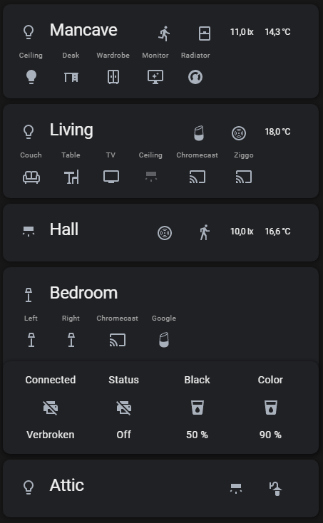
- type: custom:room-card
  title: Mancave
  entity: group.mancave_lights
  icon: mdi:lightbulb-outline
  show_icon: true
  tap_action:
    action: toggle
  entities:
    - entity: light.mancave
      name: Ceiling
      hide_if:
        conditions:
          - condition: equals
            entity: sensor.light_unavailable
            value: true
      tap_action:
        action: toggle
    - entity: light.desk
      name: Desk
      icon: mdi:desk
      tap_action:
        action: toggle
    - entity: light.wardrobe
      name: Wardrobe
      icon: mdi:wardrobe-outline
      tap_action:
        action: toggle
    - entity: light.monitor
      name: Monitor
      icon: mdi:monitor-shimmer
      tap_action:
        action: toggle
    - entity: climate.radiator
      name: Radiator
      tap_action:
        action: toggle
  info_entities:
    - entity: binary_sensor.motion_sensor
      show_icon: true
      hide_if:
        conditions:
          - condition: equals
            entity: sensor.motion_sensor_unavailable
            value: true
    - entity: binary_sensor.window
      show_icon: true
      icon:
        state_on: mdi:window-open
        state_off: mdi:window-closed
    - sensor.motion_sensor_illuminance
    - sensor.motion_sensor_temperature
  cards:
    - type: custom:simple-thermostat
      entity: climate.radiator_mancave
      show_states:
        - heat
      name: Radiator
      title: Mancave
      control:
        _headings: true
        _icons: true
        _names: true
        hvac:
          heat:
            icon: mdi:fire
            name: On
          'off':
            icon: mdi:power
            name: Off

- type: custom:room-card
  title: Living
  entity: group.living_lights
  tap_action:
    action: toggle
  icon: mdi:lightbulb-outline
  show_icon: true
  entities:
    - entity: light.couch
      name: Couch
      icon: mdi:sofa-outline
      tap_action:
        action: toggle
    - entity: light.table
      name: Table
      icon: mdi:table-chair
      tap_action:
        action: toggle
    - entity: light.tv
      name: TV
      icon: mdi:television
      tap_action:
        action: toggle
    - entity: light.living_ceiling
      name: Ceiling
      icon: mdi:wall-sconce-flat
      tap_action:
        action: toggle
    - entity: media_player.chromecast_living
      name: Chromecast
    - entity: media_player.stb_arris_uhd
      name: Ziggo
  info_entities:
    - entity: media_player.googlehome
      show_icon: true
      icon: mdi:google-home
    - entity: binary_sensor.smoke_sensor
      show_icon: true
    - sensor.smoke_sensor_air_temperature
  cards:
    - type: custom:mini-media-player
      entity: media_player.chromecast_living
      show_states:
        - playing
        - paused
    - type: custom:mini-media-player
      entity: media_player.stb_arris_uhd
      show_states:
        - playing
        - paused
    - type: custom:mini-media-player
      entity: media_player.googlehome
      show_states:
        - playing
        - paused

- type: custom:room-card
  title: Hall
  icon: mdi:wall-sconce-flat
  show_icon: true
  entity: light.lamp_overloop
  tap_action:
    action: toggle
  info_entities:
    - entity: binary_sensor.smoke_sensor
      show_icon: true
    - entity: binary_sensor.motion_sensor
      show_icon: true
    - sensor.motion_sensor_illuminance_2
    - sensor.motion_sensor_air_temperature_2
- type: custom:room-card
  title: Bedroom
  entity: group.bedroom_lights
  icon: mdi:floor-lamp-outline
  show_icon: true
  tap_action:
    action: toggle
  entities:
    - entity: light.left
      name: Left
      show_icon: true
      icon: mdi:floor-lamp-outline
      tap_action:
        action: toggle
    - entity: light.right
      name: Right
      show_icon: true
      icon: mdi:floor-lamp-outline
      tap_action:
        action: toggle
    - entity: media_player.chromecast
      name: Chromecast
    - entity: media_player.google_home
      show_icon: true
      icon: mdi:google-home
      name: Google
  cards:
    - type: custom:mini-media-player
      entity: media_player.chromecast
      show_states:
        - playing
    - type: custom:mini-media-player
      entity: media_player.google_home
      show_states:
        - playing
        - paused
    - title: null
      type: glance
      entity: binary_sensor.hp_printer_connectivity
      entities:
        - entity: binary_sensor.hp_printer_connectivity
          name: Connected
        - entity: sensor.hp_printer_status
          name: Status
        - entity: sensor.hp_printer_inkcartridge_black
          name: Black
        - entity: sensor.hp_printer_inkcartridge_cyanmagentayellow
          name: Color

- type: custom:room-card
  title: Attic + Garden
  entity: light.attic
  icon: mdi:lightbulb-outline
  show_icon: true
  tap_action:
    action: toggle
  info_entities:
    - entity: light.attic
      icon: mdi:wall-sconce-flat
      show_icon: true
      tap_action:
        action: toggle
    - entity: light.garden
      icon: mdi:outdoor-lamp
      show_icon: true
      tap_action:
        action: toggle