Our World in D3 is a educational website that shows world demographics through data visualization. Using different visualization gives different perspective of same information and allows us to see hidden trends and relationships.
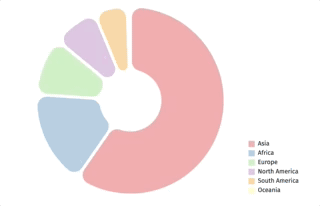
Hover effect was added for each pie. Hovering over would make selected information bigger and reveals the center circle with selected pie's information.
This was done by using giving entirely new properties of pie dimension with D3's mouseover and mouseleave effect.
function mouseOver(d) {
// Selecting the element that mouse entered.
  d3.select(this)
    .transition()
    .duration(300)
    .attr("d", (d2) => arcHover(d2));

//Giving new texts to tooltip divs.
  tooltip.attr("hidden", null);
  tooltip.select('.continent')
    .html(d.data.continent);
  tooltip.select('.population')
    .html(d.data.population.toLocaleString());
  let percentage = Math.round(1000 * d.data.population / totalPopulation) / 10;
  tooltip.select('.percentage')
    .html(String(percentage) + " %");
}

function mouseLeave() {
// Reverting back the hovered effect and hiding the rendered tooltip.
  d3.select(this)
    .transition()
    .duration(300)
    .attr("d", (d2) => arcs(d2));
  tooltip.attr("hidden", true);
}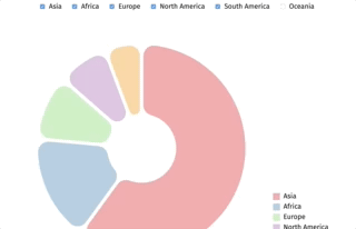
Users can select the countries they want to compare.
The input tags were linked with a change function that filters all the checked inputs and filtering the incoming data by the input values.
// Selcting all inputs and giving them click property that invokes change function.
d3.selectAll("input[type=checkbox]")
  .on("click", (d) => change(data));

const change = (data) => {
  let userInput = [];

// Getting an array of what user selected.
  d3.selectAll("input[type=checkbox]")._groups.forEach((d) => {
    d.forEach((d2) => {
      if (d2.checked) {
        userInput.push(d2.defaultValue);
      }
    });
  });

// Using the array above to filter unnecessary data.
  let dataOfInterest= [];
    data[0].byContinents.forEach((d) => {
    if (userInput.includes(d.continent)) {
      dataOfInterest.push({
        continent: d.continent,
        population: Number(d.population)
      });
    }
    return d;
  });
// Invoke update function with the filtered data.
  update(dataOfInterest);
};
Rendering each data on a map was done by iterating through each data and invoking updateDots function in every iteration. The previously rendered data had to be removed before entering new data.
// Fetching and iterating through the data.
d3.json("data/data.json").then((data) => {
  let mappedData = data.map((byYear) => {
    return byYear["countries"].filter((d) => d.life_exp);
  });
// Fetching new data every 0.2 sec.
  d3.interval(() => {
    time = (time < 214) ? time + 1 : 0;
    updateDots(mappedData[time]);
  }, 200);
  // updating
  updateDots(mappedData[0]);
});

const updateDots = (data) => {
  // Joining Data
  let dots = svg.selectAll("circle")
  .data(data, (d) => d.country);

  // Delete old dots
  dots.exit().remove();

  // transition time set to 0.2 sec
  let t = d3.transition().duration(300);

  // Enter
  dots.enter()
    .append("circle")
      .attr("fill", (d) => pastelColor1(d.continent))
      .merge(dots)
      .transition(t)
      .attr("cy", (d) => y(d.life_exp))
      .attr("cx", (d) => x(d.population))
      .attr("r", "7px");
};
The size of the circle is represented by the population, so that the graph shows three different information at once.
By adding a simple line of code, the circle size was able to represent the population size of each country.
// The circle radius was calculated based on the population.
.attr("r", (d) => Math.sqrt(area(d.population) / Math.PI));Our World in D3 was designed to render extensive data to a simple and interactive graph. Using different visualization gives different perspective of same information as well as reveal hidden relationships.
D3.js was used to render the JSON file in HTML. CSS was used to style and position some of the components.
- Slider bar for two time lapse graph.
- Zoom in feature for pie chart.