First you need to install package for sidebar and icons:
npm i @martinstf/ngx-commander-sidebar @ng-icons/core @ng-icons/heroicons
In your module or standalone component you need to import SidebarComponent
    imports: [
      ...
      SidebarComponent,
      ...
    ],
Don't forget to include NgIconsModule. You can read more about it here
You can find example here
  <c-sidebar
    height="100vh"
    [logoConfig]="{
      logo: {
        url: './../assets/full-logo.png',
        height: '50px',
        width: 'auto'
      },
      collapsedLogo: {
        url: './../assets/full-logo.png',
        height: '30px',
        width: 'auto'
      }
    }"
    [sidebarConfig]="largeSidebar"
    [smallSidebarConfig]="smallSidebar"
    [smallSidebarDefaultIndex]="0"
    (onItemClick)="onSidebarItemClick($event)"
  />
| Name | Type | Description | Default |
|---|---|---|---|
| height | string |
Sidebar height. You can use any CSS unit here. | |
| logoConfig | object |
You can set logo options for expanded sidebar but also you can set different logo options when sidebar is collapsed. | |
| smallSidebarConfig | object |
Config contains routes key with list of small sidebar items. |
undefined |
| smallSidebarDefaultIndex | number |
Predefine selected item for small sidebar. | undefined |
| sidebarConfig | object |
Config contains routes key with list of sidebar items and title for sidebar title if you need it. |
undefined |
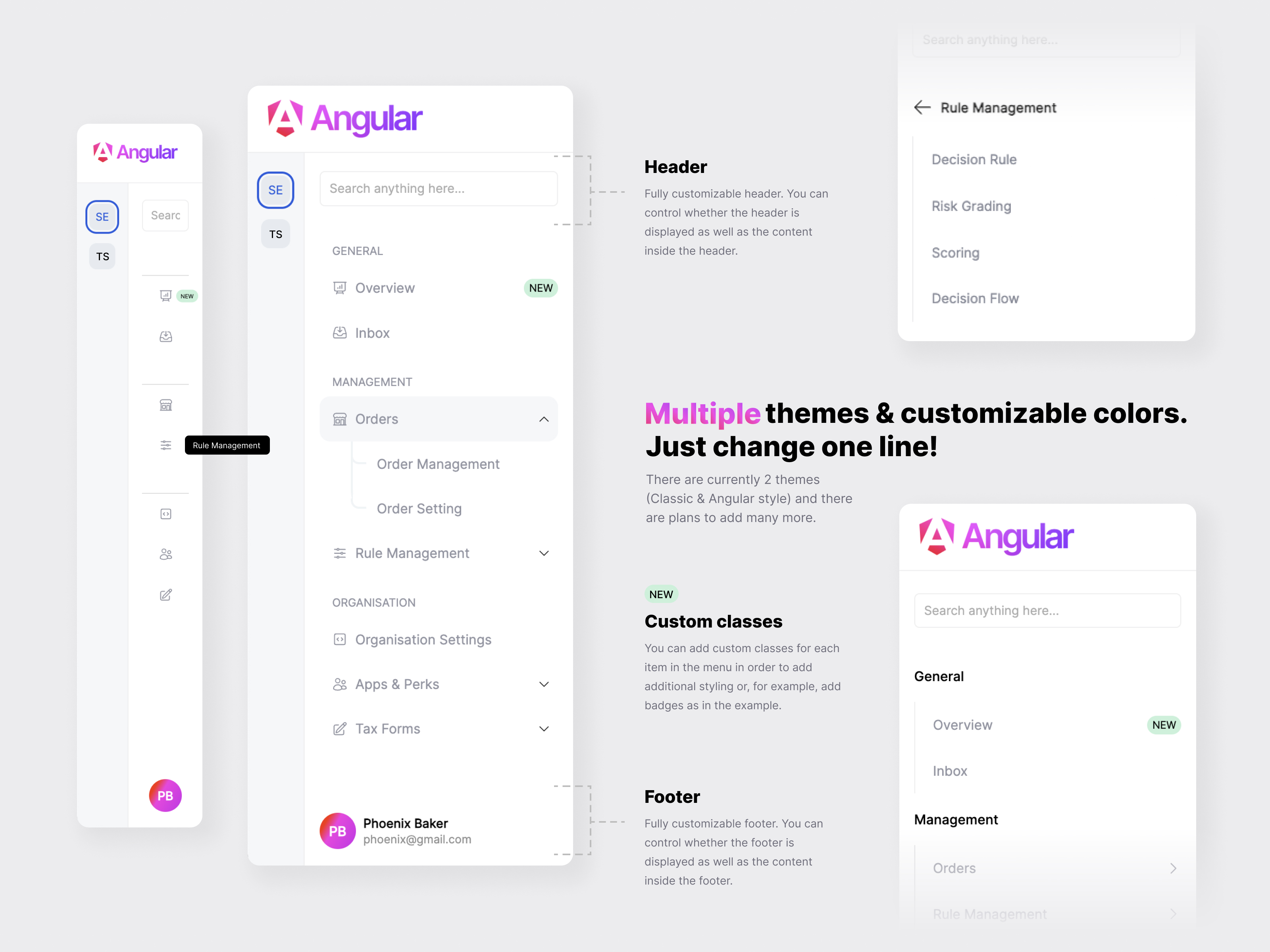
You have SidebarTheme enum with all suported themes for sidebar.
If you dont want to show sidebar (e.g. when you just want small sidebar) just dont provide sidebarConfig property to <c-sidebar/> component.
You can adjust height of each sidebar part (header, body, footer) with CSS flex propery. Default values are shown in exaple below. Also if you dont need header or footer in sidebar you can set show key to false. Default is true for all.
  largeSidebar: LargeSidebarConfig = {
    theme: SidebarTheme.Angular,
    title: 'Sidebar example',
    layout: {
      header: {
        show: true,
        flex: 1,
      },
      body: {
        flex: 8,
      },
      footer: {
        show: false,
        flex: 1,
      },
    },
    routes: [...],
  };
If you dont want to show small sidebar just dont provide smallSidebarConfig property to <c-sidebar/> component.
  smallSidebar: SmallSidebarConfig = {
    style: {
      width: '55px',
    },
    routes: [...],
  };
If you dont want to show logo part of sidebar just dont provide logoConfig property to <c-sidebar/> component.
logo config will be shown when sidebar is expanded and collapsedLogo when sidebar is colapsed.
  logoConfig: SidebarLogoConfig = {
    logo: {
      url: './../assets/full-logo.png',
      height: '50px',
      width: 'auto'
    },
    collapsedLogo: {
      url: './../assets/full-logo.png',
      height: '30px',
      width: 'auto'
    }
  }
| Name | Description | Return |
|---|---|---|
| onItemClick | When item is selected. This include both small sidebar and regular sidebar items | Object of selected item with type of selected item and type of sidebar. |
  <c-sidebar
      [sidebarConfig]="{
      ...
      routes: [
        // Sidebar items
        ...
      ]
    }"
  />
In routes you can pass diferent types of items.
  {
    title: 'General'
  }
  {
    path: ['statistics','users'], // This array will be transformed to 'statistics/users'
    title: 'Statistics',
    icon: 'heroArrowTrendingUp', // Icon from @ng-icons/core
  }
  {
    opened: false,
    title: 'Customers',
    type: 'dropdown',
    icon: 'heroUsers',
    children: [
	  ...
      {
        path: ['users'],
        title: 'Users',
        icon: 'heroUsers',
      },
	  ...
    ]
  }
You can add custom content instade of predefined to: small sidebar, header and footer. Just use ng-container element with proper name:
  <c-sidebar
    // All configuration props here...
  >

    <ng-container smallSidebar>
      <p>Small sidebar custom content</p>
    </ng-container>

    <ng-container header>
      <p>Header custom content</p>
    </ng-container>

    <ng-container footer>
      <p>Footer custom content</p>
    </ng-container>

  </c-sidebar>
If you have additional styling or change positions of burger menu button on mobile you can target class .CMND-mobile-sidebar-btn
If you want to change icon for button you can do it like this:
  <c-sidebar
    ...
    burgerMenuIcon="heroBars4"
    ...
  >
If you want different colors you can overide this CSS variables
:root {
  // Small sidebar
  --ngx-commander-small-sidebar-background: #f5f7f9;
  --ngx-commander-small-sidebar-active-text: #215bde;
  --ngx-commander-small-sidebar-text: black;
  --ngx-commander-small-sidebar-item-active-background: #e6ebef;
  --ngx-commander-small-sidebar-item-background: #e6ebef;
  --ngx-commander-small-sidebar-active-border: #215bde;
  --ngx-commander-small-sidebar-font: 'Inter', sans-serif;

  // Large sidebar
  --ngx-commander-large-sidebar-background: #fff;
  --ngx-commander-large-sidebar-icon: #9194a1;
  --ngx-commander-large-sidebar-active-icon: #215bde;
  --ngx-commander-large-sidebar-active-text: #215bde;
  --ngx-commander-large-sidebar-text: #9194a1;
  --ngx-commander-large-sidebar-item-active-background: #f0f4f6;
  --ngx-commander-large-sidebar-item-background: #fff;
  --ngx-commander-large-sidebar-font: 'Inter', sans-serif;
  --ngx-commander-large-sidebar-menu-btn-color: #215bde;
}