System monitor : themes
The System Monitor (main.py) uses themes to display your computer HW sensors & metrics.
Themes are located in res/themes, each in a sub-folder.
A theme folder contains a theme.yaml and optionally some pictures like a background picture, logos etc.
It can be easily shared with the community: just share the theme sub-foler.
The theme used at startup is specified in config.yaml at repository root.
When developing a new theme, do not start from existing themes as they do not contain all the sensors that can be displayed.
Instead, create a new sub-folder for your theme and copy theme_example.yaml into it as theme.yaml.
Then copy your PNG resources in your new sub-folder.
To edit your theme, use the Theme Editor (see below).
If you have a theme you like from the original vendor app, you cannot import it directly to this program because the formats do not match.
You can still extract the resources (PNGs) from the original theme using tools/turing-theme-extractor.py
python3 turing-theme-extractor.py "Dragon Ball.data"
The PNGs from the theme will be extracted to files.
The first PNG is generally the background image/color and the 2nd PNG is the layers above. You can use an online tool to "merge PNG" to get a single file that you will use as background.png for your theme.
You can then re-create the theme for the System Monitor program by replacing content at the right place on top of the extracted background: see below.
Note: the default Turing/XuanFang themes resources have already been extracted to res/themes/--Theme examples/.
Check also for existing themes in res/themes/: see sub-folders. Some Turing default theme have already been fully re-created.
The Theme Editor allow to quickly develop/update a theme without the need to restart Turing Smart Screen to reload changes.
It can be started from the configuration wizard (configure.py): select a theme and click Edit theme.
It can also be started from the command line:
Usage :
        python3 theme-editor.py theme-name (= name of the folder in res/themes/)
Examples :
        python3 theme-editor.py 3.5inchTheme2
        python3 theme-editor.py Landscape6Grid
        python3 theme-editor.py Cyberpunk
When started, the program will open the selected theme YAML file in your default editor for .yaml files (e.g. Notepad++, VS Code...)
It will also open an always-on-top window displaying a preview of the selected theme with stubbed data (not your real computer HW sensors).
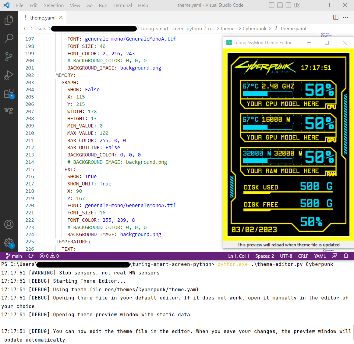
Whenever you edit and save the theme.yaml file from your editor, the preview window will reload the theme with your new changes.
If the theme file does not open automatically, you can open it manually in the editor of your choice.
You can now edit your theme file following the next section:
The mandatory theme.yaml file defines what to show on the screen and where to show it.
The file is structured in several entries.
Some theme files may not contain all entries if they do not use them.
For an example, see theme_example.yaml file that contains all metrics in it.
The author entry defines theme author name as a string:
author: "John Doe"This name will be displayed below the theme preview in the Configuration Wizard.
If the author name starts with @ it will be displayed as a hyperlink to the author's GitHub profile.
author: "@johndoe"This entry is not mandatory.
The display entry defines the display specific configuration for this theme:
- orientation
- backplate RGB LEDs colors for supported HW
This entry and its properties are mandatory.
display:
  # Specify the display size in inch for this theme: 3.5" (default) or 5"
  DISPLAY_SIZE: 3.5"

  # Specify the display orientation for this theme: portrait, landscape, reverse_portrait, reverse_landscape
  DISPLAY_ORIENTATION: portrait

  # Backplate RGB LED color (for HW revision 'flagship' devices only), set one that match your theme dominant color
DISPLAY_RGB_LED: 0, 0, 255The static_images entry defines some pictures to be displayed once at boot, like a background picture.
Entries in static_images must have unique names.
Classic images formats are supported: jpg, png, etc. Run python3 -m PIL to get all supported formats.
Images are fetch from the theme sub-folder.
They are drawn in the order they are listed, the top image will be drawn first.
static_images:
  MY_THEME_BACKGROUND:
    PATH: background.png
    X: 0
    Y: 0
    WIDTH: 320
    HEIGHT: 480
  MY_CUSTOM_LOGO:
    PATH: logo1.jpg
    X: 150
    Y: 100
    WIDTH: 50
HEIGHT: 50The static_text entry defines some text to be displayed once at boot, like labels.
Entries in static_text must have unique names.
Texts are drawn in the order they are listed, the top text will be drawn first.
You can specify a font .ttf filename (fetched from res/fonts/ folder) as well as a font size and font color. For text to have a transparent background, you must provide the path to the image you used as background picture in BACKGROUND_IMAGE instead.
static_images:
  DISK_USED_LABEL:
    TEXT: "Used:"
    X: 124
    Y: 405
    FONT: jetbrains-mono/JetBrainsMono-Bold.ttf
    FONT_SIZE: 23
    FONT_COLOR: 255, 255, 255
    BACKGROUND_COLOR: 132, 154, 165
    # BACKGROUND_IMAGE: background.png
    ALIGN: left
    ANCHOR: lt
  TRANSPARENT_TEXT:
    TEXT: "MyText"
    X: 200
    Y: 200
    FONT: geforce/GeForce-Bold.ttf
    FONT_SIZE: 23
    FONT_COLOR: 255, 255, 255
    # BACKGROUND_COLOR: 132, 154, 165
    BACKGROUND_IMAGE: background.png
    ALIGN: right
ANCHOR: ltThe STATS entry defines the computer HW sensors & metrics that are displayed on screen by the theme.
- CPU:
- usage (%)
- frequency (GHz)
- average loads in the latest 1/5/15 minutes (%)
- temperature (°C)
- fan speed (RPM)
- GPU:
- usage (%)
- GPU memory usage (% and Mb)
- temperature (°C)
- FPS
- fan speed (RPM)
- frequency (GHz)
- MEMORY:
- Swap usage (%)
- (virtual) usage (% and Mb)
- DISK:
- usage (% and Gb)
- total size (Gb)
- free space (Gb)
- NETWORK:
- for the two network interfaces (WLO and ETH):
- upload/download speed (automatic unit : B/s, M/s...)
- uploaded/downloaded data (automatic unit: B, M, G...)
- for the two network interfaces (WLO and ETH):
- DATE/TIME
- UPTIME in seconds or as a formatted string e.g. "49 days, 16:47:16"
- CUSTOM sensors from Python code - see below
Some files may not have all metrics if the theme does not use it.
For an example, see theme_example.yaml file that contains all metrics in it.
Every metric has an INTERVAL parameter in seconds between two redraw of the value.
Longer intervals lower CPU usage, but cause data to be refreshed more slowly on screen.
Small values will display near real time data on screen, but may cause significant CPU usage or fill the asynchronous request queue if requests are added faster than they are processed by display.
Sensors can be displayed using several components:
-
TEXT: a label to display current value as text with its unit

-
GRAPH: a horizontal bar graph to display current value on a min/max scale

-
RADIAL: a radial bar graph to display current value on a min/max scale, and text value in the center

-
LINE_GRAPH: a line graph to display current and previous values

Sensors with numeric values (frequency, % usage, temperature...) can be displayed using all the components above.
Sensors with static values (min / max memory available, disk size...) can only displayed with the TEXT component.
TEXT is displayed as a horizontal text label.
Label width and height are calculated automatically based on the content.
Customization options:
-
FONTfont .ttf filename (fetched from res/fonts/ folder). -
BACKGROUND_COLORRGB color for the empty part of the label behind the text. For a transparent background, provide the path to the image used as background picture inBACKGROUND_IMAGEinstead. -
ALIGNto align the text to theleft,centerorright, useful if you specify a staticWIDTH -
ANCHORdetermines the alignment of text relative to the X and Y parameters, check https://pillow.readthedocs.io/en/stable/handbook/text-anchors.html
⚠ Text sensors may vary in size and create "ghosting" effects where old values are not properly erased by new values.
To avoid this, use one of these 2 methods (or both):
- use a monospaced font (fonts with "mono" in name, see res/fonts/ for available fonts)
- force a static
WIDTH/HEIGHTfor the text field. Be sure to have enough space for the longest value that can be displayed (e.g. "100%" for a percentage)
  CPU:
    PERCENTAGE:
      TEXT:
        SHOW: False
        SHOW_UNIT: True
        X: 100
        Y: 20
        # WIDTH: 200   # Uncomment to force a static width
        # HEIGHT: 50   # Uncomment to force static height
        FONT: roboto-mono/RobotoMono-Bold.ttf
        FONT_SIZE: 20
        FONT_COLOR: 255, 255, 255
        # BACKGROUND_COLOR: 0, 0, 0
        BACKGROUND_IMAGE: background.png
        ALIGN: left  # left / center / right
        ANCHOR: lt   # Check https://pillow.readthedocs.io/en/stable/handbook/text-anchors.html
GRAPH is displayed as horizontal bar graph.
Customization options:
-
BAR_COLORRGB color for the filled part of the bar. -
BACKGROUND_COLORRGB color for the empty part of the bar. For a transparent background, provide the path to the image used as background picture inBACKGROUND_IMAGEinstead. -
BAR_OUTLINEWhether to show outline or not. The outline will have the same color as the bar. -
MIN_VALUEandMAX_VALUEmust match the sensor data e.g. [0,100] for usages sensor in %.
  DISK:
    USED:
      GRAPH:
        SHOW: True
        X: 155
        Y: 345
        WIDTH: 150
        HEIGHT: 15
        MIN_VALUE: 0
        MAX_VALUE: 100
        BAR_COLOR: 0, 0, 255
        BAR_OUTLINE: False
        # BACKGROUND_COLOR: 0, 0, 0
        BACKGROUND_IMAGE: background.png
RADIAL is displayed as a radial bar graph with/without text inside.
It combines customization options from both TEXT and GRAPH components.
⚠ If SHOW_TEXT: True, sensor text value may vary in size and create "ghosting" effects where old values are not properly erased by new values.
To avoid this use a monospaced font (fonts with "mono" in name, see res/fonts/ for available fonts).
  CPU:
    PERCENTAGE:
      RADIAL:
        SHOW: False
        X: 100
        Y: 110
        RADIUS: 40
        WIDTH: 10
        MIN_VALUE: 0
        MAX_VALUE: 100
        ANGLE_START: 120
        ANGLE_END: 60
        ANGLE_STEPS: 20
        ANGLE_SEP: 5
        CLOCKWISE: True
        BAR_COLOR: 0, 255, 0
        SHOW_TEXT: True
        SHOW_UNIT: True
        FONT: roboto-mono/RobotoMono-Bold.ttf
        FONT_SIZE: 13
        FONT_COLOR: 200, 200, 200
        # BACKGROUND_COLOR: 0, 0, 0
        BACKGROUND_IMAGE: background.png
LINE_GRAPH can display current and previous values of a sensor.
Customization options:
-
HISTORY_SIZEnumber of previous data to keep in memory and display on the graph. -
AUTOSCALEignoreMIN_VALUE/MAX_VALUEand adapt graph scale to lowest / highest value in history. -
LINE_COLOR&LINE_WIDTH -
AXISwhether to display X & Y axis, or just the line wiht the values -
AXIS_COLORif not specified, defaults toLINE_COLOR -
BACKGROUND_COLORRGB color for the empty part of the graph. For a transparent background, provide the path to the image used as background picture inBACKGROUND_IMAGEinstead.
  CPU:
    PERCENTAGE:
      LINE_GRAPH:
        SHOW: False
        X: 300
        Y: 220
        WIDTH: 133
        HEIGHT: 70
        MIN_VALUE: 0
        MAX_VALUE: 100
        HISTORY_SIZE: 10
        AUTOSCALE: False
        LINE_COLOR: 61, 184, 225
        LINE_WIDTH: 2
        AXIS: True
        AXIS_COLOR: 255, 135, 0
        # BACKGROUND_COLOR: 0, 0, 0
BACKGROUND_IMAGE: background.pngWhile this projects aims to include most used hardware sensor stats available for theming, you may want to add your own custom data (unsupported hardware sensors, sound from music players, web API data...) and display them on themes next to other sensors.
This is possible and is made in 2 steps: first you need to develop your Python code to gather your custom data to display, then you need to specify in your theme how and where to display these custom data.
A Python custom data class must be implemented in library/sensors/sensors_custom.py, inherit the CustomDataSource abstract class and implement its 2 methods as_numeric()and as_string().
Your class can offer numeric and/or string data:
- Numeric value from
as_numeric()function will be used for graph and radial progress bars. If there is no numeric value to return, keepas_numeric()empty, but it won't be possible to display graph or radial bars on a theme from this class. - Text value from
as_string()function will be used for text display and radial progress bar inner text. Ifas_string()function is empty, the numeric value fromas_numeric()will be used as string without formatting.
You will find in library/sensors/sensors_custom.py two examples already implemented with comments to help you get started:
- class
ExampleCustomNumericDatais a custom data class that returns a numeric value, and a string which contains the same numeric value but formatted with a unit. - class
ExampleCustomTextOnlyDatais a custom data class that that only has text values. This class can display only text on themes, it won't be possible to display graph or radial bars.
There is no limitation on how much custom data source classes can be added.
Feel free to add as many classes as you like. They need to have a unique class name.
To display these custom data sources to a theme, they must be added to a new CUSTOM: field in the STATS:section from the theme.yaml file of the theme.
The name of the class in theme.yaml must be an exact match to the class name in sensors_custom.py
Here is an example for the ExampleCustomNumericData class listed previously. Because this class has numeric values, it can be displayed as text, as graph progress bar and/or as radial progress bar:
STATS:
  # All custom sensor classes are listed under CUSTOM
  CUSTOM:
    # For now the refresh interval (in seconds) is the same for all custom data classes
    INTERVAL: 3
    # The name of the class must be an exact match to the class name in sensors_custom.py
    ExampleCustomNumericData:
      # There are 3 ways of displaying a custom sensor containing numeric values: as text, as graph progress bar, as radial progress bar
      GRAPH:
        SHOW: True
        X: 50
        Y: 150
        WIDTH: 180
        HEIGHT: 30
        MIN_VALUE: 0
        MAX_VALUE: 100
        BAR_COLOR: 255, 135, 0
        BAR_OUTLINE: True
        # BACKGROUND_COLOR: 0, 0, 0
        BACKGROUND_IMAGE: background.png
A theme has been developed to match example classes from sensors_custom.py : check res/themes/CustomDataExample/theme.yaml