


Summary
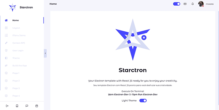
This application is basically a template project to help you with some basic features that we usually need develop, such as a collapsed menu, switch theme and a simple login. So, I created this app to make better use of time on new things. In addition, you can check other components such as Row, Column, Box, Switch Button, Toolbar, Title and Subtitle.
Bearing in mind that this application is based on Electron.js, so we will need the Node installed on the machine. After that, you can use development editor like your preference, in my case, I used o Visual Studio Code.
If you don't want to read the documentation here, I created some pages inside the app with the instructions like this. So, just do the clone and following the steps to install below.
# Clone the repository
$ git clone https://github.com/mcosta21/starctron.git

# Access the folder
$ cd starctron

# Install the dependencies
$ yarn or npm install

# Launch the application
$ yarn electron-dev or npm run electron-devstarctron
│
└─── src
│ │ index.js
│ │ routes.js
│ │
│ └─── assets
│ │
│ └─── components
│ └─── Body
│ └─── Menu
│ └─── SwitchButton
│ │ ...
│ │
│ └─── contexts
│ │ LoginContext.js
│ │ MenuContext.js
│ │ ThemeContext.js
│ │
│ └─── pages
│ └─── Home
│ └─── SignIn
│ └─── Layout
│ │ ...
│ │
│ └─── screen
│ │
│ └─── services
│ │
│ └─── styles
│ │ GlobalStyles.js
│ │ theme.js
│
│ .env
│ .gitignore
│ package.json
│ README.md
│ README-pt-br.md
Electron |

React JS |
React Icons |
React Router |
Styled Components |
Inside the app, you can use some components that it will help you to create your content, such as insert a box, with rows and columns. For example:

  <Row height={100}>
    <Column>
      <Box>
        <h3>100%</h3>
      </Box>
    </Column>
  </Row>

  <Row height={100}>
    <Column width={50}>
      <Box>
        <h3>50%</h3>
      </Box>
    </Column>
    <Column width={50}>
      <Box>
        <h3>50%</h3>
      </Box>
    </Column>
  </Row>

  <Row height={100}>
    <Column>
      <Box>
        <h3>33%</h3>
      </Box>
    </Column>
    <Column>
      <Box>
        <h1>33%</h1>
      </Box>
    </Column>
    <Column>
      <Box>
        <h1>33%</h1>
      </Box>
    </Column>
  </Row>

  <Row height={100}>
    <Column width={70}>
      <Box>
        <h3>70%</h3>
      </Box>
    </Column>
    <Column width={30}>
      <Box>
        <h3>30%</h3>
      </Box>
    </Column>
  </Row>

  <Row height={130}>
    <Column width={20}>
      <Box>
        <h3>20%</h3>
      </Box>
    </Column>
    <Column width={80}>
      <Box>
        <h3>80%</h3>
      </Box>
    </Column>
  </Row>
  <Row height={130}>
    <Column width={40}>
      <Box>
        <h3>40%</h3>
      </Box>
    </Column>
    <Column width={30}>
      <Box>
        <h3>30%</h3>
      </Box>
    </Column>
    <Column width={30}>
      <Box>
        <h3>30%</h3>
      </Box>
    </Column>
  </Row>
Navigating to components folder, you will find the Menu component. Note that its structure is based on options constant, which will be rendered by a map. Then, for each option, a React-router-dom Link is available with the following attributes:
const options = [
        {
        "title": "Home",
        "link": "/home",
        "icon": "<FaHome size={20}/>"
        }
];
Finally, just access the routes.js file at the root of the project, and include the new routes for each page, correlating them with the option's link attribute.

The Context API is how React makes data available from parent to child components via props. Thus, it's not necessary to explicitly pass the props on each component.
Then, inside the src folder, you can see the contexts created, and which are in use in the application, for example:
| LoginContext | This context is responsible for keeping the session user in all components. |
| MenuContext | This context is used by the Menu component to maintain the width state provided by the isSmallMenu attribute. |
| ThemeContext | This context is responsible for managing the application theme between light e dark. |
As stated on the Context API page, we created a simple login system to keep the user throughout the session using the LoginContext, so you can access the services folder and customize user.js with your own method to connect to the database and integrate into the SignIn and ForgotPassword pages.
    {
        "id": "3",
        "username": "mcosta",
        "password": "12345",
        "email": "marcioc424@gmail.com",
        "photo": "https://avatars0.githubusercontent.com/u/30120305?s=400&u=2c33a6777ec253d664a59108230924e555c89070&v=4"
    }
In the routes.js file, note that there is a redirect to the SignIn page when there is no user in the session, with that, just comment on that line and go to development.
Accessing the styles folder, you can customize all the colors available in the application.
The GlobalStyles.js file contains all the styles applied to the global theme. And in the theme.js file, it contains the variables referring to the light and dark themes, in addition to a set of auxiliary colors.
Light theme
export const lightTheme = {
  name: 'light',
  backgrounds: {
    lightest:  '#FFFFFF',
    lighter: '#FEFEFE',
    dark: '#F5F5FC',
    darker: '#D8DCF3',
    darkest: '#CCC8C8',
  },
  colors: {
    lightest: '#252131',
    lighter: '#201B2D',
    dark: '#31303C',
    darker: '#15121E',
    darkest: '#13111B'
  },
  colorsTheme
}
Dark theme
export const darkTheme = {
  name: 'dark',
  backgrounds: {
    lightest: '#252131',
    lighter: '#201B2D',
    dark: '#191622',
    darker: '#15121E',
    darkest: '#13111B'
  },
  colors: {
    lightest:  '#FFFFFF',
    lighter: '#FEFEFE',
    dark: '#F5F5FC',
    darker: '#D8DCF3',
    darkest: '#CCC8C8',
  },
  colorsTheme
}
Global colors
export const colorsTheme = {
    white: '#FFF',
    grey: '#F7F8FC',
    opaque: '#41414D',
    purple: '#',
    purpleDark: '#5A4B81',
    green: '#6CCACE',
    orange: '#E89E64',
    pink: '#FF79C6',
    cyan: '#78D1E1',
    red: '#E96379',
    yellow: '#FFDD67',
    blue: '#4849FF'
}
The theme.js file is the most important in this matter, since we use it in ThemeContext to manage the current theme of the application, as we can see by clicking on a SwitchButton. So, if you want to customize the themes, just change the attributes of each variable.
The best part of the project is a pre-configuration already done, this aims to make your life easier and not waste your time with certain project configurations.
So, before we go into the build process, it will be necessary to make small changes to the application. Of course, this should be done if you want the name and icons customized to your liking.
First, we will make some changes to the files contained in the public folder. Then find the index.html file and change the title tag to your application name.
<title>{ your_app_name }</title>
After that, access the electron settings file, where you can customize several things such as window size, menu and icon.
The createWindow function has attributes like width, height and icon, customize them at will. Note also that, even informing the size attributes of the window, the call mainWindow.maximize() keeps the screen at maximize, if you want to change that, just remove the command.
Now that we've made these customizations, let's move on to the build process of the application. Then, access the package.json file. In this file, you'll see all the necessary information for the application, such as name, description, dependencies, scripts, etc. So, remember to change the following attributes:
{
  "name": "your_app_name",
  "description": "your_app_description",
  "author": "your_name",
}
And most importantly, the build attribute contains the appId, don't forget to change it, if you are making your own application, on the contrary, the installer will replace it.
{
  "build":
        {
          "appId": "your_unique_app_id"
        }
}
Finally, open the terminal and run the following command:
After finishing the process, a folder called dist will be created, there will be the installer file ready for use 🚀.
After finishing the process, a folder called dist will be created, there will be the installer file ready for use 🚀.
 |
Português / Portuguese |
|---|

Marcio Costa @mcosta21