Responsive Jumbotron built with Bootstrap 5. Examples of classic hero component, with background image, with navbar and many other combinations.
Check out Bootstrap Jumbotron Documentation for detailed instructions & even more examples.
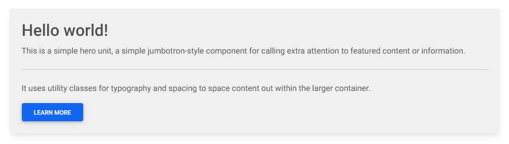
<!-- Jumbotron -->
<div class="p-4 shadow-4 rounded-3" style="background-color: hsl(0, 0%, 94%);">
  <h2>Hello world!</h2>
  <p>
    This is a simple hero unit, a simple jumbotron-style component for calling extra
    attention to featured content or information.
  </p>

  <hr class="my-4" />

  <p>
    It uses utility classes for typography and spacing to space content out within the
    larger container.
  </p>
  <button type="button" class="btn btn-primary">
    Learn more
  </button>
</div>
<!-- Jumbotron -->-
Download MDB 5 - free UI KIT
-
Choose your favourite customized component and click on the image
-
Copy & paste the code into your MDB project
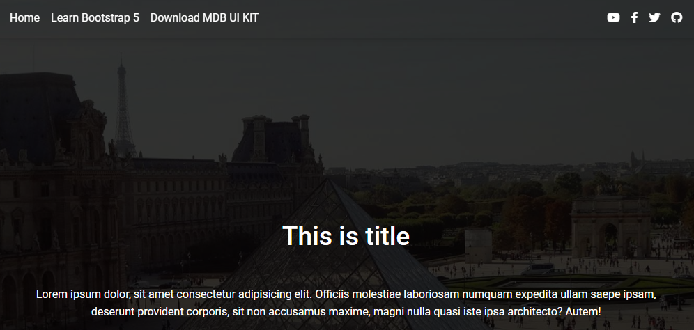
Bootstrap Jumbotron Background image:

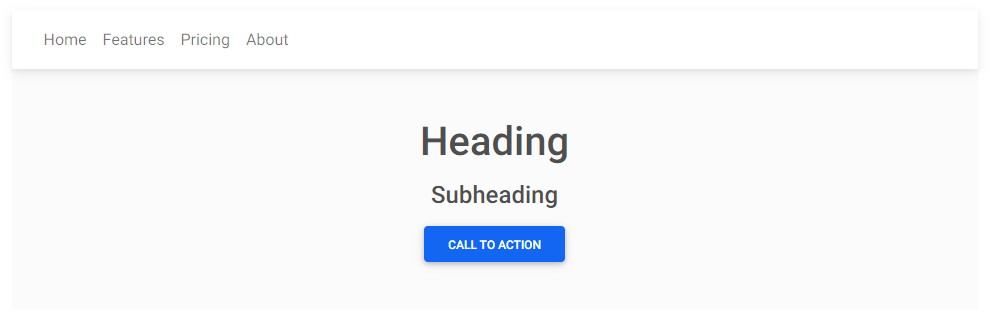
Bootstrap Jumbotron With navbar:
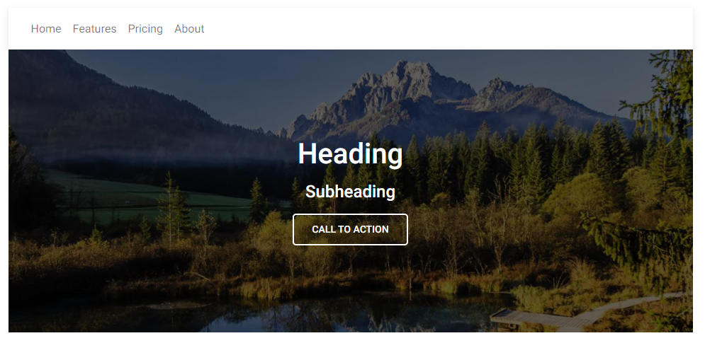
Bootstrap Jumbotron Background image with navbar:
Bootstrap Jumbotron Fixed navbar:

Bootstrap Jumbotron Animated navbar:
- Bootstrap Address Form
- Bootstrap Avatar
- Bootstrap Back To Top Button
- Bootstrap Carousel Slider with Thumbnails
- Bootstrap Chat
- Bootstrap Code Blocks
- Bootstrap Comments
- Bootstrap Comparison Table
- Bootstrap Credit Card Form
- Bootstrap Drawer
- Bootstrap Nested Dropdown
- Bootstrap FAQ component / section
- Bootstrap Gallery
- Bootstrap Hamburger Menu
- Bootstrap Invoice
- Bootstrap Jumbotron
- Bootstrap Login Form
- Bootstrap Maps
- Bootstrap Media Object
- Bootstrap Mega Menu
- Bootstrap Multiselect
- Bootstrap News Feed
- Bootstrap Offcanvas
- Bootstrap Order Details
- Bootstrap Page Transitions
- Bootstrap Payment Forms
- Bootstrap Product Cards
- Bootstrap Profiles
- Bootstrap Quotes
- Bootstrap Registration Form
- Bootstrap Expanding Search Bar
- Bootstrap Shopping Carts
- Bootstrap Side Navbar
- Bootstrap Sidebar
- Bootstrap Social Media Icons & Buttons
- Bootstrap Square Buttons
- Bootstrap Survey Form
- Bootstrap Testimonial Slider
- Bootstrap Testimonials
- Bootstrap Textarea
- Bootstrap Timeline
- Bootstrap To Do List
- Bootstrap Video Carousel / Gallery
- Bootstrap Weather