Time display in Tooltip/ticks is broken for timeseries charts #11435
Comments
|
Reproduced on
|
|
Is there any known workaround for this? |
|
@jens-totemic Casting as text is currently the only workaround. |
|
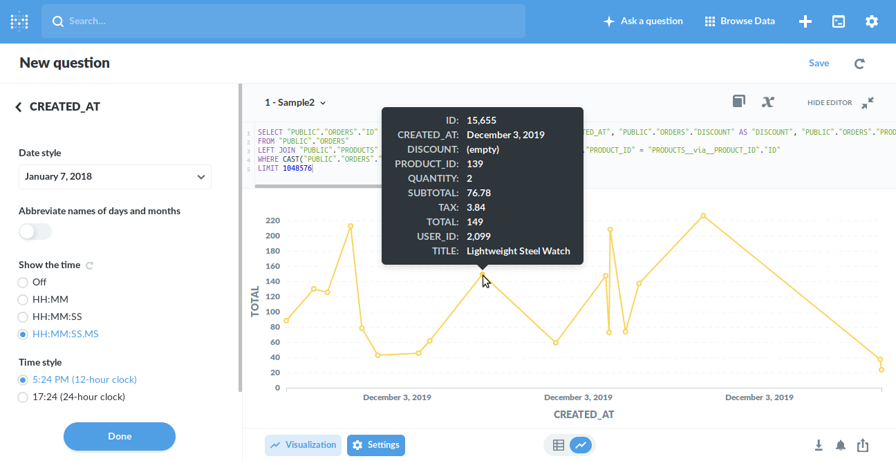
Thanks @flamber. I applied casting to my sample from #18956 and I still get the same result: WITH test(ts, v) AS (VALUES
('2021-11-11 13:00:56Z'::timestamptz, 6),
('2021-11-11 15:11:43Z'::timestamptz, 5),
('2021-11-11 17:22:35Z'::timestamptz, 4),
('2021-11-11 19:33:22Z'::timestamptz, 6),
('2021-11-11 21:44:19Z'::timestamptz, 5),
('2021-11-11 23:55:02Z'::timestamptz, 4)
)
SELECT cast(ts as text), v
FROM testThe output in the tooltip is still without time (same also in the x-axis label). |
|
@jens-totemic Sorry, you'll need to format the date yourself, so the frontend does not understand it's a date and tries to do it's magic. |
|
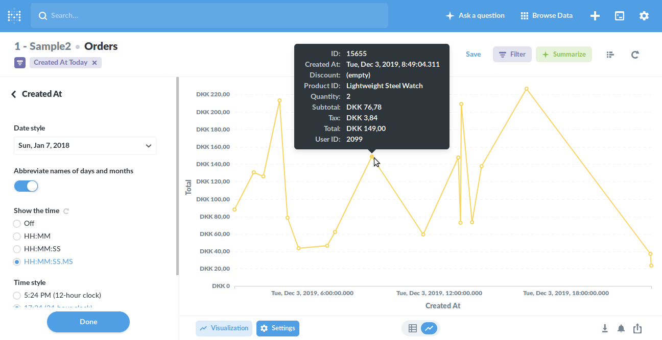
Ok, got it. The problem unfortunately is that this specific column is the one needed as the x-axis in the visualization. I.e. it cannot be modified to the point that Metabase is not recognizing it as a timestamp. So pretty much any time series display will be affected by this. |
|
Using some more info from #12370, here's a somewhat contrived way to display the data at least on a minute level resolution with both the tooltip and x-axis showing proper numbers. What makes this contrived is that if Metabase sees multiple values for the same exact minute, it will add them up in the graph - which is not what we needed. Our regular dataset will never have more than one value for each timestamp but now that we group all of them together into the same minute, it can happen. To fix this, we are just picking exactly one value to visualize for each given minute (which one to pick depends on the use case). So it might be only a 50% workaround depending on the use case but sharing here since it allowed us to keep going. WITH test(ts, v) AS (VALUES
('2021-11-11 13:00:15Z'::timestamptz, 6),
('2021-11-11 13:00:56Z'::timestamptz, 5),
('2021-11-11 15:11:43Z'::timestamptz, 5),
('2021-11-11 17:22:35Z'::timestamptz, 4),
('2021-11-11 19:33:22Z'::timestamptz, 6),
('2021-11-11 21:44:19Z'::timestamptz, 5),
('2021-11-11 23:55:02Z'::timestamptz, 4)
)
SELECT DISTINCT ON (ts) ts, v
FROM (
SELECT date_trunc('minute', ts) AS ts, v
FROM test
) AS test2
ORDER BY ts, v DESC |
|
@jens-totemic Metabase has several feature requests open about second-handling. It has not really been the main use-case. |

|
Thanks @flamber When using the Ordinal display each entry is equally spaced apart on the screen, no matter if they are just seconds or hours away from each other. The screenshot above illustrates this well. For actual time series data this is not desirable as the time relationship would need to be kept on the graph. |
|
Thanks @jens-totemic for the DISTINCT ON workaround! This issue has been a thorn in my side for years. |
Display of time in tooltips of timeseries charts has been missing/broken since 0.33.1
⬇️ Please click the 👍 reaction instead of leaving a
+1orupdate?commentThe text was updated successfully, but these errors were encountered: