Data point values on Scatter visualization #13246
Labels
Comments
|
I previously wrote out some considerations for adding labels to scatter plots here: #12645 (comment) tl;dr: we'll want a way to pick which column's value to display, including string/categorial columns. |
|
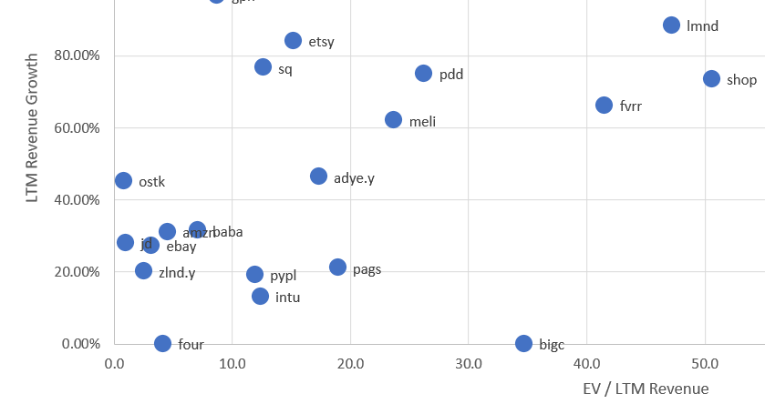
+1 for this........super important for scanning plots, often where the label to display is a string field like company name etc, eg. below |
Sign up for free
to join this conversation on GitHub.
Already have an account?
Sign in to comment
Describe the solution you'd like

Data points on Scatter plot (aka Bubble chart) visualization, similar to Line/Bar visualizations
Additional context
Related to #12977 and #13096 (historical #11585 and #12645)
⬇️ Please click the 👍 reaction instead of leaving a
+1orupdate?commentThe text was updated successfully, but these errors were encountered: