Skip to content
New issue

Have a question about this project? Sign up for a free GitHub account to open an issue and contact its maintainers and the community.

By clicking “Sign up for GitHub”, you agree to our terms of service and privacy statement. We’ll occasionally send you account related emails.

Already on GitHub? Sign in to your account

[Fluent UX] Update Settings to Windows 11 #11860

Closed
niels9001 opened this issue Jun 24, 2021 · 54 comments
Closed

[Fluent UX] Update Settings to Windows 11 #11860

niels9001 opened this issue Jun 24, 2021 · 54 comments
Assignees
Labels
Area-User Interface things that regard UX for PowerToys Product-Settings The standalone PowerToys Settings application Resolution-Fix Committed Fix is checked in, but it might be 3-4 weeks until a release.

Comments

@niels9001
Copy link
Contributor

niels9001 commented Jun 24, 2021

Provide a description of requested docs changes

Windows 11 introduces a new visual style for Settings. Would be nice to adopt this for PT as well:

image

image

@niels9001 niels9001 added Product-Settings The standalone PowerToys Settings application Area-User Interface things that regard UX for PowerToys Needs-Triage For issues raised to be triaged and prioritized by internal Microsoft teams labels Jun 24, 2021
@just1a-person
Copy link
Contributor

Love this design!

@just1a-person
Copy link
Contributor

How are we going to get the acrylic effects if we are using XAML Islands?

@Jay-o-Way
Copy link
Collaborator

How are we going to get the acrylic effects if we are using XAML Islands?

Simple, don't use xaml islands 😆

@just1a-person
Copy link
Contributor

I guess we have to wait for WinUi 3 then

@royvou
Copy link
Contributor

royvou commented Jun 24, 2021

Looks like the stable version of WinUI 3 is announced!

https://aka.ms/winui3/0.8-announcement

@crutkas
Copy link
Member

crutkas commented Jun 24, 2021

We can do this with WinUI 2.6. What the terminal folks will be leveraging.

@crutkas crutkas removed the Needs-Triage For issues raised to be triaged and prioritized by internal Microsoft teams label Jun 24, 2021
@mdtauk
Copy link

mdtauk commented Jun 24, 2021

They did a surprise announcement of a new Material, which is basically the Fauxcrylic I have been pushing for, which I believe is used for the window backgrounds.

https://docs.microsoft.com/en-us/windows/apps/design/style/mica

@Jay-o-Way
Copy link
Collaborator

Jay-o-Way commented Jun 24, 2021

Windows 11 introduces a new visual style for Settings. Would be nice to adopt this for PT as well:

This would not be logical on Windows 10. Win 11 is still very new and will be so for quite some time, for every day users. Might actually be confusing, at first. Not even talking about computers that are not deemed compatible and therefore will not update to 11. I know, you could argue that power users will not fall into this category, but I think PowerToys is available for anybody who needs or just wants it.

To me it makes as much sense as using a Win.XP style: it doesn't match the system OS.

@niels9001
Copy link
Contributor Author

@Jay-o-Way WinUI is not perse limited to Windows 11. As it's available as of today, we'll see a lot of UWP applications being updated with updated visual styles for common controls (such as buttons).

As we can see on the screenshot, the W11 Settings app' redesign is more than just a couple of new styles. Would be a shame to be held back by legacy, especially since we're targeting mostly power-users.

@just1a-person
Copy link
Contributor

Updated XAML Controls Gallery

This is updated XAML Controls Gallery (running in Windows 10). All new controls seem to work fine in Windows 10 as well.

@Jay-o-Way
Copy link
Collaborator

To me it feels like putting some expensive brand car parts on a cheap brand car. It doesn't belong together. I rather see Win.10 style used on a Win.10 system, and Win.11 style used on a Win 11 system.

@just1a-person
Copy link
Contributor

just1a-person commented Jun 29, 2021

I guess it doesn't matter. Windows 11 is the future so adding more UI inconsistency to Windows 10 is fine.

@niels9001
Copy link
Contributor Author

To me it feels like putting some expensive brand car parts on a cheap brand car. It doesn't belong together. I rather see Win.10 style used on a Win.10 system, and Win.11 style used on a Win 11 system.

I think W11 Settings improves overall usability (and, in my opinion it looks better as well) by adopting e.g. expanders.

Later this year, with Project Reunion support for unpackaged apps, we can hopefully move away from using XAML Islands to WinUI3. This could be a good moment to rethink the Settings UX as well.

I feel that PT users will probably adopt W11 fast (power users and all that) so then we can cater to the majority of users. Time will tell.. My $0.02.

@crutkas
Copy link
Member

crutkas commented Jun 30, 2021

We will not support multiple UX systems. It becomes near impossible to support and test. Apps have different UXs all the time. We will adopt the Windows 11 style as it is much more adaptable and flexible

@Jay-o-Way
Copy link
Collaborator

adding more UI inconsistency to Windows 10 is fine

Do I recognise a bit of sarcasm here? I agree, though.

Apps have different UXs all the time.

Very true. Don't consider this something to be proud on, though.

@just1a-person
Copy link
Contributor

Apps have different UXs all the time.

Very true. Don't consider this something to be proud on, though.

But unfortunately that's the reality for most apps and that's how it will be. And again, UI on Windows 10 doesn't matter anymore (as long as it works!).

@niels9001
Copy link
Contributor Author

@Jay-o-Way I fully agree.. but with legacy comes.. complexity :). Also in terms of UX.

Most people (and I can imagine PowerToys users sooner rather than later) will move towards Windows 11 once it rolls out, making the W10 user base smaller. Once it does and there's critical mass, I can imagine that moving towards a UI refresh for Settings makes sense.

For example, Office will refresh their UI to be more inline with W11 and W10 users will get it as well.
https://insider.office.com/en-us/blog/visual-refresh-of-office-apps-for-windows

And this is not only about look & feel - I think the W11 Settings app introduces some nice ways of making Settings pages more glanceable, collapsing Settings that are not super important to immediately see. Some PT settings pages could really benefit from that as well.

@just1a-person
Copy link
Contributor

might be blocked by microsoft/microsoft-ui-xaml#5319

@niels9001
Copy link
Contributor Author

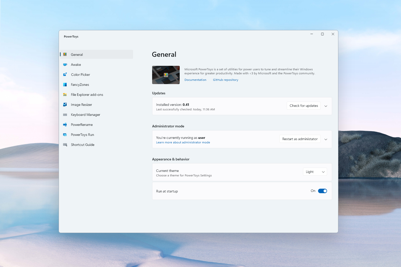
Here's a mock-up of the current settings vs. a new version:

Artboard – 9

High-res version:

Artboard – 7

@Tropix126
Copy link

Windows 11 introduces a new visual style for Settings. Would be nice to adopt this for PT as well:

This would not be logical on Windows 10. Win 11 is still very new and will be so for quite some time, for every day users. Might actually be confusing, at first. Not even talking about computers that are not deemed compatible and therefore will not update to 11. I know, you could argue that power users will not fall into this category, but I think PowerToys is available for anybody who needs or just wants it.

To me it makes as much sense as using a Win.XP style: it doesn't match the system OS.

WinUI is a global standard, and isn't the design language of a single OS, although 11 mainly adopts it in the shell. Ideally any app that has the ability to use the latest version should use the latest version for the sake of consistency and stability.

@Tropix126
Copy link

Tropix126 commented Jul 13, 2021

Here's my take on it.

image

@mdtauk
Copy link

mdtauk commented Jul 13, 2021

I think @niels9001 take on it is more aesthetically pleasing, and I think more Windows apps as they get updated, will adopt the Cards on Mica approach, as used by the Settings app.

@Jay-o-Way
Copy link
Collaborator

Jay-o-Way commented Jul 14, 2021

collapsing Settings that are not super important to immediately see

That's a thing I also hate. Example in Power Plan settings: there's three equal plans and one always ends up under the "see more/less" -arrow. I don't appreciate anybody or anything else telling me what is (or isn't) important to me.

Having that said - I am in favor of ditching those monochrome MDL2 icons in PowerToys Settings. And I mean everywhere in Settings. I would even use the colored icon to fix #9176, for example. Also would eliminate the issue of the"MDL2 v2" font (as in the 21H2 update) that @htcfreek already called out for.

@niels9001
Copy link
Contributor Author

collapsing Settings that are not super important to immediately see

That's a thing I also hate. Example in Power Plan settings: there's three equal plans and one always ends up under the "see more/less" -arrow. I don't appreciate anybody or anything else telling me what is (or isn't) important to me.

There's probably not 1 fix for all users - overall, I think we want to add some visual hierarchy across the Settings pages to make it easier to scan - that probably means we need to "hide" some settings as well.

Having that said - I am in favor of ditching those monochrome MDL2 icons in PowerToys Settings. And I mean everywhere in Settings. I would even use the colored icon to fix #9176, for example. Also would eliminate the issue of the"MDL2 v2" font (as in the 20H2 update) that @htcfreek already called out for.

To open modules we can definitely consider that. Makes them stand out a bit more. More descriptive icons I'd just stick to Segoe Fluent Icons, since we don't have colored version of those icons and we stay inline with W11 Settings.

Question: the items in the Nav menu are sorted alfabetically, but only for English. Is it possible to sort them after translation is applied?

I think we might be able to do that - good idea IMO. Now, we hard-code the NavView items - but OOBE loads these from code behind. We could do that as well and then make sure we sort it. Would you mind creating a new issue for this?

@mdtauk
Copy link

mdtauk commented Jul 15, 2021

Question: the items in the Nav menu are sorted alfabetically, but only for English. Is it possible to sort them after translation is applied?

I think we might be able to do that - good idea IMO. Now, we hard-code the NavView items - but OOBE loads these from code behind. We could do that as well and then make sure we sort it. Would you mind creating a new issue for this?

Not sure of the telemetry data, but couldn't they be listed by usage of the particular Power Toy?

@niels9001 niels9001 mentioned this issue Jul 22, 2021
10 tasks
@niels9001
Copy link
Contributor Author

@htcfreek

image
Agree, that does look more appropriate.

@htcfreek
Copy link
Collaborator

htcfreek commented Aug 2, 2021

@niels9001
Is the code in the PR up to date. I'd like to clone and run it locally.

@htcfreek
Copy link
Collaborator

htcfreek commented Aug 2, 2021

@htcfreek

image
Agree, that does look more appropriate.

@niels9001
Can we switch reboot note and svg thumbnail setting like this:

Icon Preview
ℹ️ A reboot ....
🖼️ Enable svg thumbnails  [• ]
🖼️ Enable ??? thumbnails  [ •]

@niels9001
Copy link
Contributor Author

niels9001 commented Aug 2, 2021

@htcfreek Yes, the branch is up to date (#12470 )

Changed the order as well:

image

Please bear in mind that the Run page will crash, and other pages haven't been updated yet.

@htcfreek
Copy link
Collaborator

htcfreek commented Aug 2, 2021

Changed the order as well:

image

We should use only one symbol. I suggest the image.

@htcfreek
Copy link
Collaborator

htcfreek commented Aug 2, 2021

image

@niels9001
Do we have a admin warning box UNDER the all users info box when running as non-admin?

How it can look like:

ℹ️ The settings on this page affect all users on the system.
⚠️ Please restart as admin to change the settings on this page.

Btw.: The dots are missing at the end of the info/warning texts.

@htcfreek

This comment has been minimized.

@htcfreek
Copy link
Collaborator

htcfreek commented Aug 3, 2021

Different states when installing updates:
Loaders

@niels9001

  • ⚠️ There is a margin bug that error bar and auto download settings bar are overlapping each other.
  • Can we use the same icons like on the update page of Windows 11`s settings app?
    image image image [Update error image]
  • I am sure we don't need to show the seconds on last checked time.
  • Colors and message type for update available and update ready should be updated to warning because this is an important information.
  • Can we update the UX like this to have only one bar? The first line should be bold and the color should depending on the symbol/state. Please pay attention that I have change the text a bit.
✅ PowerToys is up to date
v0.41.1 • Release notes
Last checked: 8/2/2021 1:19:52 PM
ℹ️ You are running a dev build
v0.0.1 • Updater not available.
ℹ️ The Update is under the way
v0.41.1 -> v0.41.4 • See what's new
🔄 Downloading ...
⚠️ A new version is ready to install/available
v0.41.1 -> v0.41.4 • See what's new
Last checked: 8/2/2021 1:19:52 PM
❌ An error occurred trying to install the update
v0.41.1 -> v0.41.4 • See what's new
Last checked: 8/2/2021 1:19:52 PM

@Jay-o-Way
Copy link
Collaborator

ℹ️ The Update is under the way

"under the way" doesn't sound very professional - nor descriptive - to me. (right now, 0.45 is also on the way, it just asn't been built yet.)

⚠️ A new version is ready to install/available

This is informational, not a warning!

@htcfreek
Copy link
Collaborator

htcfreek commented Aug 4, 2021

ℹ️ The Update is under the way

"under the way" doesn't sound very professional - nor descriptive - to me. (right now, 0.45 is also on the way, it just asn't been built yet.)

"Is under the way" is a well known phrase which says something is going on/is running.

⚠️ A new version is ready to install/available

This is informational, not a warning!

The idea behind is to say: "Attention there is a new version you should update to."

@Tropix126
Copy link

"Is under the way" is a well known phrase which says something is going on/is running.

Is it? I've always heard it used as "underway", though that might just be a dialect thing.

@just1a-person
Copy link
Contributor

"Is under the way" is a well known phrase which says something is going on/is running.

Is it? I've always heard it used as "underway", though that might just be a dialect thing.

yes, If I remember correctly Windows Update also uses "underway"

@htcfreek
Copy link
Collaborator

htcfreek commented Aug 9, 2021

Changed the order as well:

image

We should use only one symbol. I suggest the image.

@niels9001
Any updates on this?

@niels9001
Copy link
Contributor Author

Changed the order as well:
image

We should use only one symbol. I suggest the image.

@niels9001
Any updates on this?

What symbol are you referring to?

@htcfreek
Copy link
Collaborator

htcfreek commented Aug 9, 2021

Changed the order as well:
image

We should use only one symbol. I suggest the image.

@niels9001
Any updates on this?

What symbol are you referring to?

The symbols of the preview/thumbnail file types.

@htcfreek
Copy link
Collaborator

htcfreek commented Aug 9, 2021

@niels9001
Any updates on this too?

#11860 (comment)

#11860 (comment)

@niels9001 niels9001 added the Status-In progress This issue or work-item is under development label Aug 16, 2021
@niels9001 niels9001 self-assigned this Aug 16, 2021
@Jay-o-Way
Copy link
Collaborator

We can do this with WinUI 2.6. What the terminal folks will be leveraging.

And later upgrade to v3? Maybe when the "forgotten" modules are caught up? Rename, Resizer and Shortcut are waiting to be improved.

@niels9001
Copy link
Contributor Author

We can do this with WinUI 2.6. What the terminal folks will be leveraging.

And later upgrade to v3? Maybe when the "forgotten" modules are caught up? Rename, Resizer and Shortcut are waiting to be improved.

I miss the context of the quote :-).

Yeah, the goal is to move Settings out of WPF + XAML Islands (and using WinUI 2.6) to WinUI 3 completely. For that we need unpackaged app support, which will hopefully happen this year according to the roadmap.

This will then allow us to simplify our code-behind, using Mica on W11 and full customization of the title bar. Luckily, all the XAML and visual updates we're doing now will be 1:1 portable 👍.

After Settings, hopefully other modules can be ported over to WinUI 3. Although that will be more work since their are mostly WPF.

@Aaron-Junker Aaron-Junker added Resolution-Fix Committed Fix is checked in, but it might be 3-4 weeks until a release. and removed Status-In progress This issue or work-item is under development labels Aug 23, 2021
@Aaron-Junker
Copy link
Collaborator

Fixed in #12470 and will be integrated in the next major release of PowerToys

@niels9001 niels9001 added this to To do in 0.45 Release via automation Aug 24, 2021
@niels9001 niels9001 moved this from To do to Done in 0.45 Release Aug 24, 2021
@Jay-o-Way
Copy link
Collaborator

Jay-o-Way commented Aug 27, 2021

@niels9001 maybe a bit late, but I see now that the Navigation is either completely visible, or completly hidden when the window is narrow. It omits the compact view, where only the icons are visible. Shouldn't we use that too? This is happening because thresholds for compact and expanded are equal (coincidently same values as shown in the example on page linked below). Is there a reason?

<navigationview
 OpenPaneLength="288"
 CompactModeThresholdWidth="1007"
 ExpandedModeThresholdWidth="1007"
 PaneOpened="NavigationView_PaneOpened"
 PaneClosed="NavigationView_PaneClosed"

ref: https://docs.microsoft.com/en-us/windows/apps/design/controls/navigationview#adaptive-behavior

@niels9001
Copy link
Contributor Author

@Jay-o-Way W11 Settings has the same behavior. Only differences is that the hamburger menu should be collapsed at wider widths (and visible at the top in small mode). That's something we can't do at the moment with the WPF titlebar.

@dedavis6797
Copy link
Contributor

Resolved with the release of v0.45. Thanks @niels9001!

Sign up for free to join this conversation on GitHub. Already have an account? Sign in to comment
Labels
Area-User Interface things that regard UX for PowerToys Product-Settings The standalone PowerToys Settings application Resolution-Fix Committed Fix is checked in, but it might be 3-4 weeks until a release.
Projects
No open projects
Development

No branches or pull requests