This case study is based on a fictitious wholesale wine business looking to optimize sales by segmenting customers — restaurant and liquor store owners, into groups based on buying behavior. This is a very common problem faced by all kinds of businesses from large retailers like Walmart and Target to your friendly neighborhood liquor store.
The data set provided includes two files, one listing about three dozen product discount offers made over the course of a year, and the other listing customers and their purchase details. Our objective is to figure out which customers would be most attracted to which types of discount offers going forward. This is a classic customer segmentation or clustering problem.
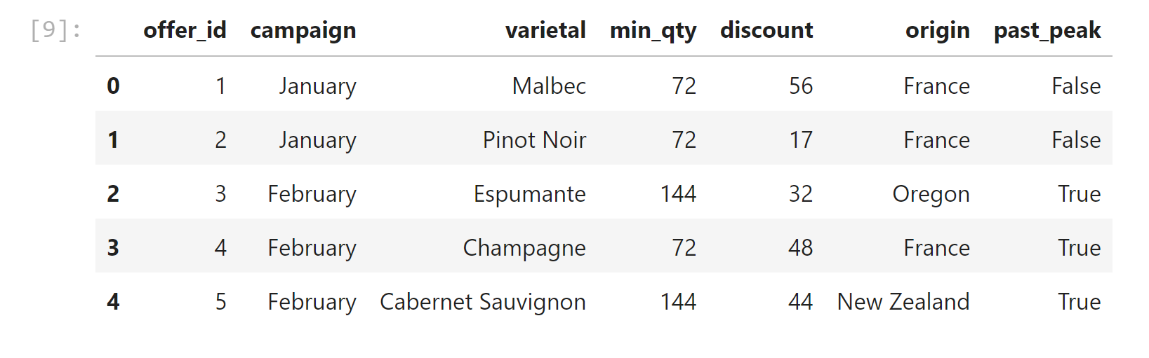
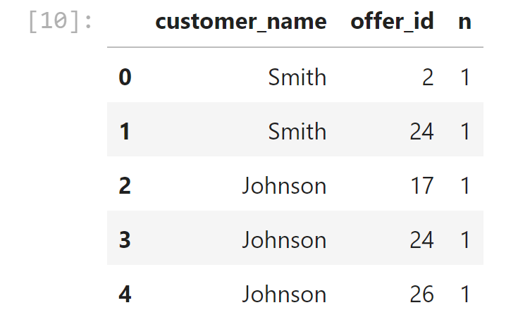
Each discount offer is described with six attributes — Month, Wine Varietal, Minimum Quantity, Discount %, Country of Origin and Past Peak (T/F). There are 32 different offers listed, each with a different combination of these attributes. The customer list includes 324 transactions for about 100 customers. So this challenge involves many more dimensions than you typically see in a machine learning tutorial for clustering.
The dataset contains information on marketing newsletters/e-mail campaigns (e-mail offers sent to customers) and transaction level data from customers. The transactional data shows which offer customers responded to, and what the customer ended up buying. The data is presented as an Excel workbook containing two worksheets. Each worksheet contains a different dataset.
We're trying to learn more about how our customers behave, so we can use their behavior (whether or not they purchased something based on an offer) as a way to group similar minded customers together. We can then study those groups to look for patterns and trends which can help us formulate future offers.
The first thing we need is a way to compare customers. To do this, we're going to create a matrix that contains each customer and a 0/1 indicator for whether or not they responded to a given offer.
-
Merge df_transactions & df_offers on=offer_id
-
Make a pivot table, to show a matrix with customer names in the row index and offer numbers as columns headers and fill NANs with zeros.
K-Means Clustering
Recall that in K-Means Clustering we want to maximize the distance between centroids and minimize the distance between data points and the respective centroid for the cluster they are in. True evaluation for unsupervised learning would require labeled data; however, we can use a variety of intuitive metrics to try to pick the number of clusters K. We will introduce two methods: the Elbow method, the Silhouette method and the gap statistic.
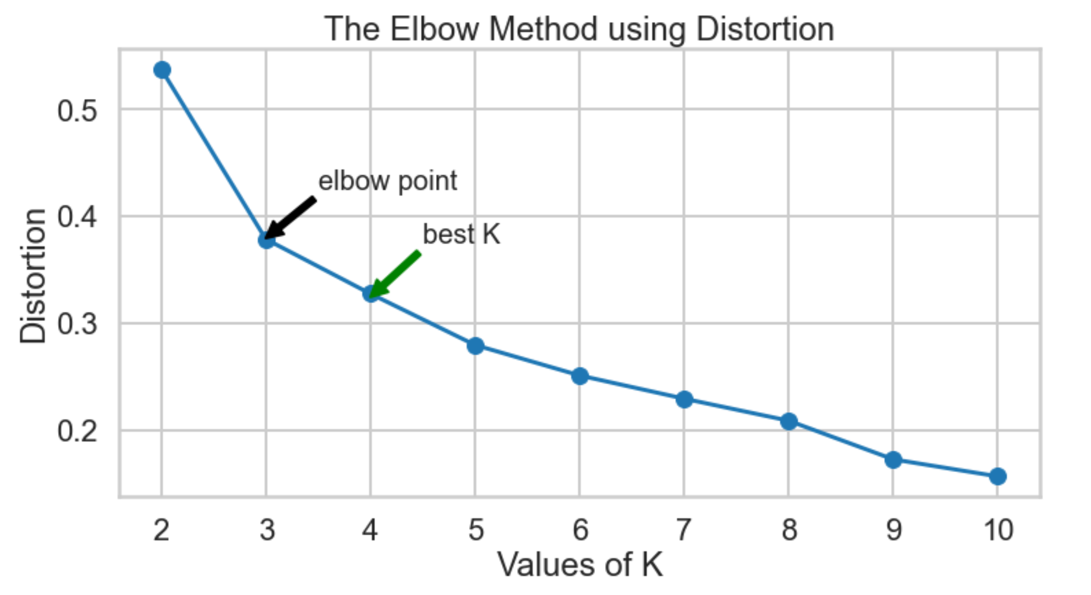
Which K to choose? The Elbow Method
-
Distortion: It is calculated as the average of the squared distances from the cluster centers of the respective clusters. Typically, the Euclidean distance metric is used.
-
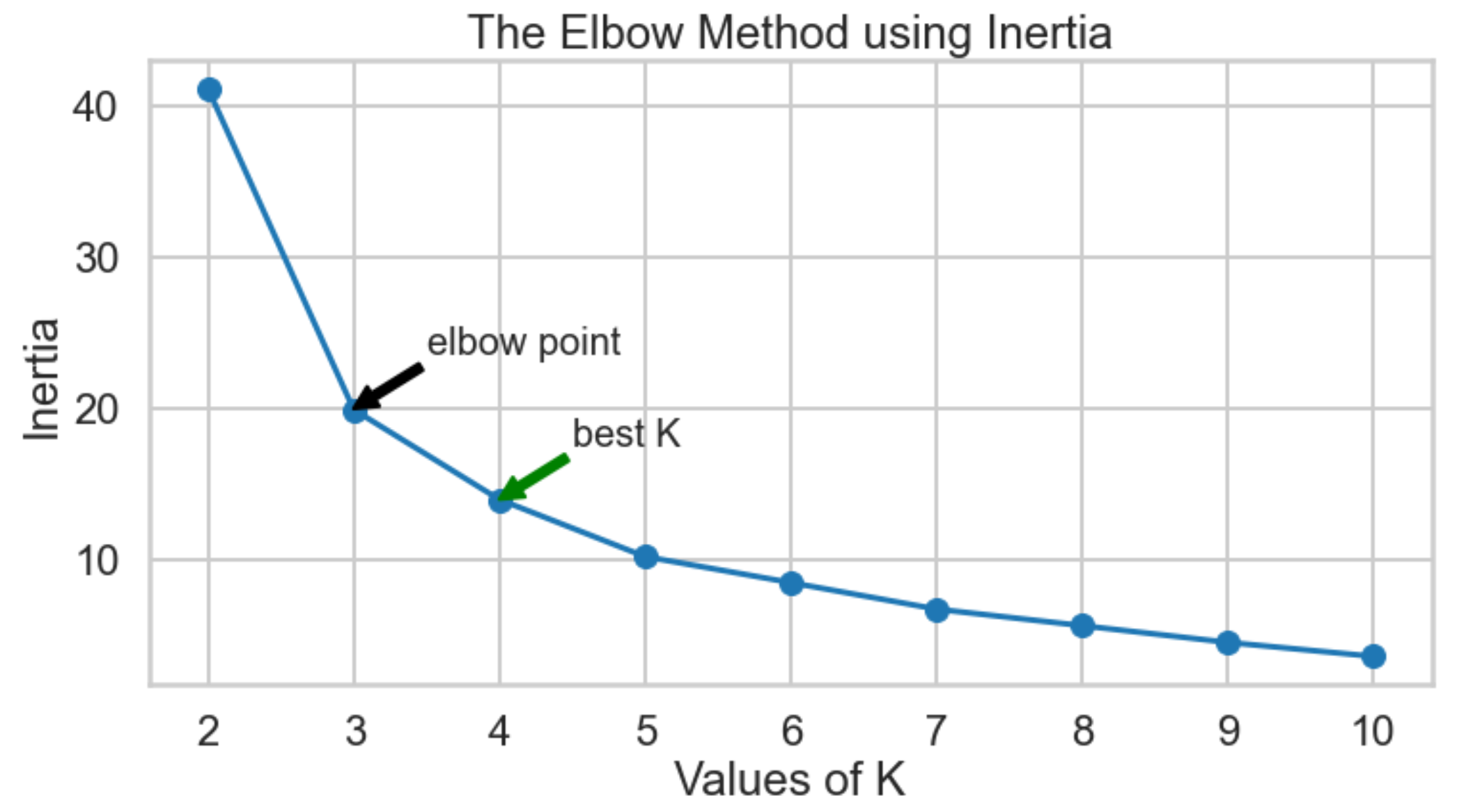
Inertia: it will be calaculated in two methods:
-
It is the sum of squared distances of samples to their closest cluster center. Typically, inertia_ attribute from kmeans is used.
-
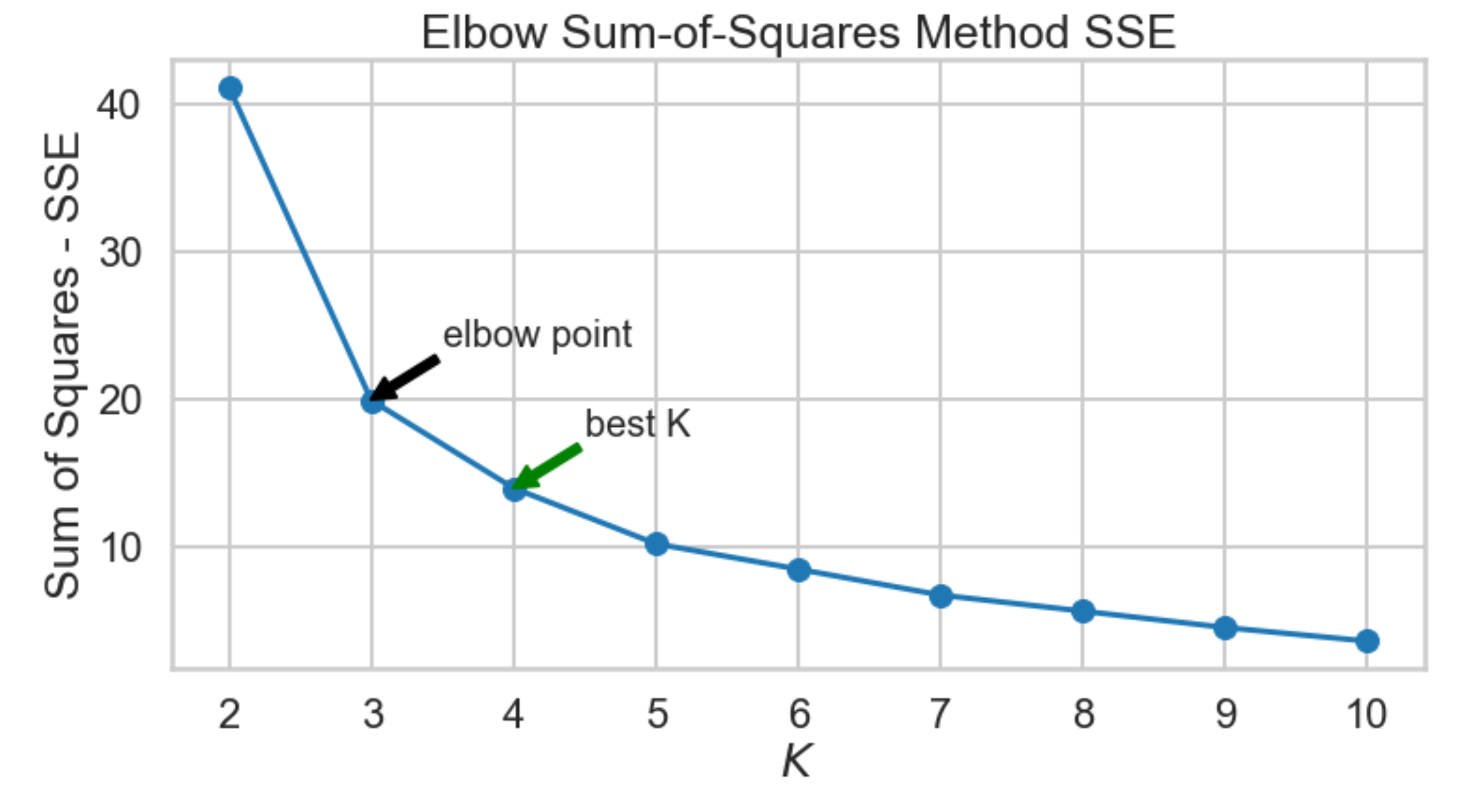
Lastly, we look at the sum-of-squares error in each cluster against
$K$ . We compute the distance from each data point to the center of the cluster (centroid) to which the data point was assigned.
-
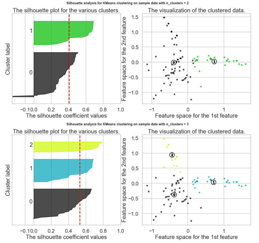
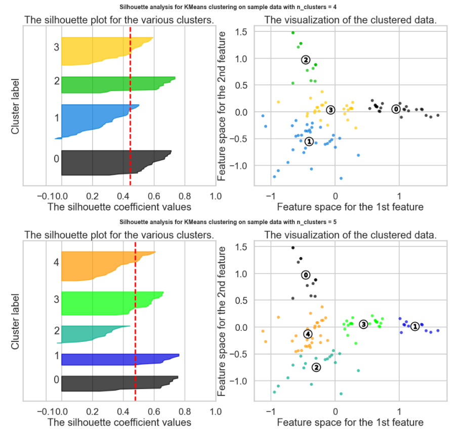
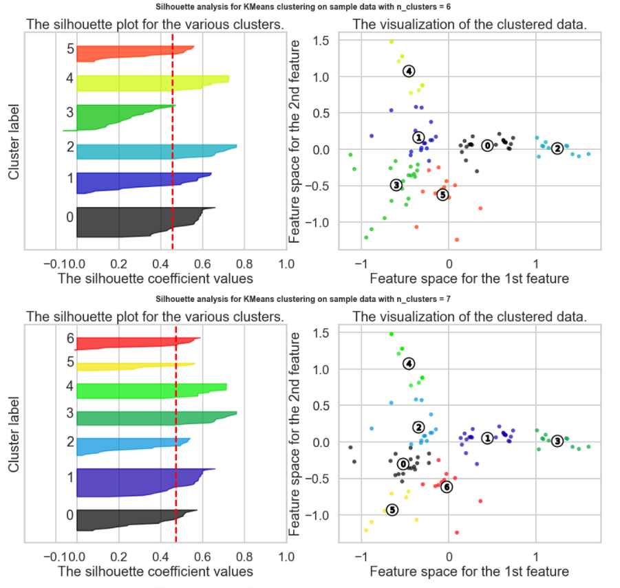
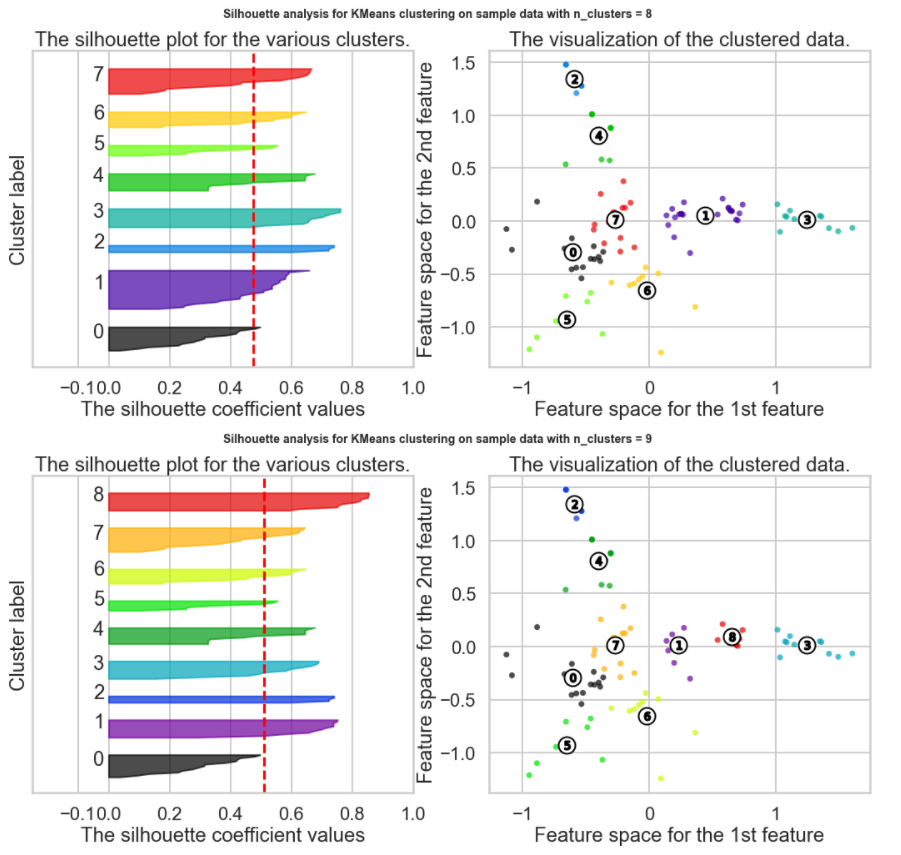
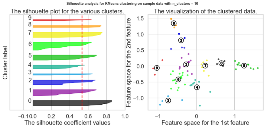
Which K to choose? The Silhouette Method
There exists another method that measures how well each datapoint 𝑥𝑖 "fits" its assigned cluster and also how poorly it fits into other clusters. This is a different way of looking at the same objective. Denote 𝑎𝑥𝑖 as the average distance from 𝑥𝑖 to all other points within its own cluster 𝑘 . The lower the value, the better. On the other hand 𝑏𝑥𝑖 is the minimum average distance from 𝑥𝑖 to points in a different cluster, minimized over clusters. That is, compute separately for each cluster the average distance from 𝑥𝑖 to the points within that cluster, and then take the minimum.
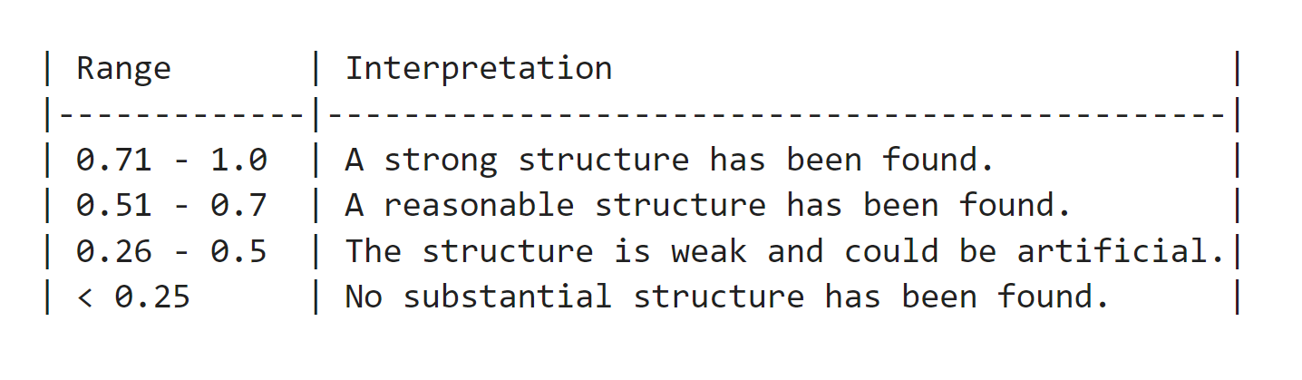
The silhouette score is computed on every datapoint in every cluster. The silhouette score ranges from -1 (a poor clustering) to +1 (a very dense clustering) with 0 denoting the situation where clusters overlap. Some criteria for the silhouette coefficient is provided in the table below:
Which K to choose? Summary
-
Elbow Method using Distortion from Scipy confirms that the elbow point k=3 so the best k will be 4 (the plot starts descending much more slowly after k=3)
-
Elbow Method using Inertia from kmeans confirms that the elbow point k=3 so the best k will also be 4.
-
Elbow Method using Sum of Squares (SSE) , confirms that the elbow point k=3 so the best k will also be 4
-
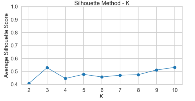
The Silhouette Method does not appear to be a clear way to find the best K. It is not straightforward to find the number of clusters using this method. Yet, from the above graph, we can see k=10, 3 and 9 are our best option for now (Closest to 1 = best Silhouette Score, but clearly Silhouette Scores are relatively small suggesting we may have a weak structure)
How do we visualize clusters? If we only had two features, we could likely plot the data as is. But we have 100 data points each containing 32 features (dimensions). Principal Component Analysis (PCA) will help us reduce the dimensionality of our data from 32 to something lower. For a visualization on the coordinate plane, we will use 2 dimensions. In this exercise, we're going to use it to transform our multi-dimensional dataset into a 2 dimensional dataset.
This is only one use of PCA for dimension reduction. We can also use PCA when we want to perform regression but we have a set of highly correlated variables. PCA untangles these correlations into a smaller number of features/predictors all of which are orthogonal (not correlated). PCA is also used to reduce a large set of variables into a much smaller one.
If you need more information, consult this useful article and this visual explanation.
What I've done is I've taken those columns of 0/1 indicator variables, and I've transformed them into a 2-D dataset. I took one column and arbitrarily called it x and then called the other y. Now I can throw each point into a scatterplot. I color coded each point based on it's cluster so it's easier to see them.
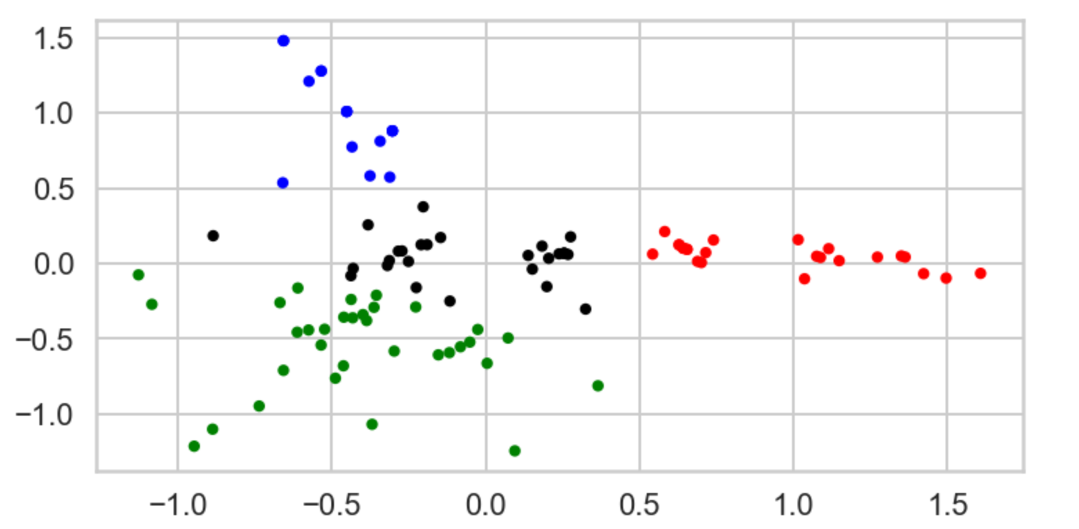
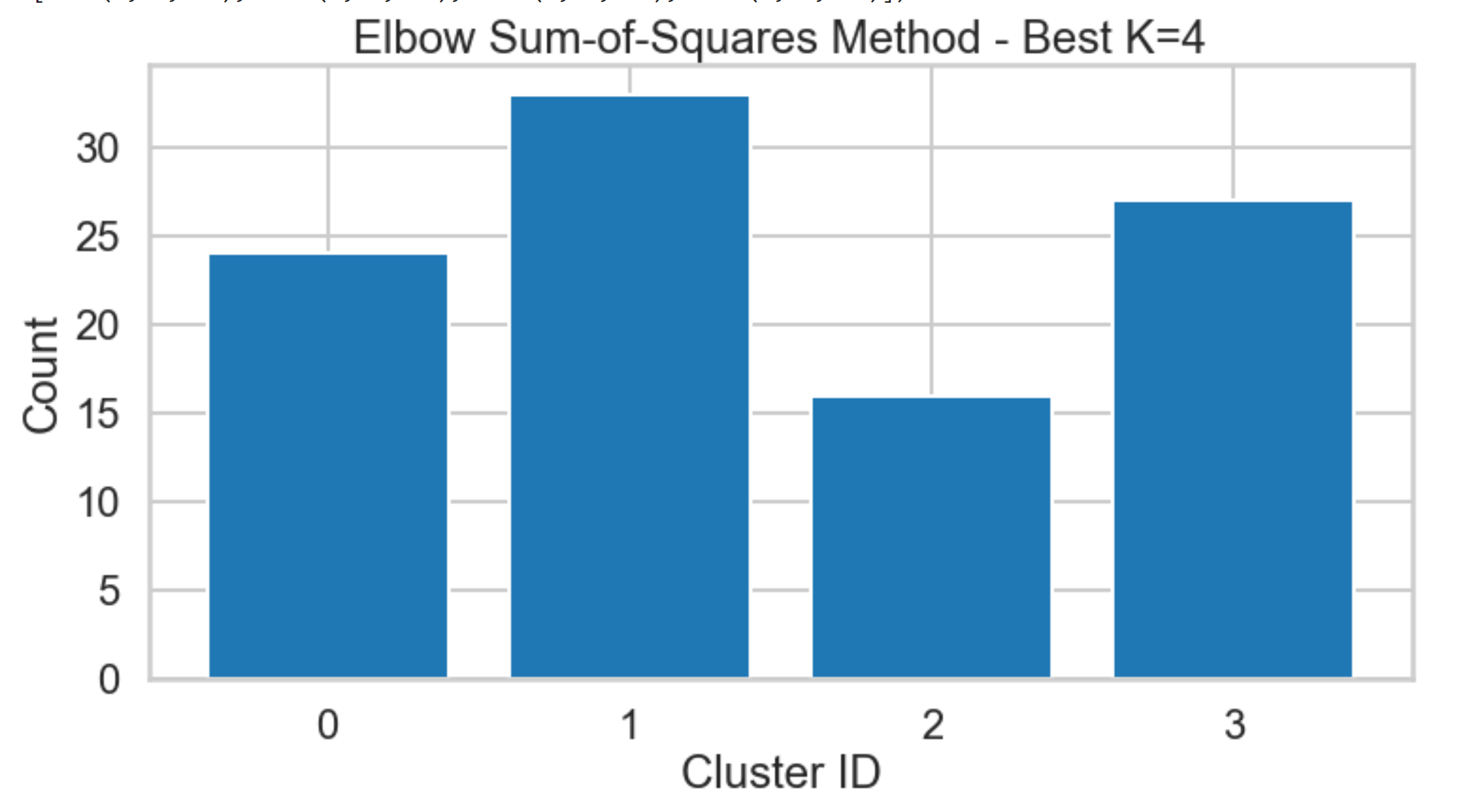
Customers Behavior – Unsupervised Machine Learning K-means Clustering (K=4)
“Customer Group 1”: Represents customers who love and appreciates both French Red Wine and Sparkling Wine (89% consumes >= 72 Min Qty) specifically: Cabernet Sauvignon & Champagne.
“Customer Group 2”: Represents customers who love Sparkling Wine (75% consumes >= 72 Min Qty) mainly Champagne but in general they enjoy French Sparkling Wine.
“Customers from both Group 1 & 2”: More than 75% of them who consumes >= 72 Min Qty, love Cabernet Sauvignon & Champagne specially if there are high Discounts since they’re heavy drinkers.
“Customer Group 3”: Represents customers who are light Wine drinkers (Almost 100% of them, consumes 6 Min Qty) but still they appreciate French Wine in general (sparkling, Red, and some white).
“Customer Group 4”: Represents customers who love Red Wine especially Pinot Noir. These customers will buy Pinot Noir regardless if there’s a Discount or not and they don’t care about the origin either. They’re just Pinot Noir lovers!.
High Yield Segments That need our attention for their growth potential
“Customers from both Group 1 & 2”: Focused group of customers to increase sales by introducing more Discounts on Cabernet Sauvignon & Champagne.
“Customer Group 3”: Focused group of customers to increase revenue by introducing more wine varieties because these customers are NOT wine specific who are not settled yet and they would try more or new varieties.
“Customer Group 4”: Focused group of customers to increase revenue by increasing Pinot Noir prices!.
High Yield Segments That need our attention for their growth potential
“Customers from both Group 1 & 2” Focused group of customers to increase sales by introducing more Discounts on Cabernet Sauvignon & Champagne.
“Customer Group 3” Focused group of customers to increase revenue by introducing more wine varieties because these customers are NOT wine specific who are not settled yet and they would try more or new varieties.
“Customer Group 4” Focused group of customers to increase revenue by increasing Pinot Noir price!.
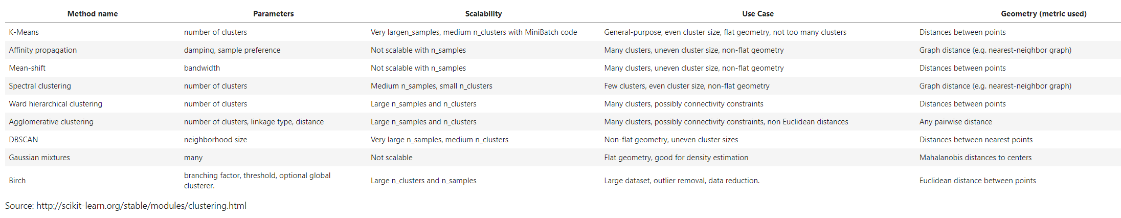
k-means is only one of a ton of clustering algorithms. Below is a brief description of several clustering algorithms, and the table provides references to the other clustering algorithms in scikit-learn.
-
Affinity Propagation does not require the number of clusters
$K$ to be known in advance! AP uses a "message passing" paradigm to cluster points based on their similarity. -
Spectral Clustering uses the eigenvalues of a similarity matrix to reduce the dimensionality of the data before clustering in a lower dimensional space. This is tangentially similar to what we did to visualize k-means clusters using PCA. The number of clusters must be known a priori.
-
Ward's Method applies to hierarchical clustering. Hierarchical clustering algorithms take a set of data and successively divide the observations into more and more clusters at each layer of the hierarchy. Ward's method is used to determine when two clusters in the hierarchy should be combined into one. It is basically an extension of hierarchical clustering. Hierarchical clustering is divisive, that is, all observations are part of the same cluster at first, and at each successive iteration, the clusters are made smaller and smaller. With hierarchical clustering, a hierarchy is constructed, and there is not really the concept of "number of clusters." The number of clusters simply determines how low or how high in the hierarchy we reference and can be determined empirically or by looking at the dendogram.
-
Agglomerative Clustering is similar to hierarchical clustering but but is not divisive, it is agglomerative. That is, every observation is placed into its own cluster and at each iteration or level or the hierarchy, observations are merged into fewer and fewer clusters until convergence. Similar to hierarchical clustering, the constructed hierarchy contains all possible numbers of clusters and it is up to the analyst to pick the number by reviewing statistics or the dendogram.
-
DBSCAN is based on point density rather than distance. It groups together points with many nearby neighbors. DBSCAN is one of the most cited algorithms in the literature. It does not require knowing the number of clusters a priori, but does require specifying the neighborhood size.