[meta] Multitasking V2 #1250
Comments
|
Does this new issue mean that all those things have been moved to a new/later milestone? |
|
"Please add a proper tabs system maybe by changing the action flow button from delete history to tabs? Opening tabs by holding links to open in new tab is difficult." |
|
Tab management is the last remaining nit that stops me using FFF for all tasks. Why not just have a button to open a new tab someplace? That's all you'd need. |
|
@vesta0 @brampitoyo i think @colintheshots has done some great work on changing our multitasking flow, can we plan to incorporate some of it in 8.0? This issue may be dated so we can close this one and add a new one for @brampitoyo to post his thoughts / mocks in? |
|
@Sdaswani I have a meeting with @brampitoyo later today to talk about this. @colintheshots and I also talked about it briefly last week. Once we have a mockup I'd like the team to break it down to smaller independent pieces that can be prioritized and I'd love to incorporate some in 8.0 |
|
@Sdaswani After talking with @vesta0, we have decided on a few features that we like to consider for multitasking v2: 1. Open fresh new tabs quicklyOpening a new tab that contains a link of your choosing (not just link contained within the page you already have open) should be faster and simpler compared to other browsers. In this mockup, “Open in new tab” is a new action that we add to our URL bar and keyboard.
Why it’s faster and simplerOther browsers
Firefox Focus
2. Get to an open tab quicklyFinding a tab that’s already open should be faster and simpler compared to other browsers. In this mockup, you’d be able to search your open tabs by simply typing its name on the URL bar. Why it’s faster and simplerOther browsers
Firefox Focus
3. View all open tabsThis is a tricky one to justify. Having a tab list view doesn’t differentiate us from other browsers. And if we do build one, it’s very hard to make it quicker, faster and simpler to access. However, since we don’t show anything when you tap on the URL bar, why not give this UI some superpowers?
This tab view isn’t really faster or simpler to access than other browsers, but it fits in with other components that we’ve designed as part of multitasking v2. 4. Close individual tabsThis is an easy one to design for. We can simply add some close “x” buttons to the side of each tab (whether it’s a tab name or a thumbnail). Remember that our goal is to help privacy-concerned users get to their destinations quicker. If we can make things quicker, faster and simpler to access compared to other browsers, it’s probably a good starting reason to build it. |


|
In addition to this, it will help to user test multitasking UIs in other browsers and find out where they’re lacking. Although you can argue that our multitasking use case is quite different (because people frequently wipe all their tabs clean!) |
|
Looks very interesting @brampitoyo ! @colintheshots your thoughts on this fits in with your refactoring work, i.e., hopefully you can use that MVP as a base for this work? |
|
Also @brampitoyo should we replace this experience as the multitasking experience, or A/B test it with the old one? What about user education of the new experience (e.g., can these be explained in tool tips)? |
|
Hi, A firefox focus user here. I'm really glad that this is being tackled. Since "request desktop site" and "find in page" have been implemented, I feel that tab management is the only lacking feature in firefox focus. The proposed interface sounds efficient, but I wonder if it's obvious enough? And by that I mean, if I had not read this thread, would I know to:
I suspect the answer would be no, so why not add these actions into the vertical dots menu next to the location bar too? Have you though about whether to keep the circle in the bottom right, with the number of open tabs? Under the new proposal it seems redundant, and covers part of the web page. Cheers! |
|
Sounds like a plan, thanks @colintheshots |
|
@vesta0 I’m in the process of writing a research study protocol. I will meet with Heather McGaw later this week and talk through it. When that’s complete, we can plug the study questions into our user research platform (e.g. UserTesting), along with the prototype APK that @colintheshots is creating. With both pieces in place, we will then run a pilot study, followed shortly by the full study involving 8–10 participants. Hopefully you and our team will be able to attend and observe! |
|
I'm working on profiling and improving the performance of tabs before the user study. GeckoView tab thumbnail support will come second. |
|
TBH I would prefer to hide the bottom panel somehow, maybe just like the floating trash icon does, maybe implementing it on the top panel as an arrow and we just do the same movement but from up to down (I painted this really quickly on GIMP just to let you know the idea (or even removing the arrow at all if there's some "help" option in the menu that describes the whole thing)): EDIT: BTW I love the idea (if it doesn't use this much space, I feel very stressed with this much space being occupied, like when it happened with IE years ago) |

|
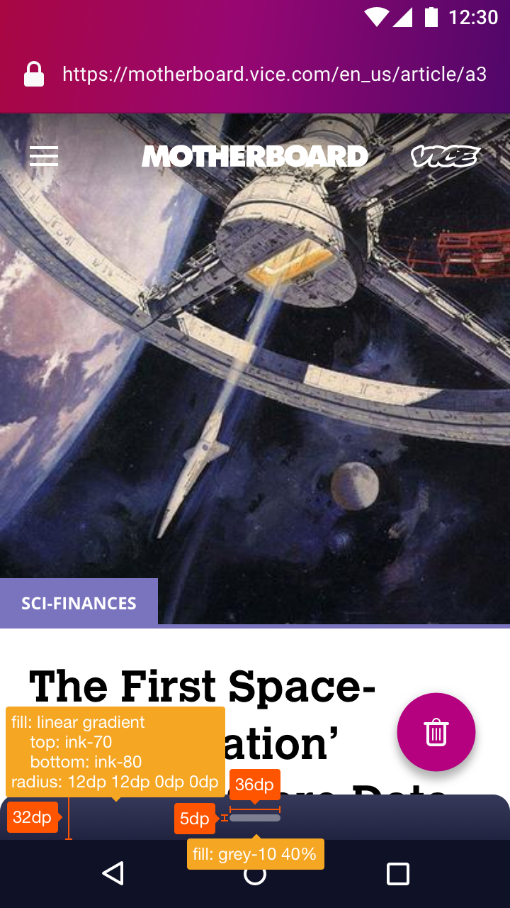
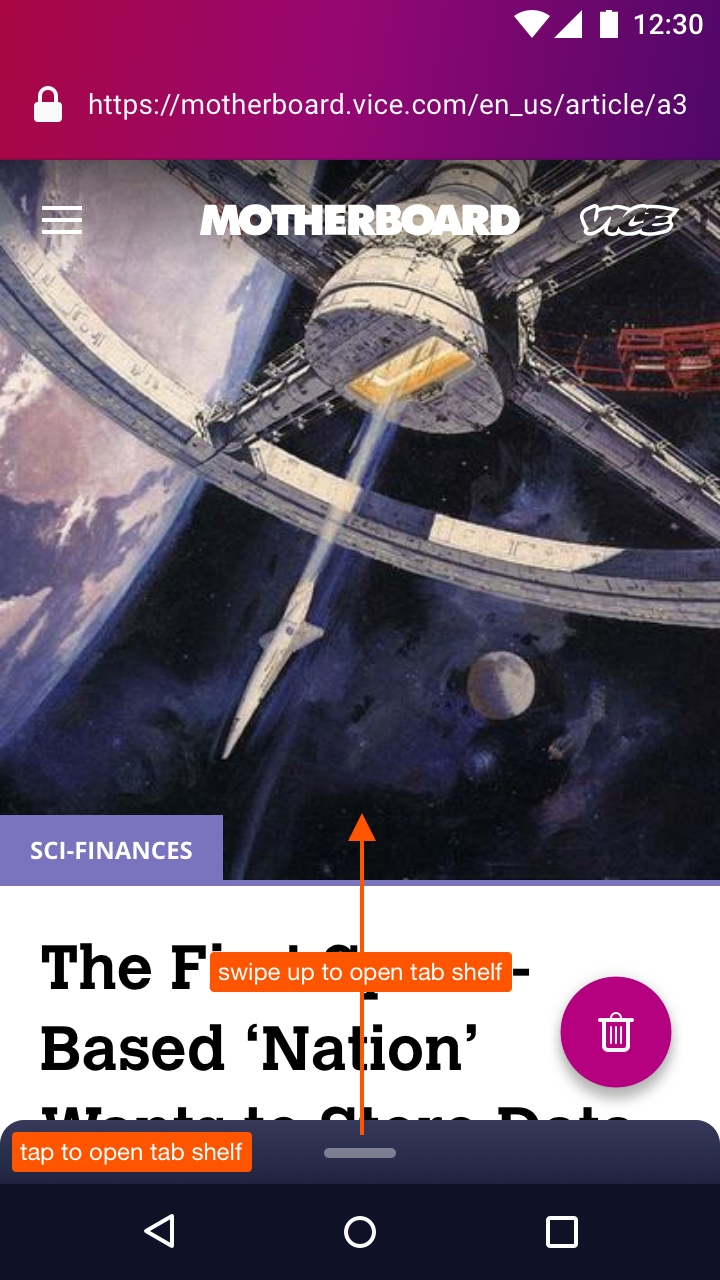
Hi @colintheshots, here’s a spec of the tab shelf visual design and behaviour:
Additionally:
|


|
@moshpirit Your concept of having the tab shelf be attached to the URL bar is totally in line with one of the mockups I’ve designed earlier in the process, as shown below:
The mockup you posted was the reverse of mine: URL bar up top, with tab shelf below it. We ultimately chose to place the tab shelf down below (no matter what the URL bar placement may be) because it’s closer to your thumb and will be quicker/easier to grab. The “empty” area is put in by design. It’s there to help you have enough space for your fingers to drag down. As Material Design’s touch target guidelines stated:
To save space, we’ve made ours 32 dp high, so technically, it breaks the guidelines. But we hope that having the area extend through the width of the screen be enough to make a large touch target. One idea from your mockup that I thought was really clever is the fact that you’ve integrated the multitasking (number of tabs) icon in the URL bar. This means that the user can also simply tap on that button to access the tab shelf (in addition to swiping down, of course). In my mockup, I’ve made the tab shelf not only swipeable, but also tappable. |

I would prefer to have the tab shelf on top and save the space (as much as possible), despite this fact.
This is not a new idea too, the same approach is used by Firefox for Android. And this is another reason why I think that the tab shelf placed on the top isn't such a bad idea. As a Firefox user, I used to this. |
|
@brampitoyo awesome!! I like it on top because of aesthetic reasons but I recognize this is more practical. This is probably up to you. |
FloatingActionButtons and Toolbars have this complex behavior built into the UI framework. The simplest implementation, without consuming too much time, for a similar behavior with the bottom sheet would be to peek the sheet if hidden on ANY scroll up and hide the sheet if peeking on ANY scroll down. It wouldn't behave identically to the FAB and Toolbar, which only appear when scrolling up near the top of the page. Is this acceptable or should I take extra time to match the same behavior? |
|
Bram agreed the current behavior is just fine. At this point, we seem ready for the customer trial. The only remaining issue is there is no disk caching of thumbnails at this point and we sometimes need to regenerate the thumbnails. Some might consider this a feature for forensic security reasons, but it limits us to around nine tabs. |
|
@colintheshots Showing 6 tabs at any one time was by design. Focus encourages aggressive/frequent erasure. Because tabs aren’t kept permanently, my hypothesis is that users probably won’t open many to begin with. The problem is, I don’t know what number this will be and had to made an educated guess. Eventually, I landed at six tabs shown at a time, because it’s close to the limit of working memory according to Miller’s famous paper, “The Magical Number Seven, Plus or Minus Two”. So I hope that we won’t run into the thumbnail caching issue. Not writing to disk is still a good general principle. |
|
I'm a casual user who is curious about this, and I do have a couple of questions (pardon me if it is inappropriate to ask these questions):
|
|
Please make it possible to open new empty tab, or at least make it possible to open entered URL in new tab. This I really miss going from Chrome |
|
I came here, because I've could not find open new tab button anywhere (also I could not find "report ux issue" button anywhere).
I think that your logic of "users of FFF do not have many tabs open so..." gets the correlation/causation backwards. If there is no simple way to open a tab, how am I supposed to have large number of tabs? If you need stats, then take them from a browser which has already a great multitasking support, not from your own! Your product is excellent, I would ditch Chrome instantly if you just give me this "+" button somewhere I could find it. |
|
Hrm, still no way to easily open a tab. I feel like we are over-thinking this somewhat. Why not just add a new tab button somewhere and deal with the UI overhaul separately? |
|
Moved to bugzilla: https://bugzilla.mozilla.org/show_bug.cgi?id=1802032 Change performed by the Move to Bugzilla add-on. |
|
@csadilek hey man, sup! hope you are doing well. is issue tracking for Focus moving back to Bugzilla? |
UX meta to track related issues. No milestone attachment necessary.
The text was updated successfully, but these errors were encountered: