Reps / Branding Update #113
Comments
|
Just leaving a comment here to keep the Reps team and council on the loop before we move with anything permanent |
|
@couci Of course. We stopped this for now as we have to work closely with this together. Pushing this for later on. It's not something as small as to work out in a GitHub issue. |
|
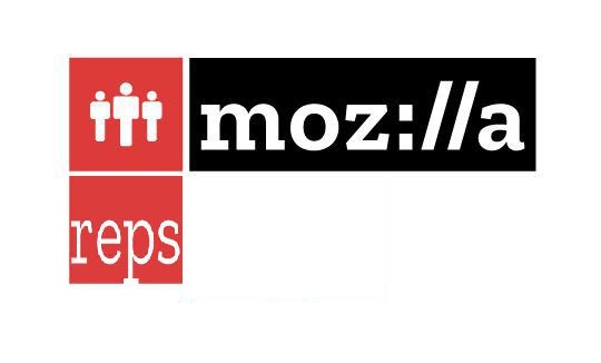
Getting back to this. With the new branding guidelines, this could be an option. It doesn't have the new color palette but I'd say that Reps has such a legacy that it can be excused for that. What do yo think? I invited Reps over on Discourse to chime in: |

|
@elioqoshi PS : I am not a designer by profession so views may be like a end user 😁 |
|
I was wondering is there a way we can integrate the crest in there? I am feeling it's a big part of the Reps however I do know we need to follow the guidelines |
|
@decode-dev Thanks for that! Having no margin in the "reps" wordmark is according to the guidelines and all logos will get this treatment so there is not much space to work around it. Mozilla has a new color palette which you can find here: The Reps color is different and an exception to this. We could change the red color (but it has years of Reps legacy with it) But we can't change the black color. Appreciate your thoughts! @couci Well, it wouldn't make much sense since the crest was more a Mozilla element and not exclusive to Reps. Other projects have/had it too: https://elioqoshi.me/mozilla-logos/ Apart the guidelines I'd feel it would be too cramped in that square (since we need to fit all into the square) |
|
Thanks @elioqoshi for the hard work and the rest for input! I agree with your approach Elio and believe this is a good case for a break from the color palette. I am curious what Yulia and the Brand Team feel about this color divergence? One stylistic recommendation, have you tried the 'people' icons with hard/square edges rather than rounded? and/or the pixel effect you're implementing on some of the other marks? |
|
Hi @elioqoshi great see this here! Just adding comments made before. The words Mozilla, Reps + logo, get too big for a single logo. Only "Mozilla Reps" words are enough, IMHO. I recommend using the icon as a favicon or printed arts such as T-shirts, stickers, etc. However I feel that this icon is very traditional, maybe an abstract icon like Parsys can bring a "brand" more solid, innovative, flexible and open to the program. Cheers! |
|
@barrosgeraldo you make great points about the logo size/length and its usability. One thing we should keep in mind is that this current iteration is the full logo lockup. For brand guidelines it's important that we create this version first. Once this lock up is finalized and agreed upon it can then be used as a full lockup, as an icon only or as a wordmark only. Hope this makes sense. :) |
|
I think it fits well into the guidelines apart from the discussed exceptions. I think the color needs to be kept, and I think it's not too far off to justify it. I'm really struggling with the padding on the bottom, but that's what the current state of the art is according to Elio. I guess I'll get used to it. :) |
|
Hi @elioqoshi wish to add my two suggestions: Suggestion 1 Maybe the two red icons could be resized equally.. Suggestion 2 I an amateur and enthusiast with graphic design...it's just my idea and contribution as a reps... ! |

|
@gangit I was thinking on similar lines with your 2nd suggestion. |
Goal:
An updated icon that aligns with new branding for Reps
Info:
This request has come out of the current (work in progress) redesign of the SSO (Okta) Dashboard. See below. Currently all Mozilla sites are represented by the black highlight Zilla treatment. This is a placeholder until icons are available.
Yulia (Brand) is the originator of this request and should be kept apprised of progress/requests for feedback and direction.
Style Information:
Single color icon that can be used with or without a wordmark is preferable. Please default to Yulia for further direction. Also, the site owner/team should be consulted for conceptual direction.
Deadline:
Initial Beta release for the SSO (Auth0) Dashboard is currently in testing. If this can be ready prior to full release implementation, fantastic! Though understandable if that timeline is too aggressive and can not be met. We will have regular releases/feature enhancements and can integrate icon(s) updates as they are available.
Tag:
Design Needed
The text was updated successfully, but these errors were encountered: