
A few kinds of checkbox that can be used as FormField
This library currently has two Widgets.
- CheckboxListTileFormField: Use CheckboxListTile in Form
- CheckboxIconFormField: Use two Icons as if they consist a checkbox and also in Form
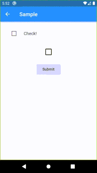
class TaskEditPage extends StatelessWidget {
  final _formKey = GlobalKey<FormState>();

  @override
  Widget build(BuildContext context) {
    return Scaffold(
      appBar: AppBar(
        title: Text(
          'Sample',
        ),
      ),
      body: Padding(
        padding: EdgeInsets.all(16),
        child: Column(
          children: <Widget>[
            Form(
              key: _formKey,
              child: Column(
                children: <Widget>[
                  CheckboxListTileFormField(
                    title: Text('Check!'),
                    onSaved: (bool value) {},
                    validator: (bool value) {
                      if (value) {
                        return null;
                      } else {
                        return 'False!';
                      }
                    },
                  ),
                  CheckboxIconFormField(
                    iconSize: 32,
                    onSaved: (bool value) {},
                  ),
                  RaisedButton(
                    onPressed: () {
                      if (_formKey.currentState.validate()) {
                        _formKey.currentState.save();
                      }
                    },
                    child: Text('Submit'),
                  ),
                ],
              ),
            ),
          ],
        ),
      ),
    );
  }
}
| Parameter | Description |
|---|---|
| key | FormField.key |
| title | CheckboxListTile.title |
| context | Provide a default color to errorColor |
| onSaved | FormField.onSaved |
| validator | FormField.validator |
| initialValue | FormField.initialValue |
| autovalidate | FormField.autovalidate |
| enabled | Whether the checkbox is enabled |
| dense | CheckboxListTile.dense |
| errorColor | Color of error message Default: Theme.errorColor (context is given), Colors.red (otherwise) |
| activeColor | CheckboxListTile.activeColor |
| checkColor | CheckboxListTile.checkColor |
| controlAffinity | CheckboxListTile.controlAffinity |
| secondary | CheckboxListTile.secondary |
| Parameter | Description |
|---|---|
| key | FormField.key |
| context | Provide a default color to errorColor |
| onSaved | FormField.onSaved |
| initialValue | FormField.initialValue |
| autovalidate | FormField.autovalidate |
| enabled | Whether the checkbox is enabled |
| trueIcon | IconData if true Default: Icons.check |
| falseIcon | IconData if false Default: Icons.check_box_outline_blank |
| trueIconColor | Color if true Default: Theme.accentIconTheme.color (if context is given), Theme.iconTheme.color (otherwise) |
| falseIconColor | Color if false Default: Theme.iconTheme.color |
| disabledColor | Color if disabled Default: Theme.disabledColor |
| padding | paddingDefault: 24.0 |
| iconSize | Icon.size |