[Lab] Improve accessibility of ToggleButton and ToggleButtonGroup #17203
Comments
 oliviertassinari
added
accessibility
oliviertassinari
added
accessibility
|
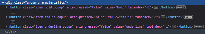
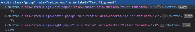
I've been researching this further and found https://www.w3.org/TR/wai-aria-practices/examples/toolbar/toolbar.html In their example, they don't mark up the Bold/Italic/Underline group as Further, their exclusive selection group (the Left/Center/Right alignment buttons) are marked as |
|
This is probably something we want to punt on until react Flare is concluded. Right now focus managment requires a lot of refs and imperative APIs. From what I can tell these problems get a lot easier with the new event system. Right now everything dealing with refs is a bit sketchy since we have to keep an eye on concurrent react. |
|
Concerning the roles: So if we discount keyboard navigation we have
It seems like checkboxes or togglebuttons are not supposed to have group characteristics. We would need to check how assistive technology treats a generic |
I was of the same opinion, until @oliviertassinari suggested otherwise (without saying why), and some further research led me to this article, which makes a fair case against using form controls (at least concerning the multiple selection toggle-buttons):
https://inclusive-components.design/toggle-button/ However it doesn't explain how you would communicate that selecting one toggle-button deselects another for exclusive selection toggle-buttons, if they are not identified as a radio buttons. |
|
@mbrookes I would encourage that we have a close look at how ckeditor and tiny mce handles the concern. They have been here for a decade, I would expect that they spend a reasonable amount of time on the topic. At least, to a level that matches the importance of the concern. |
|
I'm missing that part as well. From a UX standpoint toggle buttons are meant for switching state + submitting it. For example if you have a dark mode switch on your site it should be a toggle button if a click immediately applies the styles. It should only be a switch if you're on a settings page and have a separate "save settings" button. For me personally https://uxplanet.org/checkbox-vs-toggle-switch-7fc6e83f10b8 made the most sense for explaining when a toggle button should be used. However this distinction cannot be expressed for screen reader users if you have a group of toggle buttons where only one can be selected. WAI-ARIA implements this with radio buttons but those are used in a form with a submit button as well. It basically requires working with screen reader implementors to convey these different UX patterns. I think
This is a dangerous assumption. The time a thing has existed does not imply many time was spent iterating on that thing. |
|
@eps1lon I think you might be mixing up three different things here: toggle button, switch and checkbox. (There is a distinct ARIA role for switch separate to The UX Planet article only addresses the latter two.
According to the UX Planet article, in the particular context in which it is used, that should be a switch.
According to the UX Planet article, that should be a checkbox, which concurs with the paragraph I quoted above, and makes good old common sense. You could also infer the reverse - checkboxes should be used to apply state without a separate submit button.
It certainly seems to most appropriate pattern under the circumstances, but I would love to hear (or read) some expert opinion. @Heydon any thoughts?
Historical nitpick: the origins, as the name suggests, are from radios, where the toggle button would select a pre-tuned radio station. With a reel-to-reel tape player (and later cassette player and early VCR with mechanical switches) on the other hand, the pause button was independent of the play / record buttons - turning on "pause" didn't disengage "play", "stop" did; the difference being that play and stop mechanically engaged and disengaged the play-head, where pause simply stopped spooling the tape. |
I totally read that as toggle button because that's the only thing that would make sense. If a switch immediately commits the state then where is the distinction to toggle button? So yeah I misinterpreted that article when it comes to switches vs toggle buttons since it never acknowledges toggle buttons. It only talks about toggle switches (which is a tautology to me since a switch can only ever be toggled).
Yeah I did mix up some words here. What I meant was that the play/pause for a cassette are what to multi-selectable toggle button group is while the rest is the classic toggle button group or rather what is expressed in the WAI-ARIA implementation: radio buttons. The native radio buttons don't look anything like actual radio buttons to me. Real radio buttons are more like toggle buttons to me which is expressed by aria-pressed while native radio buttons or checkboxes have aria-selected/checked. I'm kind of focusing on the word "button" here which means clicking it triggers an action e.g. commits a change. With that meaning radio buttons are almost always not suited for forms since you usually select them and then submit which is already doable with a listbox. Depending on |
Summary 💡
I'm opening this issue as a continuation of discussion that was initiated in #17187.
ToggleButton and ToggleButtonGroup elements should be marked with appropriate role and aria attributes depending on their usage.
Copying part of my comment from #17187, this is what I envision:
role="group"andaria-label="......"attributesrole="menuitemradio",aria-checked="true/false", and maybe aria-label attributes.role="group"andaria-label="......"attributesrole="menuitemcheckbox",aria-checked="true/false", and, if necessary,aria-label="...."attributesrole="button",aria-pressed="true/false", and maybe aria-label.It would be great if somebody with more experience in accessibility could chime in.
Examples 🌈
A reference example: http://jongund.github.io/oaa-examples/examples/menubar/menubar-2/menubar-2.html (Jon Gunderson does a lot of work on W3C Aria Practices. I'd consider him a reliable source.)
FWIW, Angular Material's example uses
role="group"on their ToggleButtonGroup androle="button"on their ToggleButtons. Their docs only have an example of exclusive selection though. I haven't bothered seeing what they do in a multiple selection scenario, though they describe it: https://material.angular.io/components/button-toggle/overview#accessibilityhttps://www.w3.org/WAI/PF/aria/roles
Motivation 🔦
Improve accessibility.
The text was updated successfully, but these errors were encountered: