[Theme] Update default info success warning color
#26817
Conversation
@danilo-leal Do you mean for the branding or the second theme? Agree! @siriwatknp Looking at the color, the main question I would have is on the Are the colors vivid enough? I personally don't feel to. It feels cold and grey.
https://developers.google.com/maps/documentation/javascript/overview vs.
I think that we should re-energize them. How? I don't know. Maybe it's the point where 3 colors are not enough (light, main, dark), and we need a larger scale: 100 to 900. Maybe this is enough? diff --git a/packages/material-ui/src/Alert/Alert.js b/packages/material-ui/src/Alert/Alert.js
index f13e17cd53..3699068213 100644
--- a/packages/material-ui/src/Alert/Alert.js
+++ b/packages/material-ui/src/Alert/Alert.js
@@ -55,8 +55,8 @@ const AlertRoot = styled(Paper, {
/* Styles applied to the root element if variant="standard". */
...(color &&
styleProps.variant === 'standard' && {
- color: getColor(theme.palette[color].main, 0.6),
- backgroundColor: getBackgroundColor(theme.palette[color].main, 0.9),
+ color: getColor(theme.palette[color].light, 0.6),
+ backgroundColor: getBackgroundColor(theme.palette[color].light, 0.86),
[`& .${alertClasses.icon}`]: {
color: theme.palette[color].main,
},
Windows 11 https://twitter.com/stroughtonsmith/status/1408984689092739072
|


then, I propose this change for
here is the result. variant:
variant:
variant:
|


There was a problem hiding this comment.
@siriwatknp
I have made some tweaks to this, check the Code Sandbox here.
It seems weird using Cyan as an info color, I'd figure that gray is a more unopinionated color for information. Also proposing yellow as a warning color, which seems more suitable than orange. Made sure to pass at least from 3:1 contrast ratio.
@oliviertassinari what do you think? I feel grey is too much breaking change (even though this PR is already a breaking change). It might be better to try grey on the 2nd design system than in material design v5.
yellow is pretty bad. https://codesandbox.io/s/alert-dark-light-colors-forked-kgocn?file=/demo.js It looks like a different color between light & dark. |
I've just corrected that one, it was indeed with different shades between light and dark. I feel like we could go on with the same!
Why would you say this color change is a breaking one? Material Design as long as I know doesn't actually define info, warning, and success color, doesn't it? They generate them from the Primary and Secondary palettes. What breaks if we change it from cyan to gray? |
For new people starting with v5 it is totally fine. The breaking change is for people on v4 migrating to v5, from my experience, material-ui appears a lot in dashboard app which frequently needs Anyway, I have another idea. I am fine with your proposal on I assume that people will use codemod (which I already added adaptV4Theme as one of codemod). |
|
Regarding the info color. I think that using grey vs. cyan depends on the design direction we want to take. If we want to stay closer to Google's realm, I think that blue over the two would match better, e.g.
Regarding the warning color. I also think that yellow is more common than orange. I have tried a POC on https://codesandbox.io/s/alert-dark-light-colors-forked-l488p?file=/demo.js tweaking some of the values. |

I am fine with this, it looks like orange anyway 😂 |
|
@oliviertassinari @danilo-leal Do we have the conclusion about for Danilo's suggestion, we can put it in 2nd design system. |
|
@siriwatknp IMHO, we should use blue over cyan and grey to stay closer to Google's products. |
will go with lightBlue instead (blue is the same color as https://codesandbox.io/s/alert-dark-light-colors-forked-e6m53
|
Looks good to me :) |
I merged with |
|
@siriwatknp Sounds fair 👍 |
|
The changes we did in the Alert.tsx feels like a hack but it's probably the best/simplest we can hope for now. I can't wait for figuring out a better story around the usage of the design token of the palette, maybe in v6 or even before with the second design system. |
 oliviertassinari
changed the title
oliviertassinari
changed the title
info success warning colorinfo success warning color
BREAKING CHANGE
The default
theme.palette.info,theme.palette.successandtheme.palette.warningis changed to have better contrast ratio.info = { - main: cyan[500], + main: lightBlue[700], // lightBlue[400] in "dark" mode - light: cyan[300], + light: lightBlue[500], // lightBlue[300] in "dark" mode - dark: cyan[700], + dark: lightBlue[900], // lightBlue[700] in "dark" mode } success = { - main: green[500], + main: green[800], // green[400] in "dark" mode - light: green[300], + light: green[500], // green[300] in "dark" mode - dark: green[700], + dark: green[900], // green[700] in "dark" mode } warning = { - main: orange[500], + main: "#ED6C02", // orange[400] in "dark" mode - light: orange[300], + light: orange[500], // orange[300] in "dark" mode - dark: orange[700], + dark: orange[900], // orange[700] in "dark" mode }To get the old behavior, use this colors in theme.
Preview: https://deploy-preview-26817--material-ui.netlify.app/customization/palette/#default-values
Issue
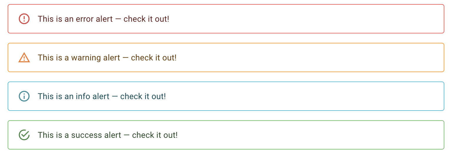
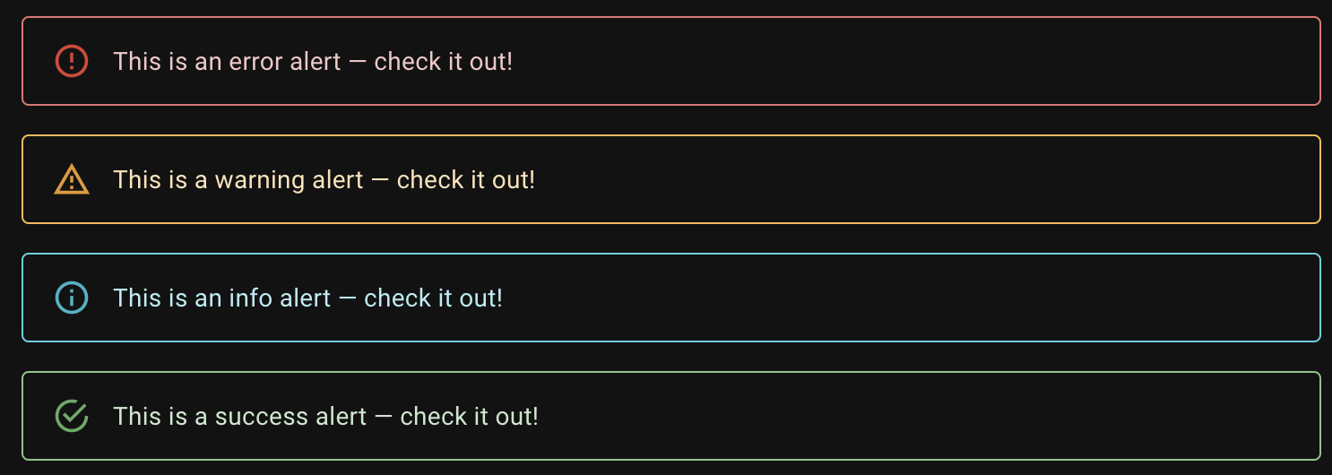
infosuccessandwarningdefault color does not pass AA contrast standard.Current colors
Components that contains text are barely seen


Proposed Change
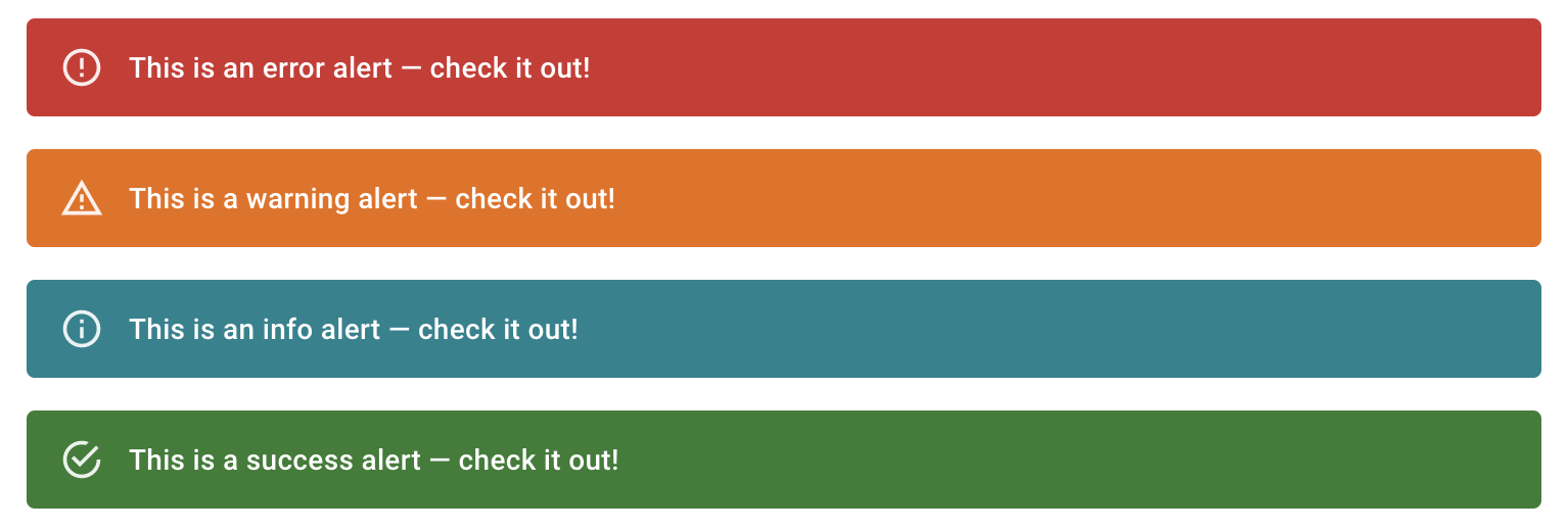
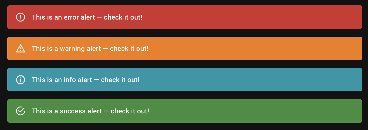
cyan[500]tolightBlue[700]green[500]togreen[800]orange[500]toorange[800](this is the best that orange can do 😭)Better


https://codesandbox.io/s/alert-dark-light-colors-forked-e6m53
Alert
Button
Chip
TextField
Progress
I have followed (at least) the PR section of the contributing guide.