[DataGrid] autoHeight has zero height #604
Comments
 oliviertassinari
added
component: data grid
oliviertassinari
added
component: data grid
|
@henrikq Thanks for raising. I agree, I think that it's an opportunity to start moving the AutoSizer deeper in the rendering tree. What about this change?: diff --git a/packages/grid/_modules_/grid/GridComponent.tsx b/packages/grid/_modules_/grid/GridComponent.tsx
index 84562673..2ebccd1b 100644
--- a/packages/grid/_modules_/grid/GridComponent.tsx
+++ b/packages/grid/_modules_/grid/GridComponent.tsx
@@ -39,6 +39,7 @@ import { useResizeContainer } from './hooks/utils/useResizeContainer';
import { useVirtualRows } from './hooks/features/virtualization/useVirtualRows';
import { RootContainerRef } from './models/rootContainerRef';
import { getCurryTotalHeight } from './utils/getTotalHeight';
+import { classnames } from './utils';
import { ApiContext } from './components/api-context';
import { OptionsContext } from './components/options-context';
import { RenderContext } from './components/render-context';
@@ -103,19 +104,19 @@ export const GridComponent = React.forwardRef<HTMLDivElement, GridComponentProps
);
return (
+ <GridRoot
+ className={classnames('MuiDataGrid-root', props.className)}
+ ref={handleRef}
+ role="grid"
+ aria-colcount={gridState.columns.visible.length}
+ aria-rowcount={gridState.rows.totalRowCount}
+ tabIndex={0}
+ aria-label="grid"
+ aria-multiselectable={!gridState.options.disableMultipleSelection}
+ >
<AutoSizer onResize={onResize}>
{(size: any) => (
- <GridRoot
- ref={handleRef}
- className={props.className}
- style={{ width: size.width, height: getTotalHeight(size) }}
- role="grid"
- aria-colcount={gridState.columns.visible.length}
- aria-rowcount={gridState.rows.totalRowCount}
- tabIndex={0}
- aria-label="grid"
- aria-multiselectable={!gridState.options.disableMultipleSelection}
- >
+ <div className="MuiDataGrid-sized" style={{ width: size.width, height: getTotalHeight(size) }}>
<ErrorBoundary
hasError={errorState != null}
componentProps={errorState}
@@ -193,9 +194,10 @@ export const GridComponent = React.forwardRef<HTMLDivElement, GridComponentProps
</OptionsContext.Provider>
</ApiContext.Provider>
</ErrorBoundary>
- </GridRoot>
+ </div>
)}
</AutoSizer>
+ </GridRoot>
);
},
);
diff --git a/packages/grid/_modules_/grid/components/styled-wrappers/GridRootStyles.ts b/packages/grid/_modules_/grid/components/styled-wrappers/Gri
dRootStyles.ts
index 7b97dcb4..0f18560a 100644
--- a/packages/grid/_modules_/grid/components/styled-wrappers/GridRootStyles.ts
+++ b/packages/grid/_modules_/grid/components/styled-wrappers/GridRootStyles.ts
@@ -9,19 +9,23 @@ export const useStyles = makeStyles(
const gridStyle: { root: any } = {
root: {
- flex: 1,
boxSizing: 'border-box',
- position: 'relative',
- border: `1px solid ${borderColor}`,
- borderRadius: theme.shape.borderRadius,
+ width: '100%',
+ height: '100%',
color: theme.palette.text.primary,
...theme.typography.body2,
outline: 'none',
- display: 'flex',
- flexDirection: 'column',
'& *, & *::before, & *::after': {
boxSizing: 'inherit',
},
+ '& .MuiDataGrid-sized': {
+ border: `1px solid ${borderColor}`,
+ borderRadius: theme.shape.borderRadius,
+ flex: 1,
+ position: 'relative',
+ display: 'flex',
+ flexDirection: 'column',
+ },
'& .MuiDataGrid-mainGridContainer': {
position: 'relative',
flexGrow: 1,It would move us a step closer to the architecture of ag-grid, and solve your issue: https://codesandbox.io/s/datagrid-autosize-bug-forked-ixtgo?file=/demo.js, at least, make it more obvious. It also gets us a step closer to the convention we have on the main repository, ref on the root & class name on the root element. |
oliviertassinari
added
the
ready to take
oliviertassinari
changed the title
|
@oliviertassinari Thanks for investigating. I don't know if you are asking me. I'm not familiar with the implementation, so can't tell if the suggested approach is good. On the surface it appears reasonable assuming That said, i took a look at the codesandbox you posted and it appears to not function perfectly yet |
|
@henrikq The gap is expected. The grid relies on virtualization, it grows to take all the space available given by its container, you can't share the container. |
|
@oliviertassinari Thanks for the prompt reply. I took another look at the sandbox you provided. I found that the containing div is sized by a constant If we increase the number of rows in the DataGrid, then i would expect the How am i suppose to create a |
oliviertassinari
added
bug 🐛
|
@henrikq Yeah ok, you are right, the grid should have an intrinsic height when |
oliviertassinari
changed the title
|
Is there any plans to resolve this any time soon? |
|
In case it's useful for other people, here is a workaround I've been using to clear the import * as react from React;
import { DataGrid } from '@material-ui/data-grid';
const MuiDataGrid = (props) => {
/*
2021-01-08
Work around MUI DataGrid issue that sets `height: 0px;` when autoHeight is enabled
https://github.com/mui-org/material-ui-x/issues/604
Get the first div (which is the MUI datagrid element) and clear the 0px CSS height style
*/
const gridWrapperRef = react.useRef<HTMLDivElement>(null);
react.useLayoutEffect(() => {
const gridDiv = gridWrapperRef.current;
if (gridDiv){
const gridEl: HTMLDivElement = gridDiv.querySelector('div')!;
gridEl.style.height = '';
}
});
return (
<div ref={gridWrapperRef}>
<DataGrid
rows={props.rows}
columns={props.columns}
autoHeight={true}
/>
</div>
);
} |
…ght. mui/mui-x#604, manually clears the 0px css styling
oliviertassinari
added
new feature
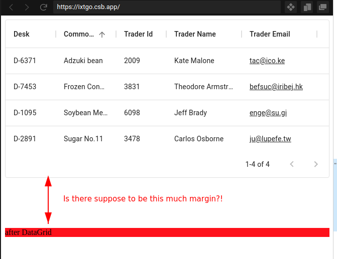
Current Behavior 😯
<DataGrid autoHeight {...stuff} />hasstyle="height: 0px; .... Therefore, siblings after data-grid overlap/overflow, e.g. inthe paragraph element and DataGrid dom overlap:
Expected Behavior 🤔
The paragraph should be appear after the DataGrid, with no overlap.
Steps to Reproduce 🕹
https://codesandbox.io/s/datagrid-autosize-bug-6uhmp?file=/demo.js
Context 🔦
I need DataGrid to have height, such that the parent element (Paper) resizes accordingly.
Your Environment 🌎
The text was updated successfully, but these errors were encountered: