[MU4 Task] Notehead popup design improvements #10028
Comments
|
Just to point out: this fixes a regression in the Inspector that I missed. It is already possible in MS3. |
|
Two remarks:
|
|
I think you're right that dotted note options should probably go under 'hide notehead' / 'small notehead'. I wouldn't have thought to put them in 'show more' because the options are not quite so niche. But I don't feel very strongly about that. I agree it should only be enabled when a dotted note head is chosen. I also prefer 'Augmentation dot position' :) |
|
I too agree with the repositioning of the "dotted note position" settings beneath the checkbox options ✅. Like @Tantacrul, I also don't have a strong opinion about whether this setting should go in "show more" or not. If pressed for a decisive resolution, however, I might be slightly in favour of leaving them where they are (i.e. not in "show more") for these reasons:
Lastly, I would be in favour of labelling this setting "duration dot position". I don't particularly like the word "Augmentation" as it is, at least in my mind, too strongly associated with a harmonic principle, rather than a rhythmic one. lmk if there is any strong opposition to the above, or other thoughts that we collectively haven't considered. I'd be happy to post an updated design shortly 🙂 |
|
Ok, I agree, let's keep the "dotted note position" settings visible directly 👍 (at least until MuseScore's automatic placement is always correct). I'm not completely sure whether I would like "duration dot". I believe that "Augmentation dot" is quite a common name, and sounds slightly more professional to me. But I feel I might not be able to judge about this very well because I'm not a native English speaker, and your point about the possible confusion with harmony is also a very fair one. @Tantacrul what are your thoughts? |
|
fwiw:
I do expect that "augmentation dot" is more common than I'm aware, in which case I'd be happy for it to take this name 🙂 |
|
Hmmm. Another of these juicy instances where the generally agreed upon term is vague and technical... I might just create a poll to find out what people prefer because I think we're damned no matter what choice we make here. The accompanying icons are probably going to have to do the heavy lifting. Setting up the poll now! |
|
The people have spoken! It seems that "Duration dot position" is the preferred label by around 70% of respondents, so in the interests of supporting the greatest understanding, I think we'll go with this. Design spec has been updated in the task above. Let me know if further info is needed! |
…ents

[MU4] Fix #10028: Notehead popup design improvements
[Tasks updated 14 Dec '21]
Task description
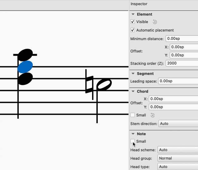
This task comprises a few minor UX improvements to the notehead popup in Properties.
Importantly, it reinstates the "small notehead" functionality from MS3.6, which has been accidentally omitted from the MS4 project.
Tasks for implementation are:
The "small notehead" functionality to be reinstated from MS3.6 (TASK 2) is this:
Link to Figma design file: https://www.figma.com/file/l0TQUrNFZmEfrZnfHhFDfb/Musescore-Notation-App-MASTER?node-id=20835%3A668717
Note also
Issue #9169 includes a bug fix for this panel, as well as a task for disabling the "Duration dot position" buttons depending on what is selected in the score. Please advise if these tasks require further illustration and I'll be happy to supply it.
Let me know if anything is unclear, or if you have any questions!
Thanks 🙂
The text was updated successfully, but these errors were encountered: