The CSS Grid Layout Module offers a grid-based layout system, with rows and columns, making it easier to design web pages without having to use floats and positioning.
Example - expand for code
<html>

<head>
    <style>
        .grid-container {
            display: grid;
            grid-template-areas:
                'header header header header header header'
                'menu main main main right right'
                'menu footer footer footer footer footer';
            gap: 10px;
            background-color: #2196F3;
            padding: 10px;
        }

        .grid-container>div {
            background-color: rgba(255, 255, 255, 0.8);
            text-align: center;
            padding: 20px 0;
            font-size: 30px;
            color: black;
        }

        .item1 {
            grid-area: header;
        }

        .item2 {
            grid-area: menu;
        }

        .item3 {
            grid-area: main;
        }

        .item4 {
            grid-area: right;
        }

        .item5 {
            grid-area: footer;
        }
    </style>
</head>

<body>
    <div class="grid-container">
        <div class="item1">Header</div>
        <div class="item2">Menu</div>
        <div class="item3">Main</div>
        <div class="item4">Right</div>
        <div class="item5">Footer</div>
    </div>

</body>

</html>
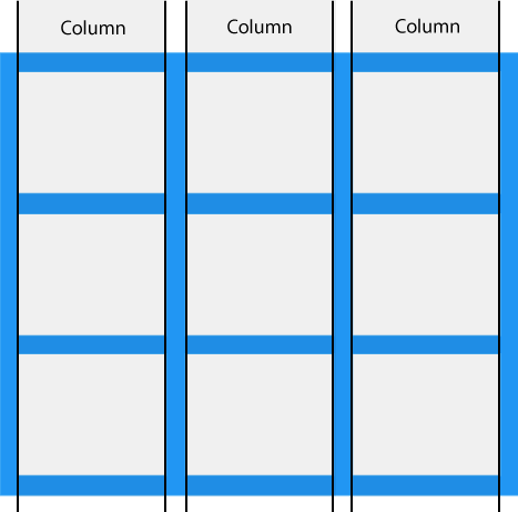
- Grid Columns
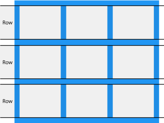
- Grid Rows
- Grid Gaps
- Grid Lines The lines between columns are called column lines. The lines between rows are called row lines.
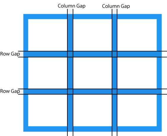
We can adjust these properties using
column-gap, row-gap, and gap css properties respectively.
Example - expand for code
<html>

<head>
    <style>
        .grid-container {
            display: grid;
            /* grid-template-areas:
                'header header header header header header'
                'menu main main main right right'
                'menu footer footer footer footer footer'; */
            grid-template-columns: auto auto auto ;
            gap: 10px;
            background-color: #2196F3;
            padding: 10px;

        }

        .grid-container>div {
            background-color: rgba(255, 255, 255, 0.8);
            text-align: center;
            padding: 20px 0;
            font-size: 30px;
            color: black;
        }

        .item1 {
            grid-row-start: 1;
            grid-row-end: 3;
        }


    </style>
</head>

<body>
    <div class="grid-container">
        <div class="item1">1</div>
        <div class="item2">2</div>
        <div class="item3">3</div>
        <div class="item4">4</div>
        <div class="item5">5</div>
    </div>

</body>

</html>

grid-template-columns property defines the number of columns in your grid layout, and it can define the width of each column.
The value is a space-separated-list, where each value defines the width of the respective column.
Similarly, you may use the grid-template-rows to define the number of rows.
- justify-content
- align-content
with values center, space-evenly, space-around, space-between, start, and end.
A grid container contains grid items.
By default, a container has one grid item for each column, in each row, but you can style the grid items so that they will span multiple columns and/or rows.
grid-column- Make "item1" start on column 1 and end before column 3:

.item1 {
           grid-column: 1 / 3
}
or
.item1 {
          grid-column: 1 / span 2;
}grid-row- Make "item1" start on row 1 and end before row 3:

.item1 {
           grid-row: 1 / 3
}
or
.item1 {
         grid-row: 1 / span 2;
}grid-areais a shorthand property for thegrid-row-start,grid-column-start,grid-row-endand thegrid-column-endproperties.- Make "item1" start on row-line 1 and column-line 2, and end on row-line 5 and column line 6:

.item1 {
          grid-area: 1 / 2 / 5 / 6;
      }
Consider this also as a way to order items around!
- Naming Grid Items
<html>
<head>
    <style>
        .grid-container {
            display: grid;
            gap: 10px;
            background-color: #2196F3;
            padding: 10px;
            grid-template-areas:
            'area2 area1 area1 area1 area1'
            'area3 area1 area1 area1 area1'
            'area4 area1 area1 area1 area1'
            'area5 area1 area1 area1 area1'
            'area6  area7 area8 area9 area10'
            ;
        }
        .grid-container>div {
            background-color: rgba(255, 255, 255, 0.8);
            text-align: center;
            padding: 20px 0;
            font-size: 30px;
            color: black;
        }
        .item1 {
            grid-area: area1
        }
        .item2 {
            grid-area: area2
        }
        .item3 {
            grid-area: area3
        }
        .item4 {
            grid-area: area4
        }
        .item5 {
            grid-area: area5
        }
        .item6 {
            grid-area: area6
        }
        .item7 {
            grid-area: area7
        }
        .item8 {
            grid-area: area8
        }
        .item9 {
            grid-area: area9
        }
        .item10 {
            grid-area: area10
        }
    </style>
</head>
<body>
    <div class="grid-container">
        <div class="item1">1</div>
        <div class="item2">2</div>
        <div class="item3">3</div>
        <div class="item4">4</div>
        <div class="item5">5</div>
        <div class="item6">6</div>
        <div class="item7">7</div>
        <div class="item8">8</div>
        <div class="item9">9</div>
        <div class="item10">10</div>
    </div>
</body>
</html>