This project is all about the collapsing toolbar which will change the colour of the tool bar while collapsing with respect to the dominant colour in the image and gives a better colour matching ui.
What are we going to develop?
The application which we are going to develop is an whats app like collapsing tool bar which will change the colour based on the dominant colour present in image so that it can give an awesome ui experience.
Android studio, basic knowledge of card view, nested scrollview, toolbar.
Getting started:
Lets get started by creating an Android application and follow the steps below.
Step 1. Add the following dependencies.
The following dependencies should be added to the gradle file of your app.
compile 'com.android.support:cardview-v7:24.2.0'
compile 'com.android.support:design:24.2.0'
compile 'com.android.support:palette-v7:24.2.0'//
this will help you to get the dominant color from the image
compile 'com.squareup.picasso:picasso:2.5.2'//
this will help you to load the image from the internet
Step 2. Add the internet permission to the manifest.
This permission will help you to access the internet to load the images.
<uses-permission android:name="android.permission.INTERNET"/>
Step 2. Add the following to your “style.xml”
This will help you for the dynamic text appearance while the collapsing of the toolbar.
<style name="expandedtoolbar" parent="@android:style/TextAppearance.Medium">
    <item name="android:textSize">45sp</item>
    <item name="android:textColor">#ffffff</item>
    <item name="android:textStyle">bold</item>
</style>
<style name="collapsedtoolbar" parent="@android:style/TextAppearance.Medium">
<item name="android:textSize">18sp</item>
<item name="android:textColor">#ffffff</item>
</style>
Step 3. Now we can start to design the layout “activity_main.xml”.
This xml files contains card view, collapsingtoolbarlayout, appbarlayout, textview, imageview and etc.
<android.support.design.widget.CoordinatorLayout
    xmlns:android="http://schemas.android.com/apk/res/android"
    xmlns:app="http://schemas.android.com/apk/res-auto"
    android:layout_width="match_parent"
    android:layout_height="match_parent"
    android:fitsSystemWindows="true">
    <android.support.design.widget.AppBarLayout
        android:layout_width="match_parent"
        android:layout_height="250dp"
        android:theme="@style/ThemeOverlay.AppCompat.Dark.ActionBar">
        <android.support.design.widget.CollapsingToolbarLayout
            android:id="@+id/collapsing_toolbar"
            android:layout_width="match_parent"
            android:layout_height="match_parent"
            app:contentScrim="?attr/colorPrimary"
            app:layout_scrollFlags="scroll|exitUntilCollapsed">
            <ImageView
                android:layout_width="match_parent"
                android:layout_height="match_parent"
                android:scaleType="centerCrop"
                android:fitsSystemWindows="true"
                android:id="@+id/image"
                app:layout_collapseMode="parallax" />
            <android.support.v7.widget.Toolbar
                android:id="@+id/toolbar"
                android:layout_width="match_parent"
                android:layout_height="?attr/actionBarSize"
                app:layout_collapseMode="pin" />
        </android.support.design.widget.CollapsingToolbarLayout>
    </android.support.design.widget.AppBarLayout>
    <android.support.v4.widget.NestedScrollView
        android:id="@+id/scroll"
        android:layout_width="match_parent"
        android:layout_height="match_parent"
        android:clipToPadding="false"
        app:layout_behavior="@string/appbar_scrolling_view_behavior">
        <FrameLayout
            android:layout_width="match_parent"
            android:layout_height="wrap_content">
            <android.support.v7.widget.CardView
                android:layout_width="match_parent"
                android:layout_height="wrap_content"
                android:layout_marginTop="24dp"
                app:cardElevation="@dimen/spacing_medium"
                app:cardUseCompatPadding="true">
                <LinearLayout
                    android:layout_width="match_parent"
                    android:layout_height="wrap_content"
                    android:orientation="vertical">
                    <TextView
                        android:id="@+id/title"
                        android:layout_width="match_parent"
                        android:layout_height="wrap_content"
                        android:layout_marginLeft="@dimen/spacing_large"
                        android:layout_marginRight="@dimen/spacing_large"
                        android:layout_marginTop="@dimen/spacing_large"
                        android:textAppearance="@style/TextAppearance.AppCompat.Headline"/>
                    <TextView
                        android:id="@+id/description"
                        android:layout_width="match_parent"
                        android:layout_height="wrap_content"
                        android:layout_margin="@dimen/spacing_large"
                        android:text="@string/loremipsum"
                android:textAppearance="@style/TextAppearance.AppCompat.Body1"/>
                </LinearLayout>
            </android.support.v7.widget.CardView>
        </FrameLayout>
    </android.support.v4.widget.NestedScrollView>
</android.support.design.widget.CoordinatorLayout>
Step 4. Now you start coding with the “MainActivity.java”.
Define the following label globally so that it can be used across various functions in the class.
private CollapsingToolbarLayout collapsingToolbarLayout = null;
Add below code inside oncreate function of the class.
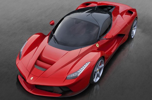
collapsingToolbarLayout = (CollapsingToolbarLayout) findViewById(R.id.collapsing_toolbar);collapsingToolbarLayout.setTitle("Ferrari");//setting the title for the tool bar
Picasso.with(this) .load("http://www.wonderslist.com/wp-content/uploads/2015/04/Ferrari-LaFerrari.jpg") .resize(300, 300).centerCrop() .into(mImageview);//loading the image to the imageview using picasso
ToolbarTextAppearance();//its a function to which will take care of the the dynamic text appearance
Thread thread = new Thread(new Runnable() {
@Override public void run() { try { ToolbarColor();//this function will help to determine the dominant colour of the image and set that colour to the toolbar and status bar. } catch (Exception e) { e.printStackTrace(); } }});
thread.start();//since thetoolbarcolour function has network call it has to run with the thread.
*if any doubt checkout comments
Step 5. “ToolBarTextAppearance” function.
This function will help you with the text appearance while collapsing and expanding of toolbar.
private void toolbarTextAppernce() {
    collapsingToolbarLayout.setCollapsedTitleTextAppearance(R.style.collapsedtoolbar);
    collapsingToolbarLayout.setExpandedTitleTextAppearance(R.style.expandedtoolbar);
}
Step 5. “ToolBarColor” function.
This function will fetch the dominant colour from the image loaded from the internet using palette and changes the colour of the tool bar and status bar.
private void ToolbarColor() {
try {
    URL url = new URL("http://www.wonderslist.com/wp-content/uploads/2015/04/Ferrari-LaFerrari.jpg");
    HttpURLConnection connection = (HttpURLConnection)
    url.openConnection();
    connection.setDoInput(true);
    connection.connect();
    InputStream input = connection.getInputStream();

//the image url will be converted to stream so that itcan be converted to the bitmap
   final Bitmap bitmap = BitmapFactory.decodeStream(input);

//bitmap will be used by palette to determine the dominant color in an image as bitmap will give access to each pixel of the image
  Palette.from(bitmap).generate(new Palette.PaletteAsyncListener() {
        @Override
        public void onGenerated(Palette palette) {
            Palette.Swatch dominant = palette.getDominantSwatch();

        //this will be used to get the dominant colour from the image

    collapsingToolbarLayout.setStatusBarScrimColor(dominant.getRgb());
    collapsingToolbarLayout.setContentScrimColor(dominant.getRgb());

            //setting the dominant colour to the toolbar

if (Build.VERSION.SDK_INT >= 21) {// used only in lolipop and above devices
Window window = getWindow();
window.addFlags(WindowManager.LayoutParams.FLAG_DRAWS_SYSTEM_BAR_BACKGROUNDS);
window.clearFlags(WindowManager.LayoutParams.FLAG_TRANSLUCENT_STATUS);
window.setStatusBarColor(dominant.getRgb());
//Setting the dominant color to the status bar
} catch (Exception e) {
    // Log exception

}

}
Conclusion:
The final result will look like this.

