Notebook Embeds Should Include New Action Menu #5810
Labels
type:feature
Feature. Required intentional design
Milestone
Comments
|
Verified fixed Testathon 2023-01-24. Great work! |
|
verified. really cool. i am seeing this though |
7 tasks
Sign up for free
to join this conversation on GitHub.
Already have an account?
Sign in to comment
Is your feature request related to a problem? Please describe.
Notebook embeds need to be enhanced so that users have a more clear action button. At the moment, it is very confusing for a user when interacting with an embed. Clicking parts of the embed may navigate a user away from a Notebook, or do actions that were not intended by a user.
Describe the solution you'd like
We want to implement an enhanced action menu whose action options are more clear to a user. This action menu will be similar in design to our Create menu button, in which, on hover, a description of each option will be displayed to the right side of the menu.
Testing Instructions
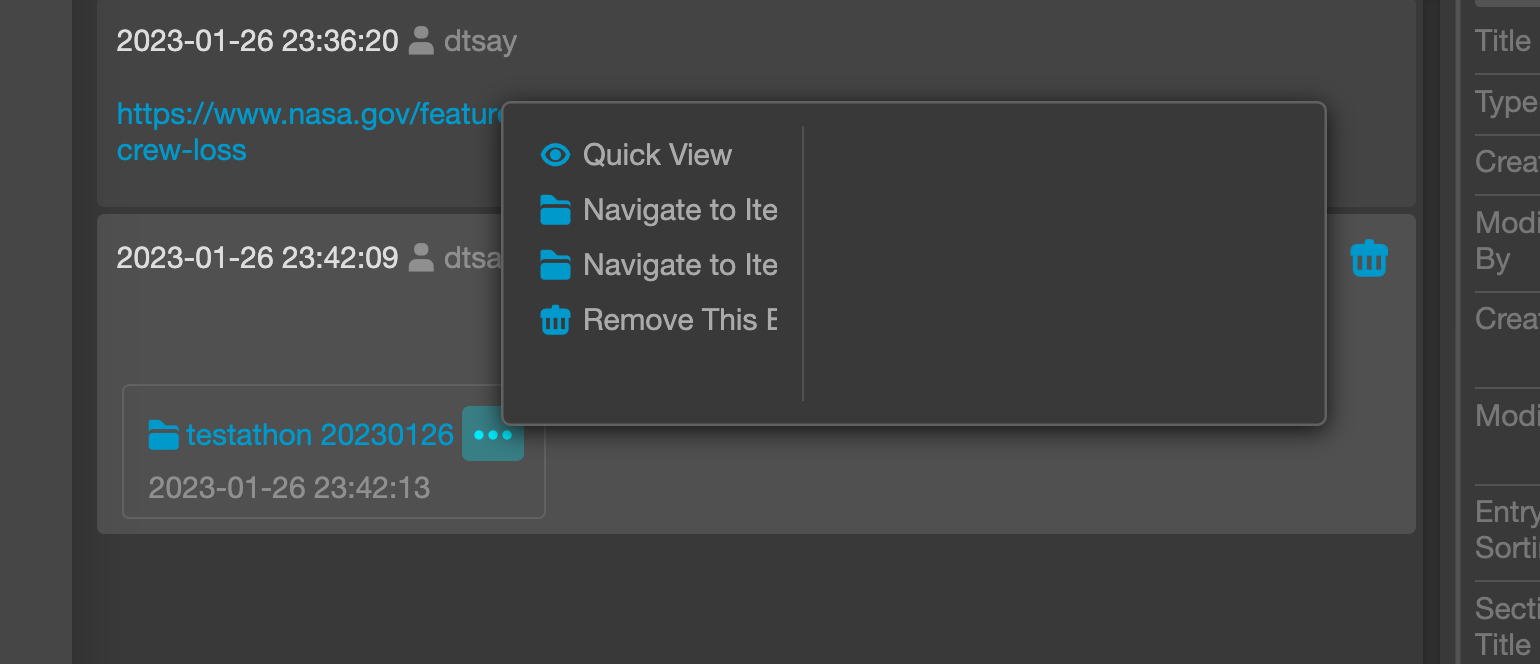
(a) Quick View: Opens a full screen overlay of the embed.
(b) Navigate to Item in Time: Navigates to item in its time frame when captured.
(c) Navigate to Item: Navigates to item with the current time settings.
(d) Remove This Embed: Removes embed from the notebook entry.
Additional context
Closes #5809
The text was updated successfully, but these errors were encountered: