Normal calendar is a Vue library with zero dependencies, providing a minimalistic calendar implementation in a 6x7 grid format without a predefined template.
Repository: https://github.com/nawajar/normal-calendar
#Installation
npm install normal-calendar#Usage
 import { Calendar, type Day } from "normal-calendar";

<Calendar #default="{ calendar }" :init="{ toggle: true, day: new Date(2023, 10, 0) }">
</Calendar>This document outlines TypeScript interfaces used in the calendar component, their properties, and their purposes.
The CalendarInstance interface represents the state of a calendar instance.
today: Date- The current date.initMonthYear: Date- The initial month and year displayed in the calendar.selectDate: Date- The currently selected date.toggle: () => void- A function to toggle the calendar's visibility.isOpenCalendar: () => boolean- A function that returnstrueif the calendar is open andfalseotherwise.days: Day[]- An array of Day objects representing calendar days.month: number- The current month (0 to 11).year: number- The current year.monthName: string- The name of the current month.trigger: Trigger- An object with functions to navigate through months and years.
The CalendarOptions interface defines options that can be passed when initializing a calendar instance.
- day?: Date - An optional date to set the calendar's initial date.
- toggle?: boolean - An optional boolean flag to specify whether the calendar should be initially open.
onGenerateDay?: (day: Day) => void- An optional callback function to handle day generation.
The Trigger interface provides functions to navigate through months and years.
nextMonth: () => void- Go to the next month.nextYear: () => void- Go to the next year.prevMonth: () => void- Go to the previous month.prevYear: () => void- Go to the previous year.jumpTo: (month: number, year: number) => void- Jump to the month , year.
The Day interface represents a day in the calendar.
day: number- The day of the month (1 to 31).year: number- The year.month: number- The month (1 to 12).
The months array provides the names of the months for use in the calendar.
const months = [
  "January",
  "February",
  "March",
  "April",
  "May",
  "June",
  "July",
  "August",
  "September",
  "October",
  "November",
  "December",
];
#Examples
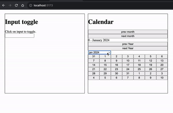
Use as date picker with input.
<script setup lang="ts">
import { Calendar, type Day } from "normal-calendar";
import { ref } from "vue";

const onSelectDay = (day: Day) => {
  pickDate.value = new Date(day.year, day.month, day.day).toLocaleString(
    "th-TH",
    { timeZone: "Asia/Jakarta" }
  );
};
</script>

<template>
<Calendar #default="{ calendar }">
        <div class="calendar-container">
          <input type="text" @click="calendar.toggle" v-model="pickDate" />
          <div v-if="calendar.isOpenCalendar()">
            <div class="head">
              <div>
                {{ calendar.month }} {{ calendar.monthName }}
                {{ calendar.year }}
              </div>
              <button @click="calendar.trigger.prevMonth()">prev month</button>
              <button @click="calendar.trigger.nextMonth()">next month</button>

              <button @click="calendar.trigger.prevYear()">prev Year</button>
              <button @click="calendar.trigger.nextYear()">next Year</button>
            </div>
            <div class="calendar">
              <template v-for="day of calendar.days">
                <button @click="onSelectDay(day)">{{ day.day }}</button>
              </template>
            </div>
          </div>
        </div>
</Calendar>
</template>
<style lang="css" scoped>
.head {
  display: flex;
  flex-direction: column;
}

.calendar-container {
  width: 400px;
  input {
    width: 400px;
  }
}

.calendar {
  width: 100%;
  display: grid;
  grid-template-columns: repeat(7, auto);
}
</style>
Use as calendar
<script setup lang="ts">
import { Calendar, type Day } from "normal-calendar";
import { ref, watch } from "vue";

const calendarRef = ref();
const monthYear = ref({ m: 10, y: 2023 });

watch([monthYear], () => {
  const { m, y } = monthYear.value;
  calendarRef.value.context.trigger.jumpTo(m, y);
});

</script>

<template>
    <Calendar
        ref="calendarRef"
        #default="{ calendar }"
        :init="{
          toggle: true,
          day: new Date(2023, 10, 0),
        }"
      >
        <div class="calendar-container">
          <div v-if="calendar.isOpenCalendar()">
            <div class="head">
              <button @click="calendar.trigger.prevMonth()">prev month</button>
              <button @click="calendar.trigger.nextMonth()">next month</button>
              <div>
                {{ calendar.month }} - {{ calendar.monthName }}
                {{ calendar.year }}
              </div>
              <button @click="calendar.trigger.prevYear()">prev Year</button>
              <button @click="calendar.trigger.nextYear()">next Year</button>
            </div>
            <div>
              <select v-model="monthYear">
                <option :value="{ m: 10, y: 2023 }">november 2023</option>
                <option :value="{ m: 11, y: 2023 }">december 2023</option>
                <option :value="{ m: 0, y: 2024 }">jan 2024</option>
              </select>
            </div>
            <div class="calendar">
              <template v-for="day of calendar.days">
                <button>{{ day.day }}</button>
              </template>
            </div>
          </div>
        </div>
      </Calendar>
</template>
<style lang="css" scoped>
.head {
  display: flex;
  flex-direction: column;
}

.calendar-container {
  width: 400px;
  input {
    width: 400px;
  }
}

.calendar {
  width: 100%;
  display: grid;
  grid-template-columns: repeat(7, auto);
}
</style>