Motivation: I was trying to smooth out high-entropy time-series data, and I found that every smoothing method I was applying to my data couldn't get the main features of the graph to line up at the correct time.
The Solution: I ended up developing this smoothing algorithm based off the bootstrap method. By nature, the bootstrap method produces NA datapoints on the tails, so I also added in a basic smoothing based off localized averages to fill in the missing values.
Disclaimer: While this solution worked for my dataset, there is no guarantees it will work for yours. Typically, a polynomial regression or LOESS regression will suffice. There is also a bit of parameter tweaking needed that doesn't have a quantifiable optimal solution.
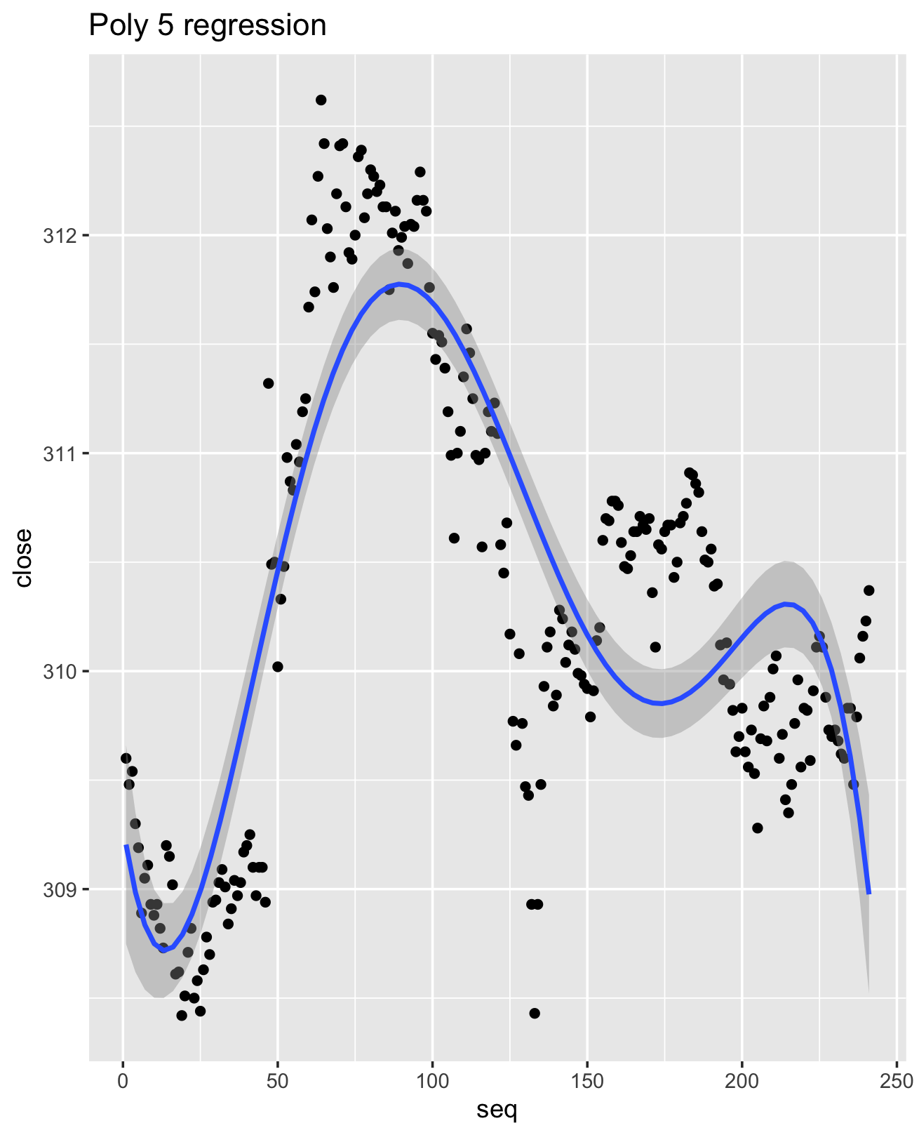
Results: With direct comparisons to LOESS and a 5th degree polynomial regression, the bootstrapping method clearly outperforms the other methods in terms of overall preservation of key attributes. With the bootstrap smooth, local smoothed minima and maxima occur close to the actual minima and maxima. With the LOESS regression, key features were smoothed out. The poly 5 regression significantly shifts the smoothed minima and maxima. While you could technically keep increasing the polynomial order, it would be extremely difficult to arrive at a satisfactory solution without overfitting.


Blue line is the smoothed derivative.

Blue line is the smoothed derivative.

Sometimes, a very high-entropy function will need to be smoothed a few times. I found through practice that this is best achieved iteratively, smoothing the previous smoothed values. I tend to make sure that the first parameter (r - the range of smoothing) decreases over time. A large range can help quickly normalize values, but moving to a smaller range will fine-tune the smoothness of the function.
Below you can see the progression of the different smoothing functions.
The red function is the first smooth, orange is the second, green is third, and purple is the 4th (and most smoothed). Note that due to the sequential nature of the data, ggplot geom_line appears more jagged than it really is.
