By the power of Streamlit that supports React,
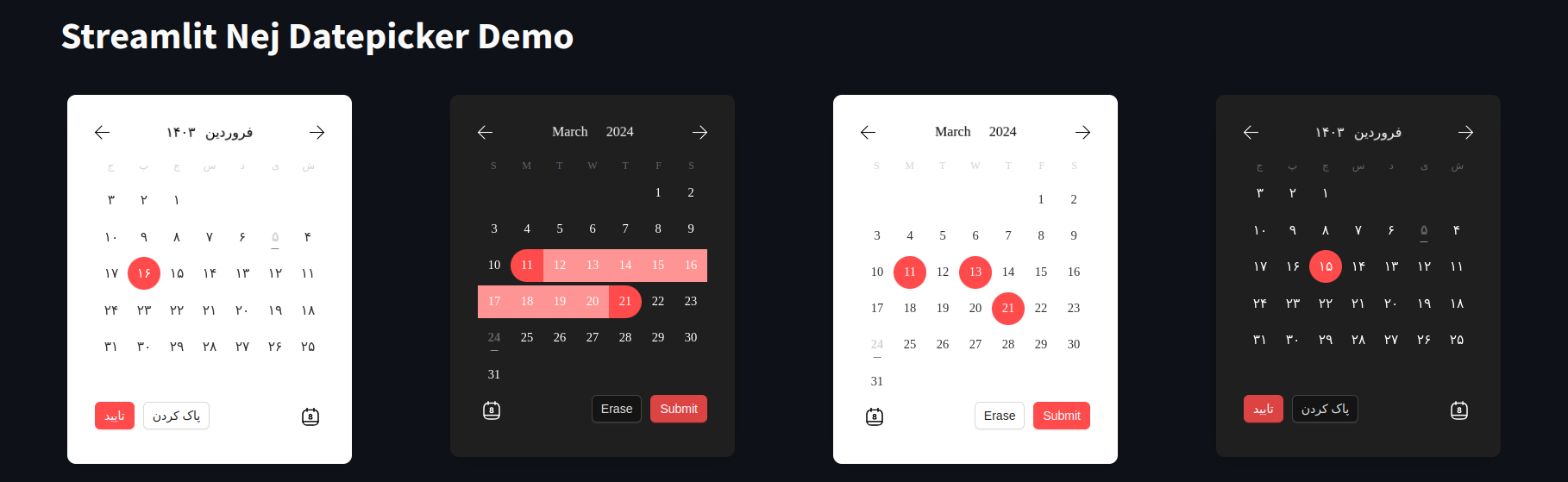
this is a modern date picker that can be used in any Streamlit app.
It is configurable very easily and supports both Gregorian and Persian calendars.
The frontend uses
@nejadipour/react-modern-datepicker as the React component.
pip install streamlit-nej-datepickerimport streamlit as st
from streamlit_nej_datepicker import datepicker_component, Config
import jdatetime
def main():
st.title("Streamlit Nej Datepicker Demo")
# Add your configuration here
config = Config(dark_mode=True, locale="en", disabled_days=[jdatetime.date.today()], color_primary="#ff4b4b",
color_primary_light="#ff9494", selection_mode="range")
result = datepicker_component(config=config)
if st.button('Print Result'):
st.write(result)
if __name__ == "__main__":
main()You can use the Config class in order to configurate the component. Here is the table of props that you can define:
| Prop | Type | Default | Description |
|---|---|---|---|
| always_open | bool | False | If True, the date picker will be always open |
| arrow | bool | True | If True, the arrow will be shown when the date picker is open |
| button_type | str | 'default' | The type of the button that is shown when the date picker is closed. It can be one of 'default', 'primary', 'dashed', 'text' or 'link' |
| closed_view | str | 'text' | The view that is shown when the date picker is closed. It can be one of "text", "button" and "input". always_open should be False |
| color_primary | str | '#1677ff' | The color of selected day in the single date picker and the color of range start and range end in range date picker |
| color_primary_light | str | '#64a9f9' | The color of range-between days |
| dark_mode | bool | False | If True, the date picker will be in dark mode |
| default_value | datetime.date or list[datetime.date] or dictionary with "from" and "to" keys | None | The default value of the date picker based on the selection mode |
| delimiter | str | '-' | The delimiter that separates year, month, and day in the date string. This is shown when the datepicker is closed |
| disabled | bool | False | If True, the date picker will be disabled |
| disabled_days | list[datetime.date] | [] | List of dates that are disabled. If user tries to select/include them DisableDayException will be raised |
| locale | str | 'en' | Locale language of the calendar. It can be one of 'fa' or 'en' |
| maximum_date | datetime.date | None | The maximum date that can be selected |
| maximum_today | bool | False | If True, the maximum date will be set to today |
| maximum_tomorrow | bool | False | If True, the maximum date will be set to tomorrow |
| minimum_date | datetime.date | None | The minimum date that can be selected |
| minimum_today | bool | False | If True, the minimum date will be set to today |
| minimum_tomorrow | bool | False | If True, the minimum date will be set to tomorrow |
| placeholder | str | 'select' for 'en' and 'انتخاب' for 'fa' | The placeholder of the date picker |
| placement | str | 'bottom' | The placement of the date picker when it gets open. It can be one of "top", "left", "right", "bottom", "topLeft", "topRight", "bottomLeft", "bottomRight", "leftTop", "leftBottom", "rightTop" or "rightBottom" |
| return_type | str | 'datetime.date' for 'en' and 'jdatetime.date' for 'fa' | The type of the return value of the date picker. It can be one of "datetime.date" or "jdatetime.date" |
| selection_mode | str | 'single' | The selection mode of the date picker. It can be one of "single", "range", or "multiple" |
| selector_ending_year | int | current year + 50 | The year that the selector ends at |
| selector_starting_year | int | current year - 100 | The year that the selector starts from |
| should_highlight_weekends | bool | False | If True, weekends will be highlighted |
| slide_animation_duration | str | '0.4s' | Duration of month slide animation. It can be any CSS valid time value |
| trigger | str | 'click' | The trigger of the date picker to open/close it. It can be one of "click", "hover", "focus" or "contextMenu" |
Note: You can use both datetime.date and jdatetime.date objects for the props. The datepicker
understands the value based on the locale.
The return value of the date picker depends on the selection mode.
If the selection mode is "single", the return value will be a datetime.date object.
If the selection mode is "range", the return value will be a dictionary with "from" and "to" keys. The value of each key
is a datetime.date object.
If the selection mode is "multiple", the return value will be a list of datetime.date objects.
Note: If the return type is set to jdatetime.date, the return value will be a jdatetime.date object instead of
a datetime.date object.