Draw Edge Labels in Multi Graph with curved edges #3813
Comments
|
An alternative would be to put the labels in relation to the path of the edge that they relate to. Taking arc3 to be a quadratic Bezier curve, its quite straightforward to get the coordinates at any point on the line, as well as necessary angle. The equations are available here . Presently, the edge label position and angle between two nodes This could be improved by passing in the An offset perpendicular to the line at
I can only get this to work when |

|
I think the aspect ratio comes into play anytime you take ratios of x-values and y-values. Think of it as translating from x-units to y-units in each of these ratios. For example, in the |
|
Multiplying by the aspect ratio whenever we have the ratio of x and y doesn't seem to work if I understood you correctly. I tried various combinations of setting up the figure to try to find out why some cases failed but others didn't but haven't been able to figure it out. I think someone with some more knowledge of matplotlib might need to take a look. Here is the full code of the function and something to test it with. I have omitted def draw_networkx_edge_labels(G, pos,
rad=None,
edge_labels=None,
label_pos=0.5,
font_size=10,
font_color='k',
font_family='sans-serif',
font_weight='normal',
alpha=1.0,
bbox=None,
ax=None,
rotate=True,
**kwds):
try:
import matplotlib.pyplot as plt
import matplotlib.cbook as cb
import numpy
except ImportError:
raise ImportError("Matplotlib required for draw()")
except RuntimeError:
print("Matplotlib unable to open display")
raise
if ax is None:
ax = plt.gca()
if edge_labels is None:
labels = dict(((u, v), d) for u, v, d in G.edges(data=True))
else:
labels = edge_labels
text_items = {}
ratio = ax.get_data_ratio()
for (n1, n2), label in labels.items():
(x1, y1) = pos[n1]
(x2, y2) = pos[n2]
# label position for straight edge
if rad is None:
(x, y) = (x1 * label_pos + x2 * (1.0 - label_pos),
y1 * label_pos + y2 * (1.0 - label_pos))
# label position for curved quadratic bezier curve (connectionstyle="arc3,rad=r")
else:
# calculate the quadratic bezier curve control point
cx = (x1 + x2) / 2 + rad * (y2 - y1)
cy = (y1 + y2) / 2 - rad * (x2 - x1)
# position of the label along the curve as a function of label_pos
x, y = (1-label_pos) * ( (1-label_pos)*x1 + label_pos*cx ) + label_pos * ( (1-label_pos)*cx + label_pos*x2 ), \
(1-label_pos) * ( (1-label_pos)*y1 + label_pos*cy ) + label_pos * ( (1-label_pos)*cy + label_pos*y2 )
# Label angle
if rad is not None:
# derivative of the curve at the point t
change_x, change_y = 2 * (1-label_pos) * (cx - x1) + 2 * label_pos * (x2 - cx), 2 * (1-label_pos) * (cy - y1) + 2 * label_pos * (y2 - cy)
angle = (np.arctan2(change_y, change_x) / (2 * np.pi)) * 360
elif rotate:
angle = numpy.arctan2(y2-y1, x2-x1)/(2.0*numpy.pi)*360 # degrees
else:
angle = 0
# make label orientation "right-side-up"
if angle > 90:
angle -= 180
if angle < - 90:
angle += 180
# transform data coordinate angle to screen coordinate angle
xy = numpy.array((x, y))
trans_angle = ax.transData.transform_angles(numpy.array((angle,)), xy.reshape((1, 2)))[0]
# use default box of white with white border
if bbox is None:
bbox = dict(boxstyle='round',
ec=(1.0, 1.0, 1.0),
fc=(1.0, 1.0, 1.0),
)
# if not cb.is_string_like(label):
# label = str(label) # this will cause "1" and 1 to be labeled the same
# set optional alignment
horizontalalignment = kwds.get('horizontalalignment', 'center')
verticalalignment = kwds.get('verticalalignment', 'center')
t = ax.text(x, y,
label,
size=font_size,
color=font_color,
family=font_family,
weight=font_weight,
horizontalalignment=horizontalalignment,
verticalalignment=verticalalignment,
rotation=trans_angle,
transform=ax.transData,
bbox=bbox,
zorder=1,
clip_on=True,
)
text_items[(n1, n2)] = t
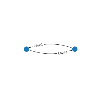
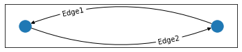
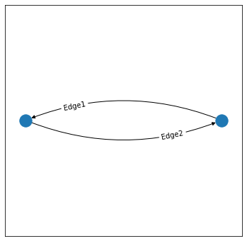
return text_itemsMinimal working example: import networkx as nx
import numpy as np
import matplotlib.pyplot as plt
G = nx.MultiDiGraph()
## WORKS
fig, ax = plt.subplots(figsize=(6,6))
ax.set_xlim([-2, 2])
ax.set_ylim([-2, 2])
## WORKS
# fig, ax = plt.subplots()
# ax.set_xlim([-1, 1])
# ax.set_ylim([-0.5, 0.5])
# ax.set_aspect("equal")
## Does not work
# Labels at wrong position
# fig, ax = plt.subplots(figsize=(6,6))
# ax.set_xlim([-2, 2])
# ax.set_ylim([-1, 1])
## Does not work
## The figure is squashed into a tiny strip, shows nothing
# fig, ax = plt.subplots(figsize=(6,6))
# ax.set_aspect("equal")
## Does not work
## Labels are not on the screen
# fig, ax = plt.subplots(figsize=(6,6))
## Does not work
## Labels are not on the screen
# fig, ax = plt.subplots()
## Does not work
## Labels at wrong position
# fig, ax = plt.subplots()
# ax.set_xlim([-2, 2])
# ax.set_ylim([-2, 2])
# add nodes
G.add_nodes_from(list(range(2)))
pos = nx.circular_layout(G)
# add edges and their labels
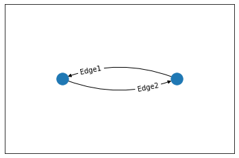
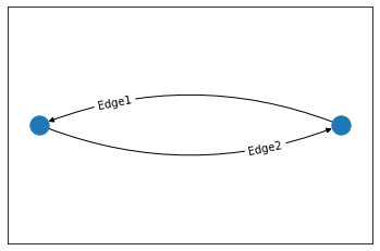
G.add_edge(0, 1, label="Edge1")
G.add_edge(1, 0, label="Edge2")
labels = {edge[:2]:edge[2]['label'] for edge in G.edges(data=True)}
# curvature of the edges
rad = 0.2
# plotting
nx.draw_networkx_nodes(G, pos)
nx.draw_networkx_edges(G, pos, connectionstyle=f"arc3,rad={rad}")
draw_networkx_edge_labels(G, pos, edge_labels=labels,
label_pos=0.75, rad=rad)
plt.show() |
|
@ShirsenduP: super work on this issue - thank you I think the root cause here is the same as this Q on stackoverflow. The edges when created in Two solutions come to mind:
Of the two ideas, the second definitely feels preferable as it is easier to ensure consistency with the output images with previous networkx versions. I'm looking into this topic because of an issue raised on one of my projects, which will require labels for curved edges of a Anyway, now I'll start looking into getting the control points for the bezier |
|
Looked at this again and it is more complicated than just setting the text location once after finding the The text will need to be aware of both the start and end points of My gut feeling is this might be possible by inheriting from The easiest solution however is just to take @ShirsenduP's solution and set |
|
IMO this is would be one of the most impactful features we could add to
This is a really interesting idea and in principle would solve some of the trickiest problems re: making sure the labels are kept in sync with their corresponding edges. I'm not sure how feasible it is, but 👍 if someone has the bandwidth to investigate along these lines. If it proves very useful we might even consider trying to upstream the fancy arrow patch + text object back into matplotlib itself. |
|
I have been playing around with this for quite a while, frustrated with learning how Fancy objects work under the hood in matplotlib, and I think I might finally have an answer following on from @alexmalins and @rossbar's of combining the FancyArrowPatch and matplotlib.text.Text object. This solution is still quite rough. To integrate into nx.draw_networkx_edge_labels, the arrows themselves can be passed into it import numpy as np
import networkx as nx
from matplotlib import pyplot as plt
from matplotlib.patches import FancyArrowPatch
from matplotlib.text import Text
class CurvedArrowText(Text):
def __init__(
self, arrow, horizontal_offset=0.5, labels_horizontal=False, *args, **kwargs
):
# how far along the text should be on the curve,
# 0 is at start, 1 is at end etc.
self.offset = horizontal_offset
self.labels_horizontal = labels_horizontal
# Initialise text position and angle
self.x = None
self.y = None
self.angle = None
self._update_text_pos_angle(arrow) # overwrites x y angle member variables
# Create text object
Text.__init__(self, x=self.x, y=self.y, rotation=self.angle, *args, **kwargs)
# Bind to FancyArrowPatch
self.arrow = arrow
# Bind to axis
plt.gca().add_artist(self)
# plt.gca().add_artist(self.arrow)
def _update_text_pos_angle(self, arrow):
# Start and end point of arrow in data coordinates
posA, posB = arrow._posA_posB
# Get start and end in display coordinates
x1, y1 = plt.gca().transData.transform(posA)
x2, y2 = plt.gca().transData.transform(posB)
rad = arrow.get_connectionstyle().rad
t = self.offset
# Calculate control point in display coords
cx = (x1 + x2) / 2 + rad * (y2 - y1)
cy = (y1 + y2) / 2 - rad * (x2 - x1)
# Text position at a proportion t along the line in display coords
# default is 0.5 so text appears at the halfway point
x, y = (1 - t) * ((1 - t) * x1 + t * cx) + t * ((1 - t) * cx + t * x2), (
1 - t
) * ((1 - t) * y1 + t * cy) + t * ((1 - t) * cy + t * y2)
x, y = plt.gca().transData.inverted().transform((x, y))
self.x = x
self.y = y
if self.labels_horizontal:
# Horizontal text labels
angle = 0
else:
# Labels parallel to curve
change_x, change_y = 2 * (1 - t) * (cx - x1) + 2 * t * (x2 - cx), 2 * (
1 - t
) * (cy - y1) + 2 * t * (y2 - cy)
angle = (np.arctan2(change_y, change_x) / (2 * np.pi)) * 360
# Text is "right way up"
if angle > 90:
angle -= 180
if angle < -90:
angle += 180
self.angle = angle
def draw(self, renderer):
# recalculate the text position and angle
self._update_text_pos_angle(self.arrow)
self.set_position((self.x, self.y))
self.set_rotation(self.angle)
# redraw text
Text.draw(self, renderer)and to test it def mvp():
np.random.seed(3)
# Create graph
edges = {
(0, 1): "A1",
(1, 0): "A2",
(1, 2): "B1",
(2, 1): "B2",
(2, 0): "C1",
(0, 2): "C2",
}
G = nx.DiGraph()
G.add_edges_from(edges.keys())
connectionstyle = "arc3,rad=0.2"
# Draw nodes and edges
pos = nx.spring_layout(G)
nx.draw_networkx_nodes(G, pos, node_color="white", edgecolors="black")
nx.draw_networkx_edges(G, pos, connectionstyle=connectionstyle, arrowsize=20)
# Draw labels
for (n1, n2), label in edges.items():
posA = pos[n1]
posB = pos[n2]
# Draw edges
arrow = FancyArrowPatch(
posA,
posB,
connectionstyle=connectionstyle,
color="black",
)
# Draw edge labels
CurvedArrowText(
arrow,
text=label,
horizontal_offset=0.5,
labels_horizontal=False,
verticalalignment="center",
horizontalalignment="center",
color="red",
bbox=dict(
boxstyle="round",
ec="red",
fc="white",
),
)
plt.savefig("test.png")
if __name__ == "__main__":
mvp()Final result:
This seems to me to work well even when the figure window is resized etc. However, it requires recreating the FancyArrowPatches. Instead of letting |

|
See also #5882 |
Have you tried to transform y-coordinates using I mean: # calculate the quadratic bezier curve control point
cx = (x1 + x2) / 2 + rad * (y2 - y1) * ax._get_aspect_ratio()
cy = (y1 + y2) / 2 - rad * (x2 - x1) / ax._get_aspect_ratio() |
Just for the record, it seems that changing those two lines does solve the problem. your working examples
|


|
See #7010 I tried to keep it minimal. Your approach seems more comprehensive. If you continue to work on this, maybe some of the notes will be helpful. |
|
I believe the changes in #7010 fix this issue of label placement along curved edges. |
Agreed - from a quick readthrough it looks like all of the major features have been addressed - there are potentially some minor tweaks/improvements in which case I'd vote to open new issues. @Jogala you may be interested to take a look at #7010 or give the new multiedge label drawing a try. It's not yet in a released networkx version but you can try the development version with |
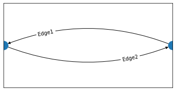
The problem is when drawing a multigraph, with curved edges, that there is no possibility to change the position of the labels, such that they are aligned with the edges:
produces
So I suggest that it should be possible to pass a list with x and y offset for each edge, for example like
label_pos = {(0,1):[0.1,0.1],(1,0):[-0.2,-0.2]}The text was updated successfully, but these errors were encountered: