Skip to content
New issue

Have a question about this project? Sign up for a free GitHub account to open an issue and contact its maintainers and the community.

By clicking “Sign up for GitHub”, you agree to our terms of service and privacy statement. We’ll occasionally send you account related emails.

Already on GitHub? Sign in to your account

Design fixes #89

Merged
merged 11 commits into from Dec 19, 2017
Merged

Design fixes #89

merged 11 commits into from Dec 19, 2017

Conversation

jancborchardt
Copy link
Member

  • Remove line-height overwrite to make messages more readable
  • Remove border, fix scrollbar position
  • Show notification message and action elements only when there, fix layout

Before & after:
screenshot from 2017-08-13 14-07-18

Please review @nickvergessen @nextcloud/designers

Signed-off-by: Jan-Christoph Borchardt <hey@jancborchardt.net>
…yout

Signed-off-by: Jan-Christoph Borchardt <hey@jancborchardt.net>
Copy link
Member

@skjnldsv skjnldsv left a comment

Choose a reason for hiding this comment

The reason will be displayed to describe this comment to others. Learn more.

Nice change!

@MariusBluem
Copy link
Member

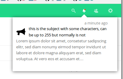
Can we add a space between the text and the buttons? @jancborchardt

@raimund-schluessler
Copy link
Member

I also find the before lineheight to narrow, but afterwards it looks like four separate sections. Could there be something in between?

Copy link
Member

@skjnldsv skjnldsv left a comment

Choose a reason for hiding this comment

The reason will be displayed to describe this comment to others. Learn more.

I want to change my mind a bit, I find the space between paragraph a little bit too big! :)

@nickvergessen
Copy link
Member

I'd vote for a bit more space between subject and message:

bildschirmfoto vom 2017-08-14 12-44-46

I will also fix the notification of the survey app, that long subject should be the message and have a short subject instead.

@jancborchardt
Copy link
Member Author

@nickvergessen actually the space is good and should stay that way for vertical rhythm. However the title should probably be semibold.

Will fix the details.

@nickvergessen
Copy link
Member

nickvergessen commented Aug 14, 2017

The space between the rows of the headline is more than between headline and message... I think thats awkward

@pixelipo
Copy link

I agree with @nickvergessen 's las comment - line height shouldn't be larger than paragraph margin/padding:
image

@jancborchardt jancborchardt self-assigned this Sep 17, 2017
@nickvergessen
Copy link
Member

@jancborchardt are you going to do something here until Nextcloud 13?

@jancborchardt
Copy link
Member Author

I would say we should merge as it is better than currently. Additional fixes can always be done afterwards, but should nt block this PR.

@MariusBluem
Copy link
Member

What’s the current state? Anything for 13?

@pixelipo
Copy link

how do I test this? any smart way to push a notification on test?

@MorrisJobke
Copy link
Member

how do I test this? any smart way to push a notification on test?

There is an occ command provided by the admin_notifications app:

occ notification:generate [-l|--long-message LONG-MESSAGE] [--] <user-id> <short-message>

@pixelipo
Copy link

@MorrisJobke [Symfony\Component\Console\Exception\CommandNotFoundException] There are no commands defined in the "notification" namespace.

@MorrisJobke
Copy link
Member

There is an occ command provided by the admin_notifications app:

As I wrote: this is provided by the admin_notifications app 😉 https://github.com/nextcloud/admin_notifications

@pixelipo
Copy link

OK, I'll push a commit to this if no one objects

@pixelipo
Copy link

Found (and fixed) one more bug in this PR - missing bottom margin for notifications that don't have long-message text

Copy link
Member

@MorrisJobke MorrisJobke left a comment

Choose a reason for hiding this comment

The reason will be displayed to describe this comment to others. Learn more.

Looks a lot better 👍

@MorrisJobke
Copy link
Member

MorrisJobke commented Dec 15, 2017

I just noticed one bug:

  • order of items is wrong (reversed) - actual: top most is the oldest, expected (and is also the case on master): top most is newest

Signed-off-by: Marin Treselj <marin.treselj@forlagshuset.no>
@pixelipo
Copy link

Good catch, @MorrisJobke - because of the old CSS solution, notifications are generated upside-down in DOM. I didn't want to mess with JS for now, so I just applied a neat css fix to reorder them (flex-direction: column-reverse) :)

@pixelipo
Copy link

@skjnldsv you requested changes on this PR - is it good now? 😉

@jancborchardt
Copy link
Member Author

The issue @MorrisJobke noted was already fixed in master (via JS I assume), so no need for the CSS fix @pixelipo :)

Also this is how it looks like rebased on master:
screenshot from 2017-12-15 16-55-55

I’d say every entry could use a bit more whitespace to the bottom? Cause now it looks a bit like the content is hanging down.

@MorrisJobke
Copy link
Member

The issue @MorrisJobke noted was already fixed in master (via JS I assume), so no need for the CSS fix @pixelipo :)

Ah - I thought that this was rebased since then. Sorry - then it's my fault and the CSS fix can be dropped again.

@skjnldsv
Copy link
Member

Agree with Jan, and the icon have too much top whitespace! :)

@pixelipo
Copy link

which icon, @skjnldsv ?

@MorrisJobke I'll revert the order fix

@skjnldsv
Copy link
Member

@pixelipo the gear icon on jan's example :)

@pixelipo
Copy link

@skjnldsv gear icon has no whitespace above - space above is (and should be) reserved for notification-heading (close button and timestamp). We could move notification icon there, but it would look weird and we can't move both that and the title, because there's not enough space.
On the other hand, notification-heading must have exactly as much vertical space as I gave it because it contains a button - buttons are 44px high, so that's that.

Marin Treselj added 2 commits December 18, 2017 15:50
Signed-off-by: Marin Treselj <marin.treselj@forlagshuset.no>
@jancborchardt
Copy link
Member Author

The icon doesn't have too much top whitespace, it's aligned with the text. :) as said above:

I’d say every entry could use a bit more whitespace to the bottom?

Signed-off-by: Marin Treselj <marin.treselj@forlagshuset.no>
@pixelipo
Copy link

Ok, done - let's merge this bad boy, @jancborchardt @skjnldsv @MorrisJobke

If there are any additional small fixes needed, I think we should make them later, because this should go into NC13 as soon as possible.

css/styles.css Outdated

.notification-subject a {
display: inline-block;
display: flex;
Copy link
Member

Choose a reason for hiding this comment

The reason will be displayed to describe this comment to others. Learn more.

Indentation is off.

Choose a reason for hiding this comment

The reason will be displayed to describe this comment to others. Learn more.

fixed

Copy link
Member

@MorrisJobke MorrisJobke left a comment

Choose a reason for hiding this comment

The reason will be displayed to describe this comment to others. Learn more.

Tested and works 👍 Looks good

Signed-off-by: Marin Treselj <marin.treselj@forlagshuset.no>
@MorrisJobke
Copy link
Member

I fixed some minor issues in nextcloud/server#7572

@jancborchardt jancborchardt merged commit d63d050 into master Dec 19, 2017
@jancborchardt jancborchardt deleted the design-fixes branch December 19, 2017 13:56
@jancborchardt
Copy link
Member Author

🎉

@@ -18,7 +9,8 @@
min-height: 100px;
max-height: 260px;
border-radius: 0 0 3px 3px;
border: 1px solid rgb(238, 238, 238);
overflow: hidden;
overflow-y: auto;
Copy link
Member

Choose a reason for hiding this comment

The reason will be displayed to describe this comment to others. Learn more.

Moving this here from the .notification-wrapper hides the drop shadow as well as the little caret in Safari. Let me fix that.

Copy link
Member

Choose a reason for hiding this comment

The reason will be displayed to describe this comment to others. Learn more.

Fix is in #106

Sign up for free to join this conversation on GitHub. Already have an account? Sign in to comment
Projects
None yet
Development

Successfully merging this pull request may close these issues.

None yet

7 participants