


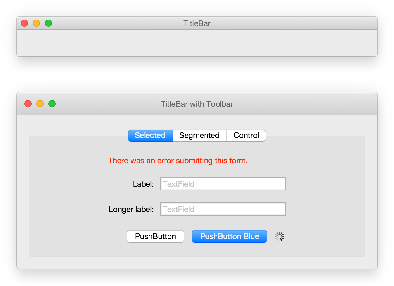
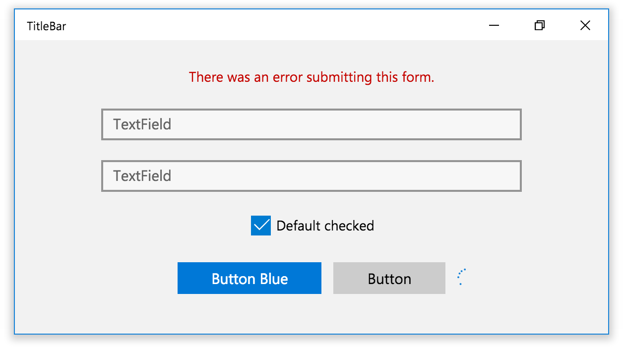
React UI Components for OS X El Capitan and Windows 10.
npm install react-desktop --save

This library has been created to bring a native desktop experience to the web. It works extremely well with tools such as node-webkit or Electron.js!
Everyone is welcome to contribute and add more components/documentation whilst following the contributing guidelines.
Guides on installation, components and advanced usage are found in the documentation.
- Box
- Check Box Button
- Indeterminate Circular Progress Indicator
- Gradient Button
- Flexible Space Toolbar Item
- Form
- Label
- Pop Up Button
- Push Button
- Radio Button
- Search Field
- Secure Text Field
- Segmented Control
- Space Toolbar Item
- Text Field
- Textured Rounded Button
- Title Bar
- Toolbar
- Window
- Button
- Checkbox
- Determinate Progress Bar
- Form
- Progress Bar
- Progress Ring
- Split View
- Text Block
- Text Box
- Title Bar
- Window
Simple usage:
import React from 'react';
import {
  Window,
  TitleBar,
  PushButton,
  TextField,
  Toolbar,
  Box,
  SegmentedControl,
  IndeterminateProgressWheel,
  Form,
  Label
} from 'react-desktop';

class MyApp extends React.Component {
  constructor() {
    super();
    this.state = { selectedTab: 'login' };
  }

  render() {
    return (
      <Window>
        <TitleBar
          title="My App"
          controls
          onClosePress={() => { alert('close'); }}
          onResizePress={() => { alert('resize'); }}
          onMinimizePress={() => { alert('minimize'); }}
        >
          <Toolbar/>
        </TitleBar>

        <Box>
          <SegmentedControl>
            <SegmentedControl.Item
              title="Login"
              selected={this.state.selectedTab === 'login'}
              onPress={() => { this.setState({ selectedTab: 'login' }) } }
            >
              <Form onSubmit={() => { alert('submit'); }}>
                <Label color="red">Error</Label>

                <Form.Row>
                  <Label>Username</Label>
                  <TextField defaultValue="" placeholder="Username"/>
                </Form.Row>

                <Form.Row>
                  <PushButton onPress={() => { alert('cancel'); }}>Cancel</PushButton>
                  <PushButton onPress="submit" color="blue">Submit</PushButton>

                  <IndeterminateProgressWheel visible absolute/>
                </Form.Row>
              </Form>
            </SegmentedControl.Item>
          </SegmentedControl>
        </Box>
      </Window>
    );
  }
}