Tailwind CSS Components
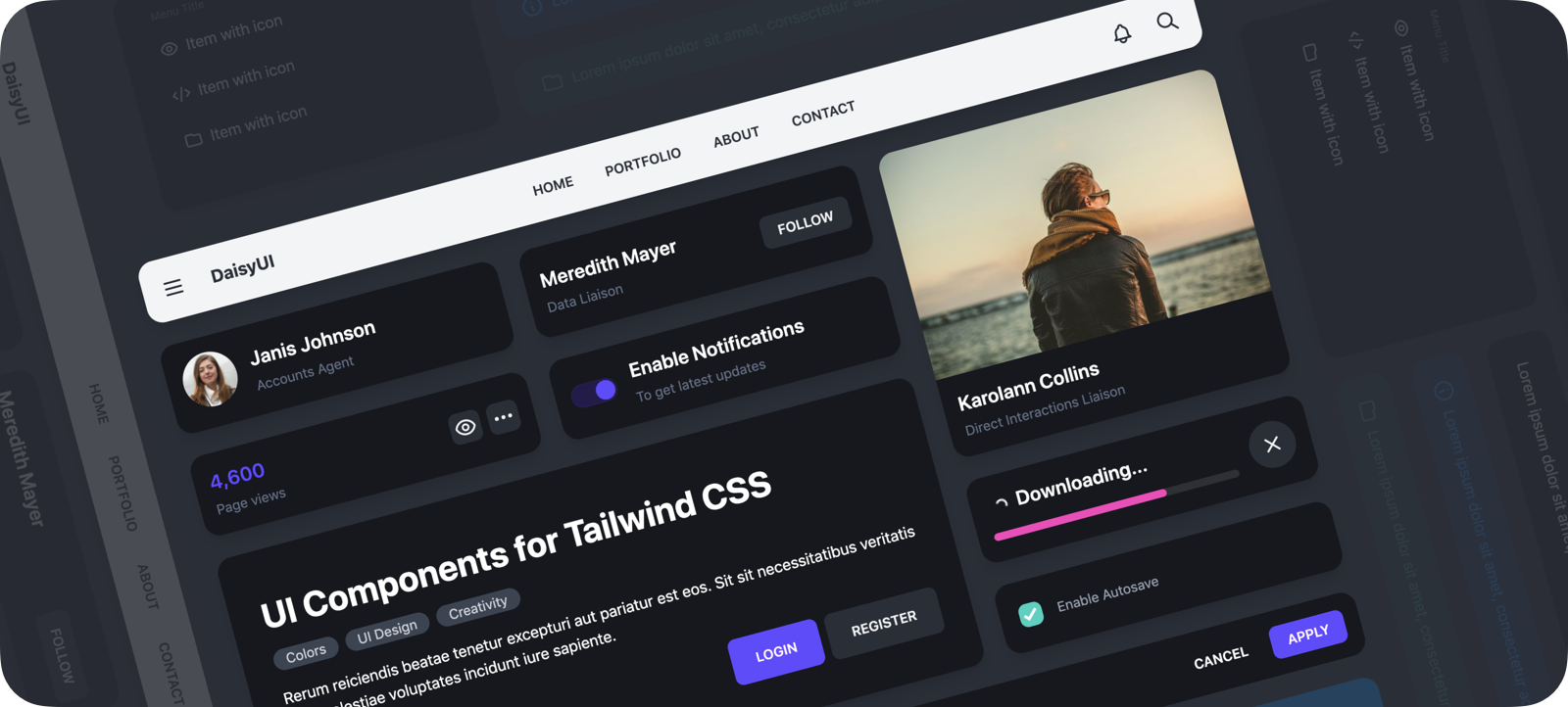
Adds components like btn, card and more to Tailwind CSS

- 👉 [ See all components ]
- 📘 Documents: daisy.js.org
- 🎲 Try it online: Tailwind Play | Codepen
- 📦 Source: GitHub | NPM | Unpkg | JSdeliver
- Component classes: DaisyUI adds component classes to Tailwind. Classes like
btn,card,… No need to deal with hundreds of utility classes. - Tailwind CSS plugin: DaisyUI is a Tailwind CSS plugin so you can simply add it to your
tailwind.config.jsfile. - Based on design system: DaisyUI applies design system concepts to Tailwind CSS. All components on your page are committed to a single design system.
- Customizable: You can customize the design of components with Tailwind utility classes and CSS variables.
- Semantic color names: Use color names like
primary,secondary,accent,… just like your design system defines. - RTL supported: Enable
rtlconfig for right to left layouts. - Themeable: Add multiple themes or change colors with a CSS variable. You can even set a theme for a specific section of your page.
- Designer-friendly: You can disable
styledconfig and only get the skeleton of components. No style, no colors. You can style everything using utility classes.
npm i daisyui --saveThen add DaisyUI to your tailwind.config.js
[ Read more ]
module.exports = {

  plugins: [
    require('daisyui'),
  ],

}
Or use a CDN
Loading CSS files from CDN is not recommended for production. It's better to install Tailwind and DaisyUI as Nodejs dependencies so you can config/customize everything, and purge unused styles.
-
full.css Includes:
- Tailwind's default config
- DaisyUI components
https://cdn.jsdelivr.net/npm/daisyui@0.20.0/dist/full.css
Use component classes like btn, card, etc… to build your UI.
<a class="btn">Hello!</a><div class="shadow card">
<div class="card-body">
<h2 class="card-title">Card Title</h2>
<p>Card text</p>
</div>
</div> 👉 See all components
🎲 Try it online
Read the documents for more info
[ daisy.js.org ↗︎ ]
List of components
- Accordion
- Alert
- Artboard
- App bar
- Avatar
- Avatar group
- Badge
- Banner
- Breadcrumb
- Button
- Button group
- Calendar
- Card
- Chat bubble
- Comment
- Countdown
- Cover
- Divider
- Drawer
- Empty placeholder
- Footer
- Form
- Select
- Text input
- Text area
- Checkbox
- Radio
- Range slider
- Rating
- Toggle
- Upload
- Hero
- Link
- Loading
- Menu
- Mockup
- Browser
- Code
- Phone
- Window
- Navbar
- Mask
- Modal
- Pagination
- Progress
- Statistic
- Steps
- Tag
- Table
- Tabs
- Timeline
- Toast
- Tooltip
༼ つ ◕_◕ ༽つ Please share