
Our company provides custom UI design and development solutions for mobile applications and websites.
Need a team to create a project?
This project is developed and maintained by openGeeksLab LLC.

- React Native 0.50+
- iOS 9.0+
- Android 4.2+
Just run:
- npm i react-native-fluid-slider
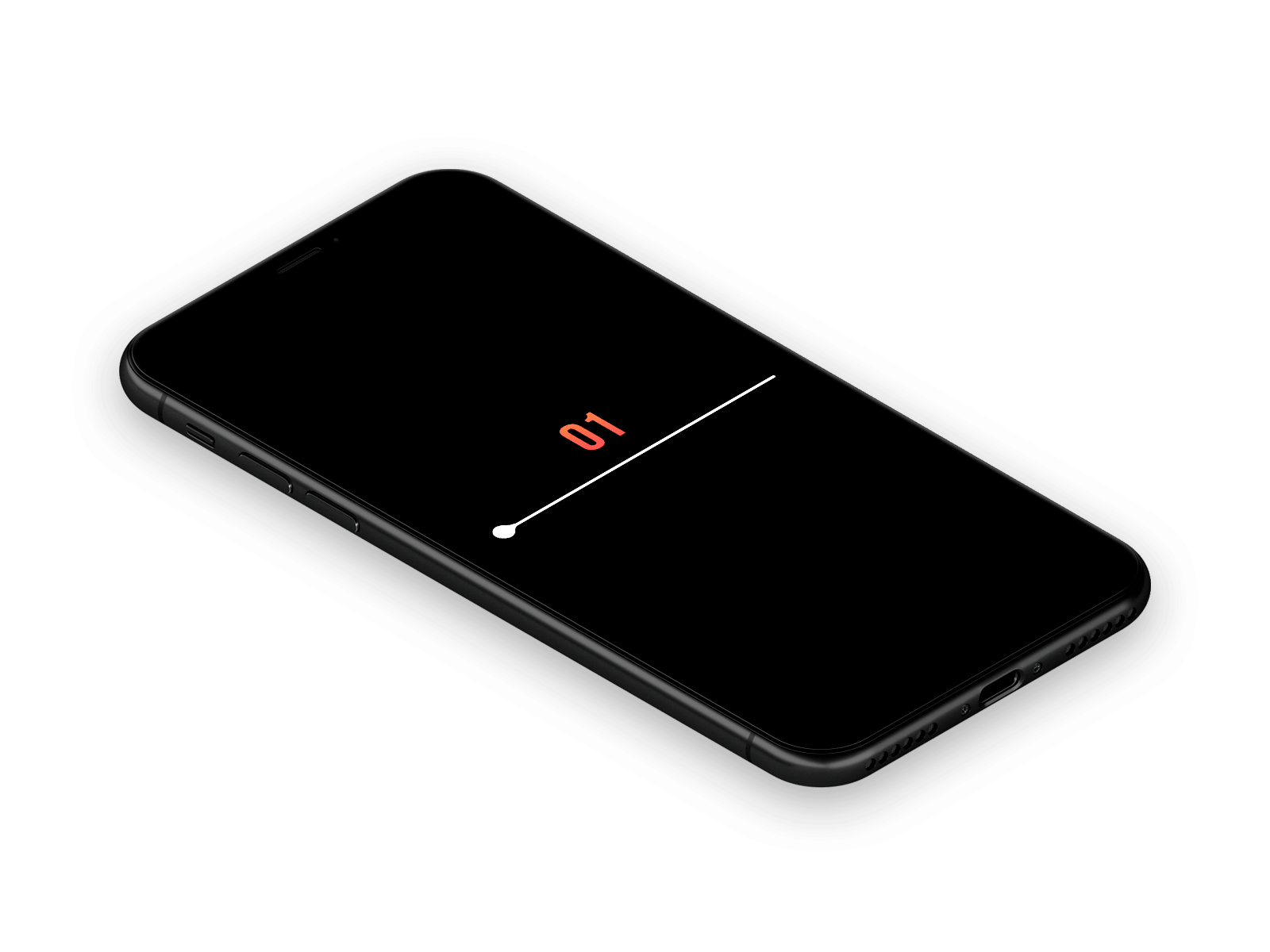
import React, { Component } from 'react';
import {
  StyleSheet,
  Text,
  View,
} from 'react-native';

import Slider from 'react-native-fluid-slider';

export default class App extends Component {
  state = { value: 40 }

  render() {
    return (
      <View style={styles.container}>
        <View style={styles.sliderContainer}>
          <Text style={styles.valueText}>
            {this.state.value.toFixed()}
          </Text>
          <Slider
            value={this.state.value}
            onValueChange={value => this.setState({ value })}
            onSlidingComplete={(value) => { console.warn('Sliding Complete with value: ', value) }}
          />
        </View>
      </View>
    );
  }
}

const styles = StyleSheet.create({
  container: {
    flex: 1,
    justifyContent: 'center',
    backgroundColor: '#000',
    paddingHorizontal: 70,
  },
  sliderContainer: {
    width: '100%',
  },
  valueText: {
    fontSize: 40,
    textAlign: 'center',
    margin: 10,
    color: '#ee6d51',
  },
});value - is the value of the slider.
step - is the slider step.
minimumValue - is the minimum value.
maximumValue - is the maximum value.
onValueChange - it is called when the value of the slider is changed and getting the new slider value parameter.
onSlidingComplete - is called when the slider is almost dragged(when the user releases the slider) The function can get one parameter, it's the value at the time of completion.
thumbTintColor - is the slider color.
minimumTrackTintColor - is the color of the slider track on the left of the slider.
maximumTrackTintColor - is the color of the slider track on the right of the slider.
Expanding is released under the MIT license.
Inspired by @Virgil Pana