Bug 1827609: Inline Create button with the Title #5080
Conversation
|
/assign @rhamilto |
| display: flex; | ||
| flex-direction: row; | ||
| } | ||
| @media (max-width: $screen-sm) { |
There was a problem hiding this comment.
In other words, move lines 32-34 to line 28.
There was a problem hiding this comment.
@rhamilto we only want 30px margin when we don't have the button and title in the same line. We show them in the same line in size > $screen-xs (480px) so adding margin at size < $screen-xs-max (767px) leaves us with unnecessary margin in the range of 480px to 767px.
Which causes issues similar to this: #5080 (comment)
|
@rhamilto I have updated the failing spec. It implies(updated spec) that a user of this component cannot have a create button without providing us with a title. If you think that should not be the behaviour please let me know and I will update it as required. Thanks, |
|
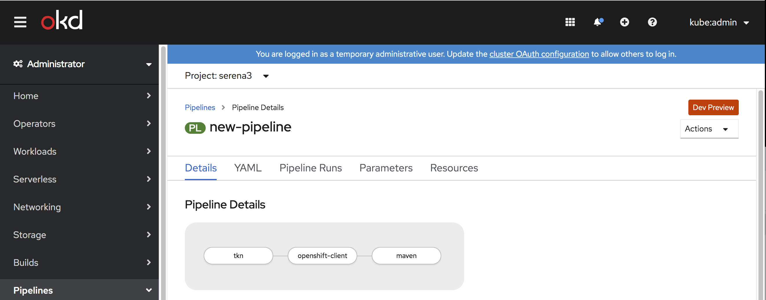
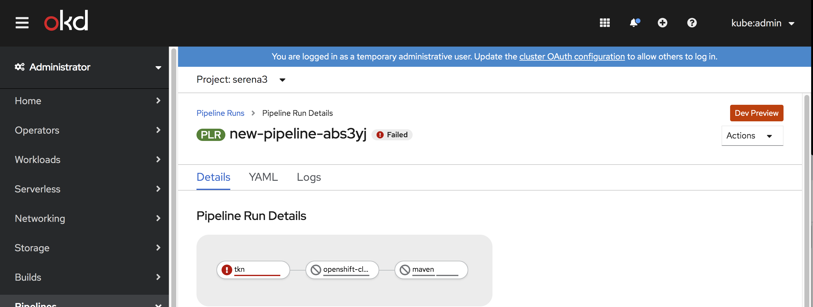
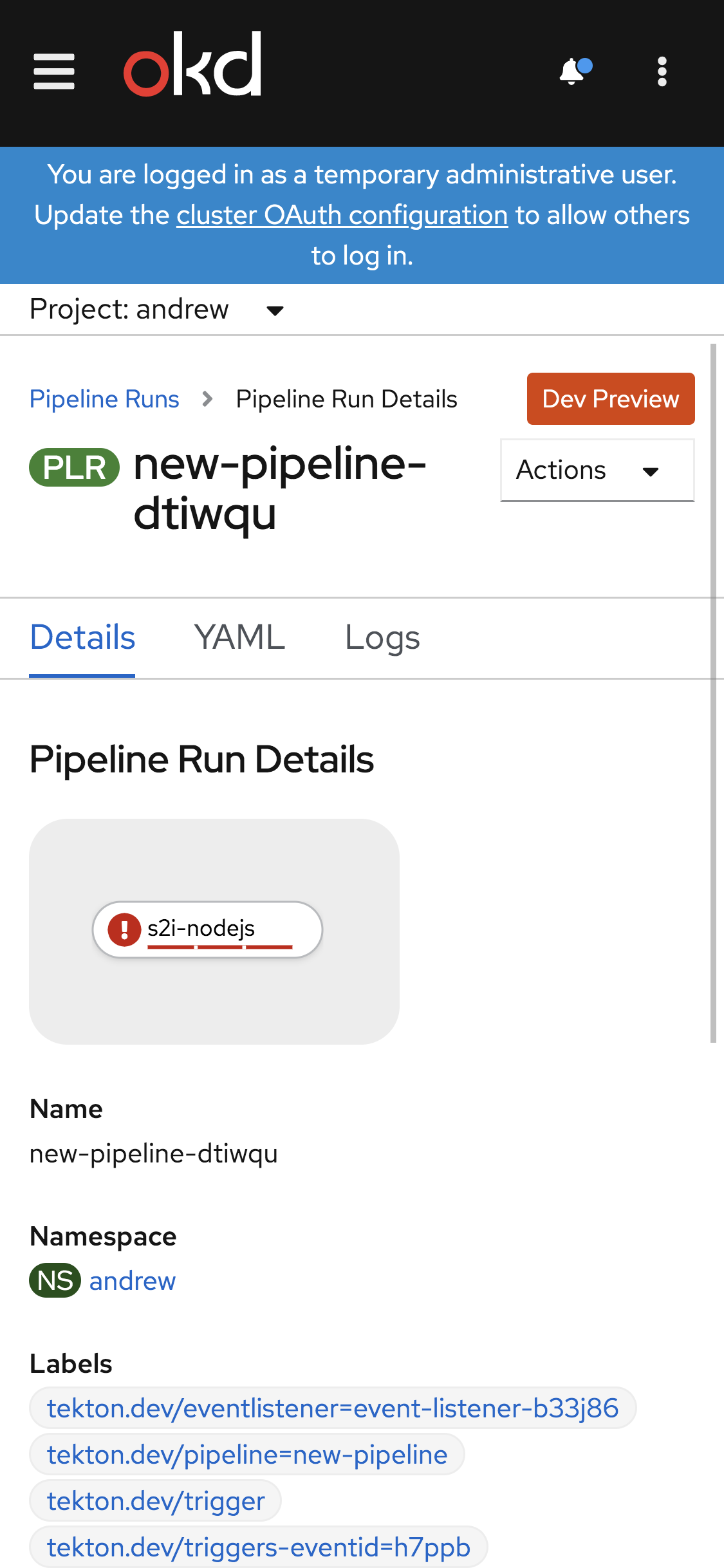
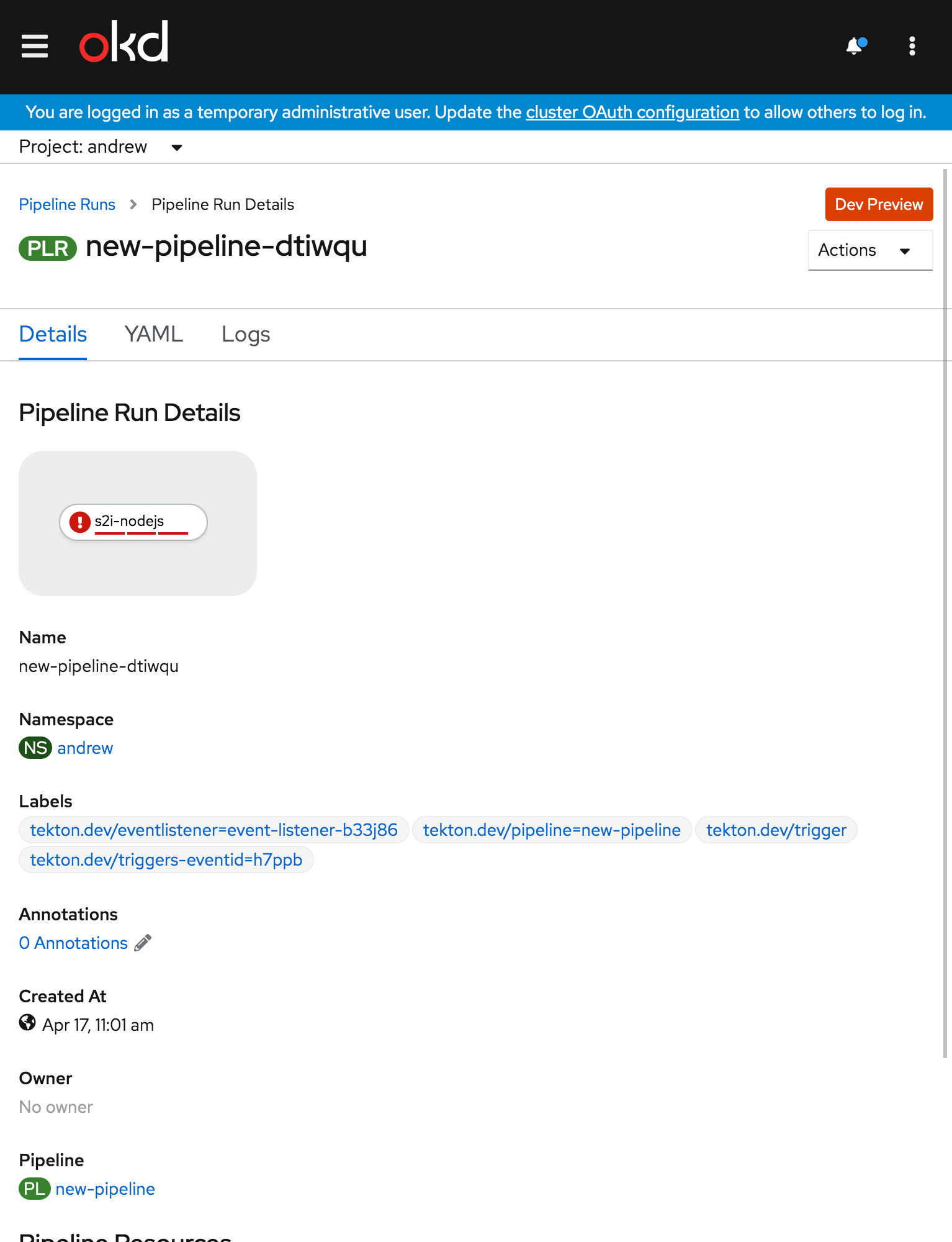
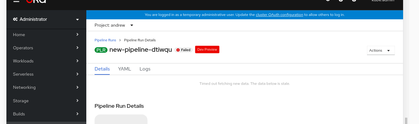
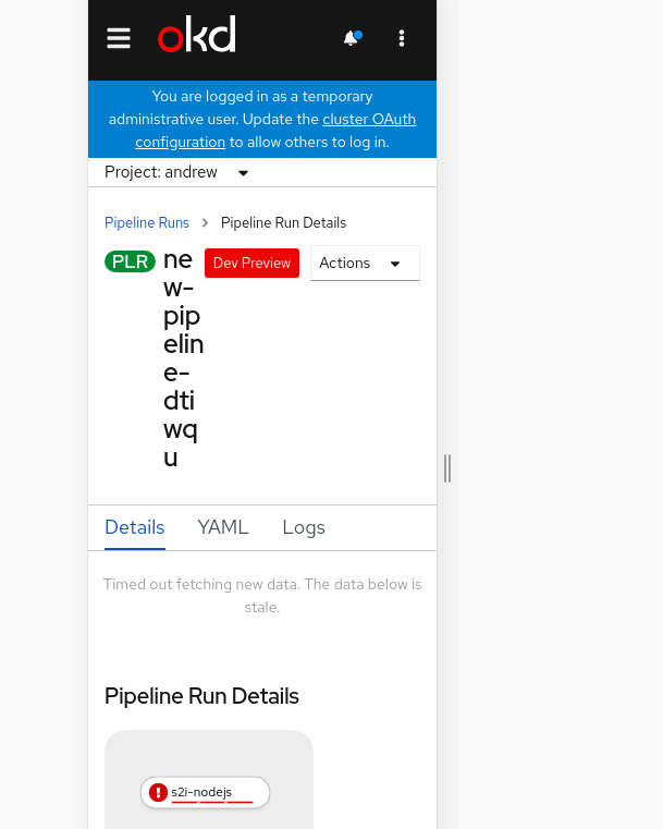
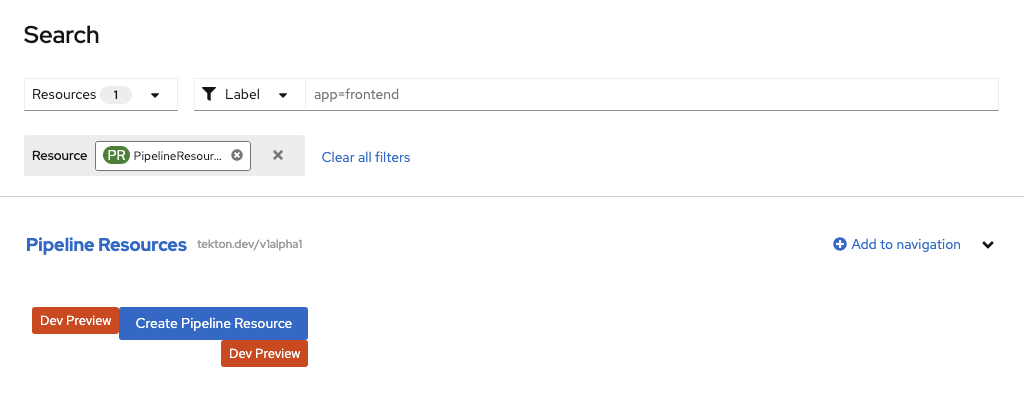
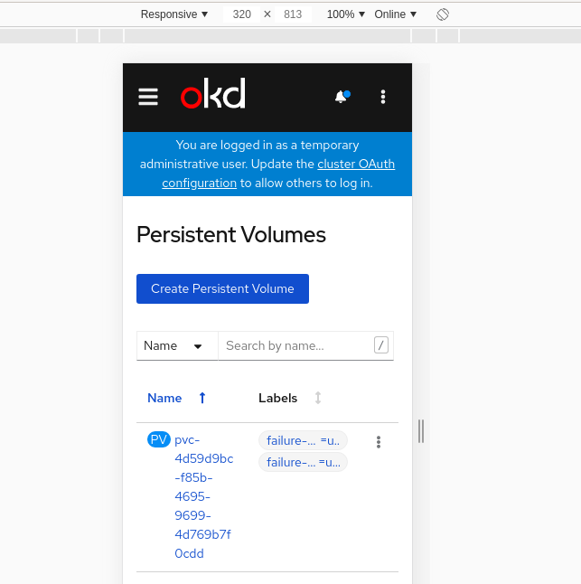
How does this look on a details page? I was initially right aligned in the same row as the breadcrumb, but would look nice following the resource name. Just remembered we also have status badges following the resource name in some cases. Including a couple of images for reference in case you haven't seen these cases. FYI @beaumorley @christianvogt
|
|
@serenamarie125 So it would look something like this. |
| @@ -24,6 +24,15 @@ | |||
| padding-left: $grid-gutter-width; | |||
| padding-right: $grid-gutter-width; | |||
| } | |||
| &--row { | |||
| @media (max-width: $screen-sm-max) { | |||
There was a problem hiding this comment.
| @media (max-width: $screen-sm-max) { | |
| @media (max-width: $screen-xs-max) { |
There was a problem hiding this comment.
Too much space with $screen-sm-max
|
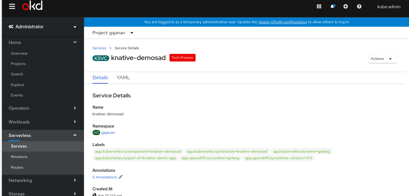
@bipuladh Could you add a screenshot of what it would look like with both a status badge and a tech preview badge? |
|
I'm seeing the badge directly abut the title. |

frontend/public/style/_common.scss
Outdated
| @@ -105,6 +108,11 @@ $co-external-link-padding-right: 15px; | |||
| } | |||
| } | |||
|
|
|||
| .co-m-pane__heading-badge { | |||
| margin-left: var(--pf-global--spacer--sm); | |||
There was a problem hiding this comment.
Nit: this declaration should come second (move to line 113) as we aim to keep declarations alphabetized by property.
Note we hide the status badge at < 768px.
|

|
@bmignano @serenamarie125 |
|
/lgtm /hold for ux approval |
|
@serenamarie125 Would you prefer not making any changes to the details pages (i.e. leaving the tech preview badge above the actions dropdown):
Or moving the tech preview badge to be after the title as on list views (to the right of status badges)?
Curious what your thoughts are – with the first version the tech preview badge will appear in different places from detail views to list views but with the second version we have 2 badges after a page title. Any other thoughts @openshift/team-ux-review |
Given code freeze is today, I recommend this as a follow-on bug fix. |
|
/retest |
|
/retest Please review the full test history for this PR and help us cut down flakes. |
4 similar comments
|
/retest Please review the full test history for this PR and help us cut down flakes. |
|
/retest Please review the full test history for this PR and help us cut down flakes. |
|
/retest Please review the full test history for this PR and help us cut down flakes. |
|
/retest Please review the full test history for this PR and help us cut down flakes. |
|
/retest |
|
/hold This seems to be consistently failing on test "displays form editor for creating a new |
|
/hold cancel |
|
/lgtm note this needs a bugzilla now as we're past feature freeze. |
|
[APPROVALNOTIFIER] This PR is APPROVED This pull-request has been approved by: bipuladh, rhamilto, serenamarie125 The full list of commands accepted by this bot can be found here. The pull request process is described here
Needs approval from an approver in each of these files:
Approvers can indicate their approval by writing |
|
@bipuladh: This pull request references Bugzilla bug 1827609, which is valid. The bug has been moved to the POST state. The bug has been updated to refer to the pull request using the external bug tracker. 3 validation(s) were run on this bug
In response to this:
Instructions for interacting with me using PR comments are available here. If you have questions or suggestions related to my behavior, please file an issue against the kubernetes/test-infra repository. |
|
@bipuladh: All pull requests linked via external trackers have merged: openshift/console#5080. Bugzilla bug 1827609 has been moved to the MODIFIED state. In response to this:
Instructions for interacting with me using PR comments are available here. If you have questions or suggestions related to my behavior, please file an issue against the kubernetes/test-infra repository. |
|
@bipuladh This appears to have caused Looked around and didn't find an issue, so I logged BZ 1828591 |
|
@andrewballantyne we really, really want you to know it's dev preview :) |
Screenshots:
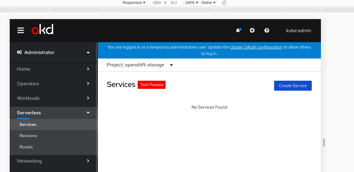
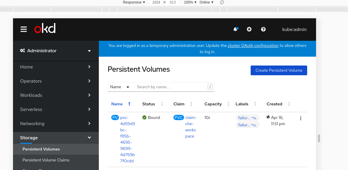


Desktop Views:
Mobile Views:
Search Remains untouched