
A customizable Flutter package for displaying grid views of sections.

Add the following to your pubspec.yaml file:
dependencies:
  flutter_super_grid: ^1.0.9
Then, run:
$ flutter pub get- Customizable grid view with sections and various configuration options.
- Support for item tap callbacks with section and item indices.
- Option to invert the row and display the grid horizontally.
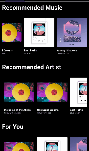
- Section titles with customizable styling and alignment.
import 'package:flutter_super_grid/flutter_super_grid.dart';

SectionGridView(
  sections: yourSectionsList,
  renderItem: (itemData) {
    // Customize how each item is rendered
    return YourCustomItemWidget(itemData);
  },
  itemsPerRow: 3,
  // ... (See Configuration Table below)
)

import 'package:flutter_super_grid/flutter_super_grid.dart';

FlatGridView(
  data: yourDataList,
  renderItem: (itemData) {
    // Customize how each item is rendered
    return YourCustomItemWidget(itemData);
  },
  itemsPerRow: 3,
  // ... (See Configuration Table below)
)
import 'package:flutter_super_grid/flutter_super_grid.dart';

SimpleGridView(
  data: yourDataList,
  renderItem: (itemData) {
    // Customize how each item is rendered
    return YourCustomItemWidget(itemData);
  },
  // ... (See Configuration Table below)
)| Configuration | Type | Default Value | Description |
|---|---|---|---|
data |
List | - | The data to display in the grid (SimpleGridView and FlatGridView). |
sections |
List | - | The sections to display in the grid (SectionGridView only). |
renderItem |
Function | - | Function that renders each item in the grid. |
onNewItemAdded |
Function or null | null | Callback when a new item is added (SectionGridView and FlatGridView). |
onPressed |
Function or null | null | Callback when an item is pressed (SectionGridView and FlatGridView). |
itemsPerRow |
int | 0 | Number of items per row or column (applies when isFixed is false). |
itemSize |
double | 120.0 | The size of items in the main axis. |
minItemDimension |
double | 120.0 | Minimum dimension (width or height) of each grid item (applies when isFixed is false). |
verticalSpacing |
double | 10 | Vertical spacing between items. |
horizontalSpacing |
double | 10 | Horizontal spacing between items. |
isFixed |
bool | false | Whether the grid item size is fixed. |
horizontal |
bool | false | Whether the grid view is horizontal. |
invertedRow |
bool | false | Whether to invert the row. |
adjustGridToStyles |
bool | false | Whether to adjust the grid to styles. |
style |
SectionGridViewStyle | - | Style configuration for the grid view. |
itemContainerStyle |
ContainerStyle | ContainerStyle() | Style for the container of each item (FlatGridView only) (applies when isFixed is false). |
footerWidget |
Widget | SizedBox | Widget to be displayed as a footer (SectionGridView and FlatGridView). |
gridViewHeight |
double | 300 | Height of the gridview. |
gridViewWidth |
double | double.infinity | Width of the gridview. |
containerWidth |
double | double.infinity | Width of the main container (applies when it's greater than gridViewWidth). |
containerHeight |
double | 300 | Height of the main container (applies when it's greater than gridViewHeight). |
physics |
ScrollPhysics or null | null | The physics of the scroll view. |
For detailed documentation, see API Documentation.
This project is licensed under the MIT License - see the LICENSE.md file for details.
Feel free to contribute to this project.
If you find a bug or want a feature, but don't know how to fix/implement it, please fill an issue.
If you fixed a bug or implemented a feature, please send a pull request.