Vertical Navigation
The Vertical Navigation component provides global site-wide navigation supporting a one or two level information architecture.
Use this component when your primary navigation consists of more than 3-5 items and/or you require multiple levels of navigation (i.e. primary and secondary categories). If you application has a simple navigation structure with only 5 primary items or less, a Horizontal Primary Menu is recommended.
Vertical Navigation always resides in the left-hand sidebar of the page and can be collapsed in situations where the user wants to maximize horizontal screen area. If a third level of navigation is needed, Vertical Navigation can be combined with local navigation within the body of the page to support up to three levels of information hierarchy.
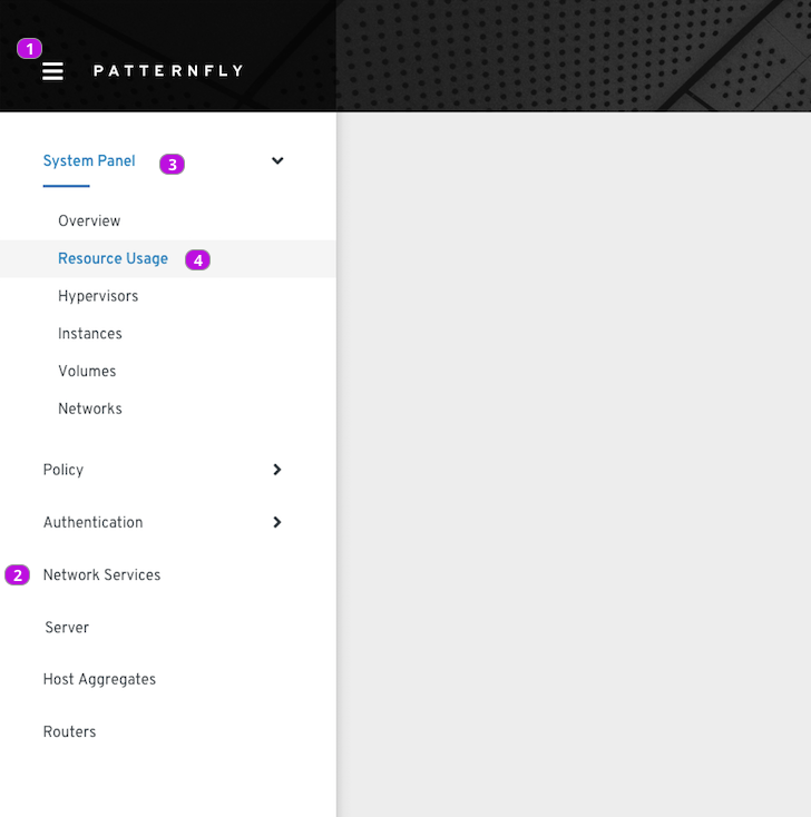
| No. | Element | Tooltip | on_Click |
|---|---|---|---|
| 1 | Menu Toggle | Show or hide menu | The display of the menu is toggled. Given the user is on a mobile device, when the user selects a menu item, then the menu is hidden. Note that clicking outside of the menu will not close the menu. |
| 2 | Primary Menu Item (no children) | -- | Go to this page and make this item active/selected and set previously selected item to inactive. Given that this is a mobile device, hide the menu after navigating to a new page. |
| 3 | Primary Menu Item (with children) | -- | Toggle the state of the secondary menu. Given that this menu contains the active page, selection will persist and the primary menu item will continue to display the active/selected state. |
| 4 | Secondary Menu Item | -- | Go to this page and make this item active/selected and set any previously selected secondary item to inactive. Also set the state of the parent primary item to selected (if not already selected) and set previously selected primary item to inactive. Given that this is a mobile device, hide the menu. |
- The first primary menu item should be selected (and displayed). If this item has children, it should be shown in the open state with the first secondary page will be selected (and displayed).
- The menu sidebar will be hidden by default if viewing on a mobile device. Otherwise the menu will always be initially shown.
(Optional) If there are styling considerations that may not be obvious from looking at the implementation examples, they should be explained here.
(optional) Provide content standards and writing suggestions for this component or pattern to help designers and developers deliver consistent and thoughtful content. You can include guidelines, messaging standards, or similar best practices specific to this component or pattern.This will extend any general terminology and wording best practices to provide component specific guidance.
- Editorial guidelines for labeling and message text
- Length restrictions and/or what to do if text overflows
- Localization considerations