Improve color palette selection behavior #1028
Conversation
This includes:
- Showing the proper icon color when selected (Fixes pencil2d#1024)
- Adding a border around the selected color, this is particularly
useful for grid mode which has no other way to display the selection
- Refactored the resizing code so that going to grid mode from list
mode does not result in unexpected icon spacing
app/src/colorpalettewidget.cpp
Outdated
| swatchPainter.drawRect(0, 0, mIconSize.width() - 1, mIconSize.height() - 1); | ||
| swatchPainter.setPen(borderShadow); | ||
| swatchPainter.drawRect(0, 0, mIconSize.width() - 1, mIconSize.height() - 1); | ||
| swatchIcon.addPixmap(colourSwatch, QIcon::Selected); |
There was a problem hiding this comment.
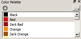
Minor thing: selection border should imo. only be shown in grid mode. There's already normal cell selection highlight in list mode.
There was a problem hiding this comment.
I agree that it isn't necessary in list mode, but I think it's still useful because the selection highlight differs based on the operating system. Here's a screenshot of the QListWidget from the qt docs:
Its style has much less emphasis on a selection than on a mac and a selection border may look better in styles like this.
Also I feel like it would be a bit of a pain to change because you would have to change the icons each time you toggle the mode, and either regenerate or store and retrieve the selection pixmap for each color when switching to grid mode. So part of the reason why I didn't do this is just laziness 😉
There was a problem hiding this comment.
The list is updated on every click anyway so the required changes are minimal to hide the border. The style also seems pretty consistent across systems too, so aside from changing the Qt Theme from source code, the style should be somewhat consistent.
The image you provided is not what it looks like in Pencil2D though, regardless the operation system as far as I know, this is how it looks through wine:
The only changes that are required is adding if statements around your selection border painting. ~290 and ~650
There was a problem hiding this comment.
For some reason I was thinking that refreshColorList wasn't called on mode change, but I can see now that it is, and you're right it's very simple to change. I have pushed the changes needed to show the selection border in grid mode only.
|
Here's what it looks like for the curious: Good job @scribblemaniac |

I spent some time trying to remove the highlight with stylesheets, and when that didn't work I was just about to try a custom item delegate when I stumbled upon this solution. |
|
Cool! it's a nice solution. Thank you @scribblemaniac |
This includes:
useful for grid mode which has no other way to display the selection
mode does not result in unexpected icon spacing