一行代码让你的页面适配所有的移动端浏览器
页面适配的原理其实无非是定义一套不同屏幕宽度的rem单位
传统的做法写多个媒体查询,通过监听不同屏幕宽度改变不同的根元素的字体大小来做页面适配 比如:
html{font-size:10px}
@media screen and (min-width:321px) and (max-width:375px){html{font-size:11px}}
@media screen and (min-width:376px) and (max-width:414px){html{font-size:12px}}
@media screen and (min-width:415px) and (max-width:639px){html{font-size:15px}}
@media screen and (min-width:640px) and (max-width:719px){html{font-size:20px}}
@media screen and (min-width:720px) and (max-width:749px){html{font-size:22.5px}}
@media screen and (min-width:750px) and (max-width:799px){html{font-size:23.5px}}
@media screen and (min-width:800px){html{font-size:25px}}
随着手机设备的类型越来越多,其实很难拿到所有屏幕的宽度,而且这种页面适配的方法在部分分辨率下跟视觉稿的比例是不匹配的
知道上面的原因之后,adaptable的原理是通过动态获取屏幕宽度,通过这个屏幕宽度定义根元素的字体大小,从而精确适配页面。
(function adaptable(window, document){
  var currentClientWidth; //当前浏览器窗口宽度
  var rootElement = document.documentElement; //根元素,即html标签
  function resizeHtmlFontSize(){
    currentClientWidth = rootElement.clientWidth;
    rootElement.style.fontSize = currentClientWidth + "px";
  }
  document.addEventListener('DOMContentLoaded', resizeHtmlFontSize);
  window.addEventListener('resize', resizeHtmlFontSize);
}(window, document))
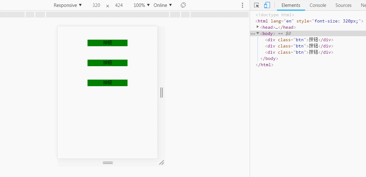
750px宽的视觉稿中有个300px宽度的按钮,那按照比例调整,这个按钮在640px宽的屏幕下的宽度为300/750*640,直接用less的变量去处理就简单了
@unit : 1/750rem; //750为视觉稿宽度
.btn{
	width: 300 * @unit;
	height: 50 * @unit;
	font-size: 32 * @unit;
}