It seems the indent of tree nodes is broken after updating to VS 17.4.0 Preview 1.0.
I will update this text when things change.
Everything is fixed 😄
This control allows you to visualise a tree of any data. Each trunk node must provide its children using a public property that supports the IEnumerable interface.
If the children are in a collection that supports INotifyCollectionChanged the control will track changes to the underlying tree data.
Children are lazy-loaded and the UI is virtualised.
| Property | Type | Bindable | Purpose |
|---|---|---|---|
| ItemsSource | object | Yes | Set this to your root node |
| TreeItemTemplate | TemplateProvider | Yes | Set this to a TreeItemDataTemplate or a TreeItemDataTemplateSelector |
| ItemContainerStyle | Style | Yes | An optional Style that can be applied to the TreeNodeZero objects that represent each node. |
| IsRootVisible | bool | Yes | Specifies whether the root node should be shown or omitted. |
| IndentMultiplier | double | Yes (OneTime) | How far the TreeNode should be indented for each nest level. Default is 15.0 |
TreeItemDataTemplate tells a tree-node how to draw itself, how to get its children and whether it should bind IsExpanded to the underlying data.
It declares the following properties:
| Property | Type | Purpose |
|---|---|---|
| ChildrenPropertyName | string | The name of the property used to find the node children |
| IsExpandedPropertyName | string | The name of the property used to store whether the node is expanded |
| ItemTemplate | DataTemplate | The DataTemplate used to draw this node |
| TargetType | Type | When used in a TreeItemDataTemplateSelector, identifies the least-derived nodes the ItemTemplate can be applied to. |
Given a hierarchy of MyNode
public class MyNode
{
   public string Name { get; set;}
   public IEnumerable<MyNode> MyNodeChildren { get; set; }
}
Add the namespace:
xmlns:cz="clr-namespace:FunctionZero.Maui.Controls;assembly=FunctionZero.Maui.Controls"Then declare a TreeViewZero like this:
<cz:TreeViewZero ItemsSource="{Binding RootNode}">
    <cz:TreeViewZero.TreeItemTemplate>
        <cz:TreeItemDataTemplate ChildrenPropertyName="MyNodeChildren">
            <DataTemplate>
                <!--Tip: The HeightRequest ensures the chevrons aren't too small to tap with your finger-->
                <Label Text="{Binding Name}" HeightRequest="100" />
            </DataTemplate>
        </cz:TreeItemDataTemplate>
    </cz:TreeViewZero.TreeItemTemplate>
</cz:TreeViewZero>If the children of a node support INotifyCollectionChanged, the TreeView will track all changes automatically.
If the properties on your node support INotifyPropertyChanged then they too will be tracked.
For example, TreeViewZero will track changes to Name, IsExpanded and any
modifications to the Children collection on the following node:
public class MyObservableNode : BaseClassWithInpc
{
   private string _name;
   public string Name
   {
      get => _name;
      set => SetProperty(ref _name, value);
   }

   private bool _isMyNodeExpanded;
   public bool IsMyNodeExpanded
   {
      get => _isMyNodeExpanded;
      set => SetProperty(ref _isMyNodeExpanded, value);
   }

   public ObservableCollection<MyObservableNode> Children {get; set;}
}
This is how to bind the IsMyNodeExpanded from our data, to IsExpanded on the TreeNode ...
<cz:TreeViewZero.TreeItemTemplate>
    <cz:TreeItemDataTemplate ChildrenPropertyName="Children" IsExpandedPropertyName="IsMyNodeExpanded">
        <DataTemplate>
            ...
        </DataTemplate>
    </cz:TreeItemDataTemplate>
</cz:TreeViewZero.TreeItemTemplate>If your tree of data consists of disparate nodes with different properties for their Children,
use a TreeItemDataTemplateSelector and set TargetType for each TreeItemDataTemplate.
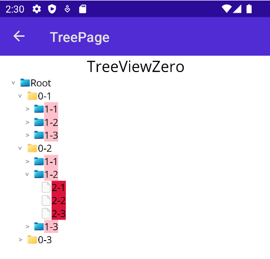
Note: In this example, the tree data can contain nodes of type LevelZero, LevelOne and LevelTwo where each type has a different property to provide its children.
The first TargetType your data-node can be assigned to is used. Put another way, the first TargetType the data-node can be cast to, wins.
<cz:TreeViewZero ItemsSource="{Binding SampleTemplateTestData}" >
    <cz:TreeViewZero.TreeItemTemplate>
        <cz:TreeItemDataTemplateSelector>
            <cz:TreeItemDataTemplate ChildrenPropertyName="LevelZeroChildren" TargetType="{x:Type test:LevelZero}" IsExpandedPropertyName="IsLevelZeroExpanded">
                <DataTemplate>
                    <Label Text="{Binding Name}" BackgroundColor="Yellow" />
                </DataTemplate>
            </cz:TreeItemDataTemplate>

            <cz:TreeItemDataTemplate ChildrenPropertyName="LevelOneChildren" TargetType="{x:Type test:LevelOne}" IsExpandedPropertyName="IsLevelOneExpanded">
                <DataTemplate>
                    <Label Text="{Binding Name}" BackgroundColor="Cyan" />
                </DataTemplate>
            </cz:TreeItemDataTemplate>

            <cz:TreeItemDataTemplate ChildrenPropertyName="LevelTwoChildren" TargetType="{x:Type test:LevelTwo}" IsExpandedPropertyName="IsLevelTwoExpanded">
                <DataTemplate>
                    <Label Text="{Binding Name}" BackgroundColor="Pink" />
                </DataTemplate>
            </cz:TreeItemDataTemplate>

            <cz:TreeItemDataTemplate ChildrenPropertyName="LevelThreeChildren" TargetType="{x:Type test:LevelThree}" IsExpandedPropertyName="IsLevelThreeExpanded">
                <DataTemplate>
                    <Label Text="{Binding Name}" BackgroundColor="Crimson" />
                </DataTemplate>
            </cz:TreeItemDataTemplate>
        </cz:TreeItemDataTemplateSelector>
    </cz:TreeViewZero.TreeItemTemplate>
</cz:TreeViewZero>If you want full-control over the TreeItemTemplate per node, you can easily implement your own
TreeItemDataTemplateSelector and override OnSelectTemplate. Here's an example that chooses a template
based on whether the node has children or not:
public class MyTreeItemDataTemplateSelector : TemplateProvider
{
   /// These should be set in the xaml markup. (or code-behind, if that's how you roll)
   public TreeItemDataTemplate TrunkTemplate{ get; set; }
   public TreeItemDataTemplate LeafTemplate{ get; set; }

   public override TreeItemDataTemplate OnSelectTemplate(object item)
   {
      /// Do something based on the incoming node ...
      if(item is MyTreeNode mtn)
      {
         if((mtn.Children != null) && (mtn.Children.Count != 0))
         {
            return TrunkTemplate;
         }
      }
      return LeafTemplate;
   }
}
Take a look at TreeItemDataTemplateSelector.cs
for an example of how to provide a collection of TreeItemDataTemplate instances to your TemplateProvider.
Do this if you want to change the way the whole Tree-Node is drawn, e.g. to replace the chevron. It is a two-step process.
- Create a
ControlTemplatefor aTreeNodeZero - Apply it to the
TreeViewZero
The templated parent for the ControlTemplate is a TreeNodeZero. It exposes these properties:
| Property | Type | Purpose |
|---|---|---|
| ActualIndent | float | How deep the node should be indented. Value is IndentMultiplier * (Indent-1). |
| IsExpanded | bool | This property reflects whether the TreeNode is expanded. |
The BindingContext of the templated parent is a TreeNodeContainer. It exposes these properties:
| Property | Type | Purpose |
|---|---|---|
| Indent | int | How deep the node should be indented. It is equal to NestLevel, or NestLevel-1 if the Tree Root is not shown. |
| NestLevel | int | The depth of the node in the data. |
| IsExpanded | bool | This property reflects whether the TreeNode is expanded. |
| ShowChevron | bool | Whether the chevron is drawn. True if the node has children. |
| Data | object | This is the tree-node data for this TreeNodeZero instance, i.e. your data! |
You can base the ControlTemplate on the default, show here, or bake your own entirely.
<ControlTemplate x:Key="defaultControlTemplate">
    <HorizontalStackLayout HeightRequest="{Binding Height, Mode=OneWay, Source={x:Reference tcp}}"
        Padding="{TemplateBinding ActualIndent, Converter={StaticResource NestLevelToPaddingConverter}, Mode=OneWay}">
        <controls:Chevron
            IsExpanded="{TemplateBinding BindingContext.IsExpanded, Mode=TwoWay}"
            ShowChevron="{TemplateBinding BindingContext.ShowChevron, Mode=TwoWay}"
        />
        <ContentPresenter VerticalOptions="Start" x:Name="tcp" HorizontalOptions="StartAndExpand" BindingContext="{TemplateBinding BindingContext.Data}" />
    </HorizontalStackLayout>
</ControlTemplate>
Note: The NestLevelConverter in this example is given a ConverterParameter set to 'any control within the template',
so it can look up the visual-tree to find the TreeViewZero, so it can get access to the IndentMultiplier property.
If you know a better way please let me know.
If you want to control e.g. the Padding from your ViewModel, you could TemplateBind to BindingContext.Data.MyVmPadding and perhaps
write your own converter.
<cz:TreeViewZero ItemsSource="{Binding SampleData}">
    <cz:TreeViewZero.TreeItemContainerStyle>
        <Style TargetType="cz:TreeNodeZero">
            <Setter Property="ControlTemplate" Value="{StaticResource YourNodeControlTemplate}"/>
        </Style>
    </cz:TreeViewZero.TreeItemContainerStyle>

    <cz:TreeViewZero.TreeItemTemplate>
       ...
    </cz:TreeViewZero.TreeItemTemplate>
</cz:TreeViewZero>There are two known issues, both in the WinUI platform, both relating to the underlying CollectionView used by TreeViewZero.
- The
CollectionViewhas a minimum item-spacing bug, reported here - The
CollectionViewis not recycling containers, reported here
I'll update the source and NuGet package once these bugs are fixed, if necessary.