Skip to content
New issue

Have a question about this project? Sign up for a free GitHub account to open an issue and contact its maintainers and the community.

By clicking “Sign up for GitHub”, you agree to our terms of service and privacy statement. We’ll occasionally send you account related emails.

Already on GitHub? Sign in to your account

Redesign #203

Merged
merged 50 commits into from Dec 20, 2019
Merged

Redesign #203

merged 50 commits into from Dec 20, 2019

Conversation

vanruch
Copy link
Contributor

@vanruch vanruch commented Nov 29, 2019

Update the extension look and feel and UX to be more pleasant and smooth to work with.

  • Re-design of current screens and flows
  • Implement both dark and light themes + choosing a theme in settings
  • Minor update in account creation flow
  • Improved UX of request signing
  • Update screenshots in documentation

@jacogr
Copy link
Member

jacogr commented Nov 29, 2019

Absolutely brilliant!

@Tbaut
Copy link
Contributor

Tbaut commented Dec 4, 2019

This looks really good!
Found only a couple nits on Firefox

  • there are unneeded scrollbars appearing on the account overview (2 vertical and 1 horizontal), as well as on the extrinsic confirmation window (1 vertical and 1 horizontal).
  • the ellipsis on the address should be IMO in the middle rather than at the end, so that it's displays: "5GZajBFLtG5...T1uHsp3p" rather than "5GZajBFLtG5oNuVo1UefiCh...". Checking it out, I realize this was the case on the old extension though.

I'll test it out with a Parity Signer account tomorrow :)
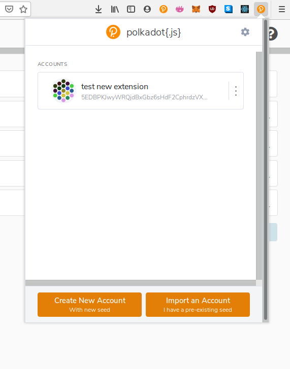
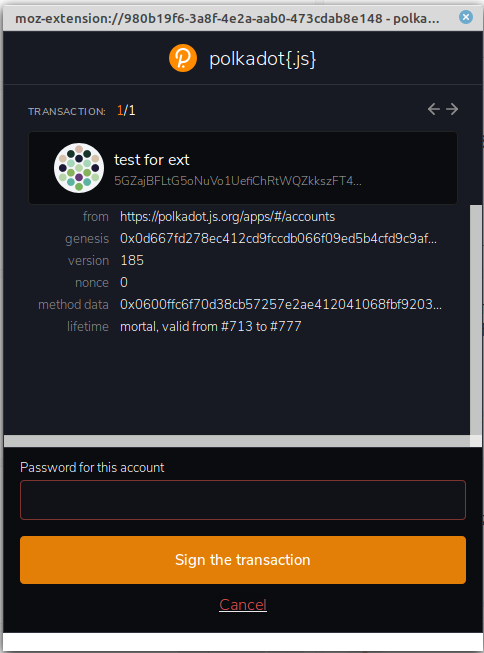
@jacogr
Copy link
Member

jacogr commented Dec 6, 2019

Play-through review -

  1. I would stay away from the completely white backgrounds. (First screen on welcome). Like a black background, it is exceptionally hard on the eyes.

  2. On the same screen, the text on the bordered box can be bit brighter. Here the background if fine, but we lose a bit too much on the text. (Fine for the white, not quite fine for the bordered)

  3. On the above screen (and everywhere else), would change the heading to have the logo and the page you are on. So on the first screen "(p) Welcome" on the accounts screen "(p) Accounts". I believe have discussed this before, but want just get get away from "polkadot" as much as possible since it can be used on all chains. Additionally, when oppoed-up, the header already contains that information so it is effectively wasted space.

  4. For the buttons, the orange doesn't quite match up with the logo orage, so it does look out of place.

  5. On the account creation screen, not sure about the big circle "plus" in the middle. The coloring here doesn't quite mathc anything else and it is not quite apparent if that is import or add new.

  6. Def back to item 3 above, the heading for add is baiscally non-existent here since it is smaller than anything else on the screen. So would go to "(p) Create 1/2" - so it is very visible what you are doing. Atm the heading as well as the actual step id gets completely lost.

  7. Tried to print the phrase, as I close that dialog the whole thing closed. Would just get rid of the print option completely. The copy is fine.

  8. I cannot go back from the 2nd creation screen to the first.

  9. This is a small nitpick, but certainly preferred the label inside the box as compared to the new version. Not is is very generic, instead of somewhat different.

  10. Not sure about the red for forget/export. This is also an issue I had on the dark mode previously. It is just hard to read.

  11. On the settings, the labels are now uppercase, as opposed to lowercase as we had on the inputs. This doesn't quite match, i.e. is not consistent in the UI. (Issue 9 above may actually work with uppercase and external, it is probably different enough)

  12. When I dark-mode open the extension in a new window, not the full screen is colored.

  13. For dark mode, I would suggest - Update copy-webpack-plugin to the latest version 🚀 #333 for the default background, Update extract-loader in group default to the latest version 🚀 #222 for the pop-up mennus (in both accounts & options) and the same Update extract-loader in group default to the latest version 🚀 #222 for the actual account cards.

  14. In dark mode the popup with the red "Reject" is very hard on the eyes, as above. Would also not make this a link, my immediate though was "where am i linking to"

  15. On that screen, back to the header - "(p) Authorize"

  16. You don't want to have forward/back on the transaction screen. When sent from the same account, the nonce is already signed. So it needs to be done in order. So when rejecting, yes, go back, but we need to handle these in-order.

  17. The fwd/back is visible when there is 1 tx as well, there is nowhere to move to in that case.

  18. There is nothing that shows me when the passowrd cannnot be used to sign. (Invalid password)

  19. May be better to make the transaction rejection "reject" isntead of "cancel", the latter may sound like just closing.

  20. Actually happy if we default to dark (provided we can adjust), the light mode is a bit much atm.

  21. One thing to be aware of - this PR Implement signRaw #196 adds one more screen for raw signing

  22. Master needs to be merged in.

  23. We have lost the "chain banner" on transactions - now it is part of the text (which is already a bit long and techy). We need to show it over the account (like previously), this also is important in cases like QR where the accounts are tied to a specific chain. (And we also need to start doing the same thing, tying accounts to chains)

vanruch and others added 6 commits December 9, 2019 10:11
# Conflicts:
#	lerna.json
#	package.json
#	packages/extension-chains/package.json
#	packages/extension-dapp/package.json
#	packages/extension-inject/package.json
#	packages/extension-ui/package.json
#	packages/extension-ui/src/Popup/Signing/Extrinsic.tsx
#	packages/extension-ui/src/Popup/Signing/Request.tsx
#	packages/extension-ui/src/components/contexts.tsx
#	packages/extension/package.json
* delete print button and change cancel to back button
Kamil Dąbrowski and others added 4 commits December 18, 2019 11:58
skip-checks: true
# Conflicts:
#	lerna.json
#	package.json
#	packages/extension-chains/package.json
#	packages/extension-dapp/package.json
#	packages/extension-inject/package.json
#	packages/extension-ui/package.json
#	packages/extension/package.json
@Tbaut
Copy link
Contributor

Tbaut commented Dec 18, 2019

Improve QR code recognition on dark theme (#54)

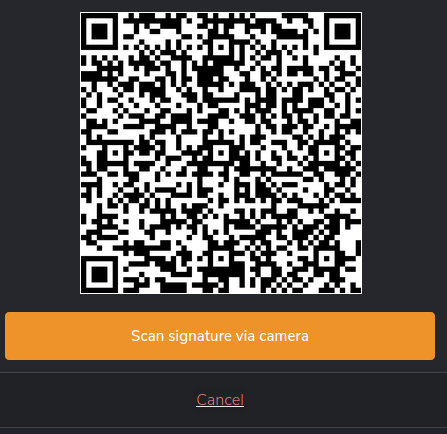
This is exactly what I wanted to test, thanks for seeing this, and sorry for my lack of test early on.

Tested the extension again with Signer. My (rather old) phone still has problems to read the QR code in dark mode, I'd go for a little more than 1px on the img border to make it even simpler: here

Found some nits, but honestly the experience is great:

  • I find this Cancel (or any link) rather hard to read (the line under doesn't help). Suggestion: no line, more contrast?
  • I'd remove the border on the top, right and left of the header to make the extension feel unified: here

Copy link
Member

@jacogr jacogr left a comment

Choose a reason for hiding this comment

The reason will be displayed to describe this comment to others. Learn more.

Thanks an absolute million. Really excited to have this and moving thing forward.

As discussed, will log some issues for the not-new issues and anything that may pop-up.

@jacogr jacogr merged commit 85db56c into polkadot-js:master Dec 20, 2019
@polkadot-js-bot
Copy link

This pull request has been automatically locked since there has not been any recent activity after it was closed. Please open a new issue for related bugs.

@polkadot-js polkadot-js locked as resolved and limited conversation to collaborators Jun 3, 2021
Sign up for free to subscribe to this conversation on GitHub. Already have an account? Sign in.
Labels
None yet
Projects
None yet
Development

Successfully merging this pull request may close these issues.

None yet

5 participants