README Image concepts #90
Assignees


Labels
status: wip
work in progress
Comments
|
Trying to get closer to the website illustration styles. I took some of the inspiration from this image:
|

|
Thanks @ashygee this is heading in the right direction! Some feedback below (also posted in slack earlier):
|
26 tasks
|
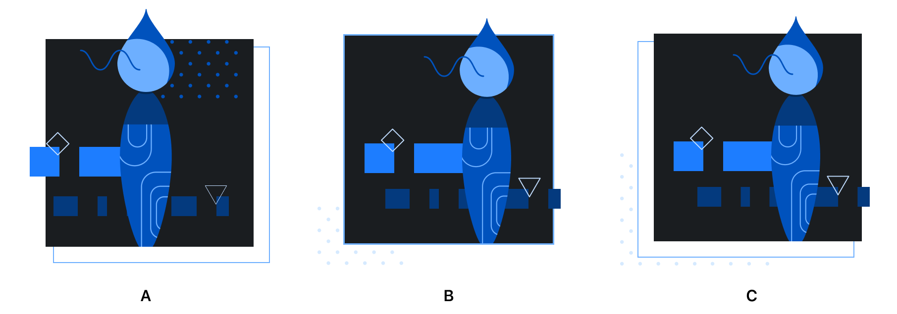
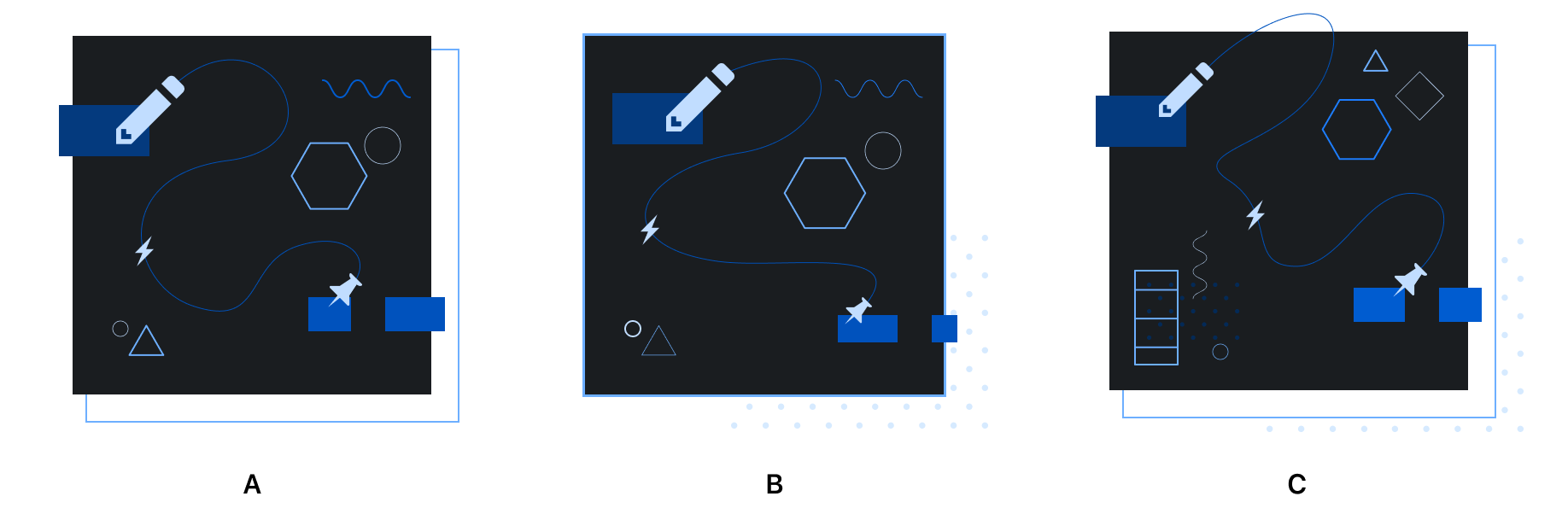
@broccolini I've gone ahead and fine-tuned the concepts with your feedback. The concepts for primer/styles and primer/components both have three different variations for background:
primer/styles concepts
primer/components concepts
Details
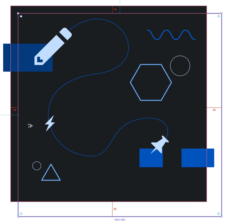
MocksExample screen mocks of the README images can be seen in full resolution in Figma.
|


|
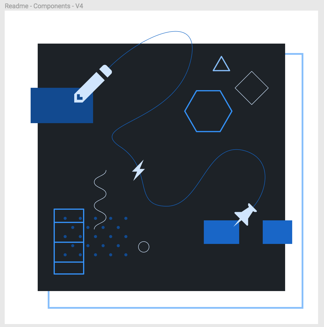
README images live on primer/components and primer/primer.style repos |

Closed
Sign up for free
to join this conversation on GitHub.
Already have an account?
Sign in to comment
Per the conversation with @broccolini on Primer illustrations, I've updated the readme concepts for the primer/styles and primer/components readme's.
You can view in detail in the figma file. I've also included some mocks of what the readme will look like when viewed on GitHub. View in Figma
The text was updated successfully, but these errors were encountered: