WARNING: The scale of the spread has meant that the individual data is no longer relevant or useful. This visualization has been removed to reduce any confusion. See the main dashboard for up to date information.
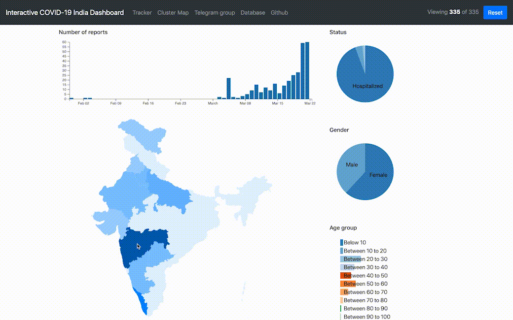
The dashboard was made using dc.js which brings crossfilter and d3 together to be able to filter the visualisation on the fly by interacting with the charts. The data comes from the API made by the good folks at covid19india.org.
No setup should be required, these are just static files.
Pull requests and bug reports are welcome!