xticks missing for scatter plots with colors #10611
Comments
|
Thanks for the report. Strange, may be related to the order or method of ax, plot and colorbar creation...? We should specify the occurrence condition. |
|
I was checking previous versions of Pandas and I can confirm that the bug starts in 0.16.1 and it is still in 0.16.2 |
|
I hit this bug as well (0.16.2), and I can confirm that this problem appears only with |
|
as a quick workaround use |
|
|
|
Still an issue in 0.20.3 |
|
@dr-1 PR's to fix are welcome. or event a simple repro on 20.3, as this issue is still open |
|
I encountered this bug also. See screenshots of the two versions of the plot, one with colors, one without. The full notebook (without output, as it's still WiP) is at: http://go.gwu.edu/engcomp2lesson4
|

|
I'm having this issue in pandas 0.22.0 running in Jupyter notebook. Would it solve the issue to hardcode |
|
Hardcoding @tacaswell maybe you have a quick answer. With import matplotlib.pyplot as plt
import numpy as np
x = np.arange(20)
y = np.sin(x)
c = np.hstack([np.ones_like(x[:10]) * 0.25,
np.ones_like(x[10:]) * 0.75])
fig, ax = plt.subplots()
sc = ax.scatter(x, y, c=c, cmap='viridis')
plt.colorbar(mappable=sc, ax=ax, ticks=[0, 0.25, 0.5, 0.75, 1.0]);Is there any way to disable the update done to the x axis ticks (not sure if it's the tick labels or something else) in the With matplotlib that gives
with pandas gives
|


|
For reference, here's the MPL code that we're calling: pandas/pandas/plotting/_core.py Lines 872 to 877 in 8a58303 |
|
Not sure if this is a duplicate, but I dug a bit deeper into the code. It is happening in _handle_shared_axes. If you comment the following line the issue disappears: pandas/pandas/plotting/_core.py Line 255 in 8a58303 it seems to stem from this line: pandas/pandas/plotting/_core.py Line 426 in 8a58303 I tried running the code from within _core.py to explore this more closely. Compare this:
with this:
|
|
@javadnoorb thanks for looking. So your suspicion is that if we excluded the newly created colorbar axes from |
|
FWIW, extracting the colorbar axes may be a tad difficult, but we should be able to hack something together. |
|
That's my guess @TomAugspurger. I vaguely remember that I extracted colorbar axes before, and as you said it was not very straightforward. I'll look more into this within the next couple of days and will get back to you. |
|
FWIW, we're creating the colorbar axes, and we control every method here, so as a last resort you could add a private attribute like |
|
That's a good idea. |
|
No idea, but probably :)
IIRC, the only other code we have is from hexbin. I don't recall if it
shares an implementation with scatter.
…On Mon, Mar 19, 2018 at 11:02 AM, Javad Noorbakhsh ***@***.*** > wrote:
That's a good idea. _handle_shared_axes seems to be just a few for loops
through the axes, so that would probably resolve this. Could that conflict
with other subplottings with colorbars?
—
You are receiving this because you were mentioned.
Reply to this email directly, view it on GitHub
<#10611 (comment)>,
or mute the thread
<https://github.com/notifications/unsubscribe-auth/ABQHIgEbRNHB71-i_VE7m0_eJ67RrS7vks5tf9aZgaJpZM4Fa7yI>
.
|
|
@TomAugspurger I'm going through this code. You're right. Extracting colorbars is not very easy. I think what you suggested with the private attribute is the way to go. The issue as far as I can tell is that axes are matploltlib objects, so I don't know of any clean way to define a private attribute for them without inheritance. Any ideas? We also need to be careful with pandas/pandas/plotting/_tools.py Line 299 in 8a58303 It loops through all axes and uses _remove_labels_from_axis to remove the axis label unless it is the last row/column or sharex/sharey=False. Simply skipping the colorbar axes wouldn't solve the problem, because by default when sharex=True, _remove_labels_from_axis will be applied to the axis anyway. However it only loops through axes if there are more than one rows/columns. So one solution I can think of is:
This won't mess up with multiplots (although we might want to do the same to ncols as well?). But it's a bit hacky. Any better solution you can think of? A second way to deal with this might be to alter layout: pandas/pandas/plotting/_tools.py Line 308 in 8a58303 whenever there is only one non-colorbar axis. Beside scatter, colorbars seem to only be used by hexbin, and they don't seem to share any code except through PlanePlot. Their colorbar implementation is very similar. So I think resolving the issue with scatter should similarly affect hexbin. |
|
The above hacks I was thinking of assume that we're dealing with a single scatterplot with a single colorbar. A more general solution to deal with multiple subplots will require more work. |
|
The hack I had in mind was getting the new cbar ax from and then directly adding a Then in the _handle_shared_axes we'll skip axes where |
|
Interesting. I didn't know it was possible to assign attributes to objects in python. That's a pretty nice feature! |
|
It's rightly considered a hack :)
…On Tue, Mar 20, 2018 at 8:20 AM, Javad Noorbakhsh ***@***.***> wrote:
Interesting. I didn't know it was possible to assign attributes to objects
in python. That's a pretty nice feature!
—
You are receiving this because you were mentioned.
Reply to this email directly, view it on GitHub
<#10611 (comment)>,
or mute the thread
<https://github.com/notifications/unsubscribe-auth/ABQHIjtF4v2V4mJu7re3L3qWzHpuP_u3ks5tgQIkgaJpZM4Fa7yI>
.
|
|
I like it! I think skipping I think we need something like |
|
I’m not sure. I don’t even know what the interaction of a color at and subplots is.
…________________________________
From: Javad Noorbakhsh <notifications@github.com>
Sent: Tuesday, March 20, 2018 8:50:32 AM
To: pandas-dev/pandas
Cc: Tom Augspurger; Mention
Subject: Re: [pandas-dev/pandas] xticks missing for scatter plots with colors (#10611)
I like it!
I think skipping getattr(ax, '_pandas_colorbar_axes', False) will avoid removing tick labels from all the axes except for colorbars. So it will interfere with subplots if there are multiple plots. Don't you think?
I think we need something like axarr=[ax for ax in axarr if getattr(ax, '_pandas_colorbar_axes', False)] and corresponding changes to nplots, naxes, nrows, ncols in the first line of _handle_shared_axes
—
You are receiving this because you were mentioned.
Reply to this email directly, view it on GitHub<#10611 (comment)>, or mute the thread<https://github.com/notifications/unsubscribe-auth/ABQHIpYA7E_Sokl_jS-RPgQYuj-ewf_Rks5tgQkngaJpZM4Fa7yI>.
|
|
@TomAugspurger, I made your suggested changes in my own fork: seems to be working fine:
Will probably require more testing. But I've never done this. What's the proper testing procedure before PR? |

|
Ideally you'd write a test that fails without your changes, apply the
changes, and then make sure the test passes with your changes.
But feel free to make a PR whenever.
…On Wed, Mar 21, 2018 at 8:15 PM, Javad Noorbakhsh ***@***.***> wrote:
@TomAugspurger <https://github.com/tomaugspurger>, I made your suggested
changes in my own fork:
https://github.com/javadnoorb/pandas
seems to be working fine:
%matplotlib inline
import numpy as np
from mypandas import pandas as pd
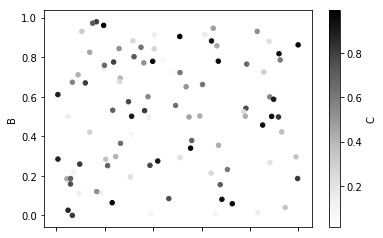
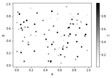
df = pd.DataFrame(np.random.random((1000,3)),columns=['A','B','C'])
df.plot.scatter('A','B',c='C');
df.plot.hexbin('A','B', gridsize=25);
[image: image]
<https://user-images.githubusercontent.com/26352146/37745615-256baf16-2d4c-11e8-97b5-2ec4a4ceb835.png>
[image: image]
<https://user-images.githubusercontent.com/26352146/37745631-3eedf016-2d4c-11e8-88cd-d3b47a000b7f.png>
Will probably require more testing. But I've never done this. What's the
proper testing procedure before PR?
—
You are receiving this because you were mentioned.
Reply to this email directly, view it on GitHub
<#10611 (comment)>,
or mute the thread
<https://github.com/notifications/unsubscribe-auth/ABQHImDiQktbntZM0QS5AyFoSJ1xpliIks5tgvsdgaJpZM4Fa7yI>
.
|
|
So @javadnoorb has submitted #20446, but I notice that with matplotlib 2.2.2 I'm getting the correct output on pandas master (without @javadnoorb's fix). Would the people in this thread mind updating to matplotlib 2.2.2 and try out this code: import matplotlib.pyplot as plt
import numpy as np
import pandas as pd
x = np.arange(20)
y = np.sin(x)
c = np.hstack([np.ones_like(x[:10]) * 0.25,
np.ones_like(x[10:]) * 0.75])
ax2 = pd.DataFrame({'x': x, 'y': y, 'c': c}).plot.scatter(x='x', y='y', c='c', cmap='viridis');My figure has the xaxis visible
|

|
I upgraded to matplotlib 2.2.2 and still get the old result (without x-axis label). @TomAugspurger are you running this in Jupyter notebook? |
|
I was not. I'd forgotten that it was just for the inline backend. Nevermind
then.
…On Fri, Mar 30, 2018 at 8:42 AM, Javad Noorbakhsh ***@***.***> wrote:
I upgraded to matplotlib 2.2.2 and still get the old result?
@TomAugspurger <https://github.com/TomAugspurger> are you running this in
Jupyter notebook?
—
You are receiving this because you were mentioned.
Reply to this email directly, view it on GitHub
<#10611 (comment)>,
or mute the thread
<https://github.com/notifications/unsubscribe-auth/ABQHIluRDrEV9sXwGg1XU5zGHUTK4HYiks5tjjY5gaJpZM4Fa7yI>
.
|
|
I had forgotten too. But I think this is an issue. I suspect the tests we've written for the PR are going to always pass. We need tests to run with inline backend. |
|
This was resolved in the master for a while but seems to have returned since 0.24.0. Example code: %matplotlib inline
import numpy as np
import pandas as pd
random_array = np.random.random((1000, 3))
df = pd.DataFrame(random_array,columns=['A label','B label','C label'])
df.plot.scatter('A label', 'B label', c='C label')output: I think the culprit is: pandas/pandas/plotting/_core.py Line 833 in d3c9d6e Note that this only happens in the inline backend. Output of
|

|
I am having the same issue |
|
Same here, executing from a Jupyter Notebook (I haven't fully understood whether it is important or not) with Matplotlib version greater than 3.0 (3.0.3). Pandas version is 0.24.2. I have tried forcing the workaround highlighted by @javadnoorb but it didn't change anything for me.
Edit : My bad, just printing the two figures one above the other made me realise that it was maybe just the width missing. I put a larger |


|
I hit this bug as well, and I found a solution that add one ax. https://stackoverflow.com/questions/52631031/make-pandas-plot-show-xlabel-and-xvalues
|

example: https://www.wakari.io/sharing/bundle/adamgreenhall/test-scatter
I think this happens specifically for pandas scatter plots with colorbars in ipython. The xticks are still working for:
plt.savefigrelated problem with
%matplotlib inline?: ipython/ipython#1443The text was updated successfully, but these errors were encountered: