
R10 is a library of interactive building blocks written in Elm and elm-ui that we use at Rakuten for creating user interfaces.
Disclaimer: This library is actively used in our live projects and the code and the documentation can be rough in most places because, you know, deadlines! It is also tailored for our use so it is probably useful as source of information rather than as a real dependency to add in your projects.
- R10 demo with documentation and examples
- R10 in the Elm's package website
- R10 in Github
- Ellie: R10 Simple View
- Ellie: R10 Simple Form
- Ellie: R10 Credit Card Form
If you already have an existing Elm project, install the library with
elm install rakutentech/r10See this Ellie.
You can find a fully functional project in the folder examples/pwa. You can use it as a base for a new project simply copying it.
From the root folder of the example, run
npm install
npm start
Then you can preview the website at http://localhost:8000.
Changing src/Main.elm will automatically recompile the application and refresh the browser.
To build the files optimized for the release in production, run:
npm run buildYou can then find the files in elm-stuff/elm-starter-files/build.
The bootstrapped website showcases has these characteristics:
- Single Page Application (SPA)
- Progressive Web Application (PWA)
- Static SSR (pre-render during the build)
- Works off-line and without Javascript
- Installable on desktop and mobile
- Friendly to search engines (SEO)
- Supports custom previews so it looks good when you share links
- Best practices, Accessibility, etc. (High scores with Lighthouse)
- Includes R10 building blocks such as logos, icons, buttons, forms, etc. with coding playgrounds.
- Supports multi language websites
- Standard header and footer
To know more, read the elm-starter documentation and the r10 documentation.
Note: If you copied the file in a new folder you need to modify the elm.json file:
- Remove
../../srcfrom the list ofsource-directories - Run
elm install rakutentech/r10that will add this library as dependency
If you are looking for Rakuten UI components written in other languages or frameworks, have a look at the ReX Github repository and the ReX Frontend Components Library.
Thanks to Evan Czaplicki, Matthew Griffith, Richard Feldman, the folks at NoRedInk, Ryan Haskell-Glatz, Ilias Van Peer, Aaron VonderHaar, Abadi Kurniawaan, Dillon Kearns, Jeroen Engels, Keith Lazuka, Luke Westby, Alex Korban, Thibaut Assus, Brian Hicks and many more from the Elm community that directly or indirectly supported us in this journey.
These are real-life fully working code samples that render these views:
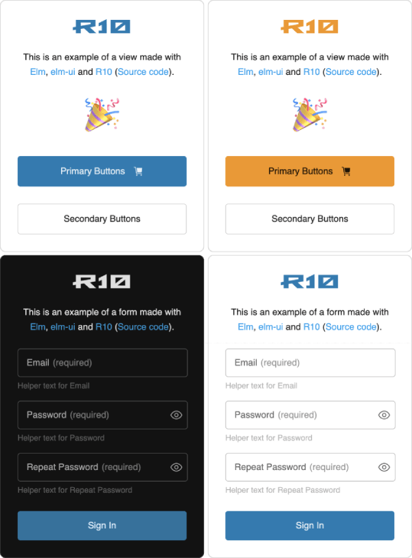
The primary color and the light/dark mode can be changed through the theme definitions. For example:
theme =
    { mode = R10.Mode.Light
    , primaryColor = R10.Color.primary.blueSky
    }

theme =
    { mode = R10.Mode.Light
    , primaryColor = R10.Color.primary.green
    }

theme =
    { mode = R10.Mode.Dark
    , primaryColor = R10.Color.primary.blueSky
    }
This is the source code for the example with two buttons: Source code.
This is the code sample for the view with the form: (Source code).