Aesthetic is an easy to use, fast, Rx-powered theme engine for Android applications.


You can download an APK of the sample project.
- Gradle Dependency
- Integration
- Basics
- View Backgrounds
- Ignoring Views
- Snackbars
- Tab Layouts
- Drawer Layouts
- Bottom Navigation
- Collapsible Toolbar Layouts
- Swipe Refresh Layouts
- Custom View Subclasses
- Activity Keys
The Gradle dependency is available via jCenter. jCenter is the default Maven repository used by Android Studio.
Add this to your module's build.gradle file:
dependencies {
    // ... other dependencies
    implementation 'com.afollestad:aesthetic:0.5.3'
}The easiest way to integrate the library is to have your Activities extend AestheticActivity.
This allows the library to handle lifecycle changes for you:
class MainActivity : AestheticActivity() {

  override fun onCreate(savedInstanceState: Bundle?) {
    super.onCreate(savedInstanceState)
    // setContentView(...), etc.

    // If we haven't set any defaults, do that now
    if (Aesthetic.isFirstTime) {
        Aesthetic.config {
          ...
        }
    }
  }
}
If you don't want to extend AestheticActivity, there are a few methods you need to call:
class AestheticActivity : AppCompatActivity() {

  override fun onCreate(savedInstanceState: Bundle?) {
    Aesthetic.attach(this)  // MUST come before super.onCreate(...)
    super.onCreate(savedInstanceState)
  }

  override fun onResume() {
    super.onResume()
    Aesthetic.resume(this)
  }

  override fun onPause() {
    Aesthetic.pause(this)
    super.onPause()
  }
}
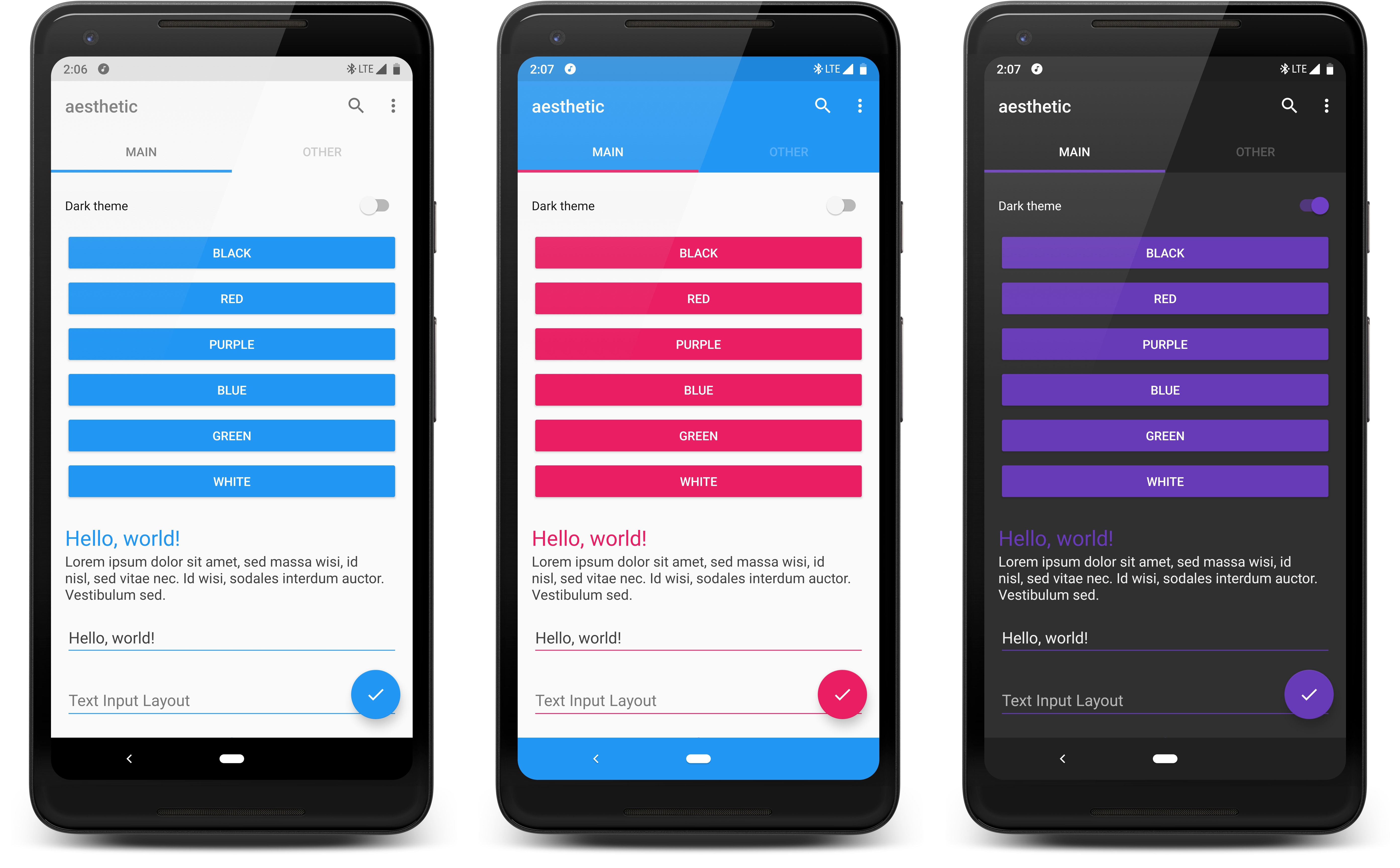
The primary color and accent color are the two base theme colors used by apps. Generally, you
see the primary color on things such as Toolbar's, and the accent color on widgets such as
EditText's, CheckBox's, RadioButton's, Switch's, SeekBar's, ProgressBar's, etc.
You use Aesthetic.get() to retrieve the current attached Aesthetic instance. You can call
the individual property setters on that instance, followed by apply().
Aesthetic.get()
    .colorPrimaryRes(R.color.md_indigo)
    .colorPrimaryDarkRes(R.color.md_indigo_dark)
    .colorAccentRes(R.color.md_yellow)
    .apply()
However, the static config method is provided for convenience. It's a syntax-sugar shortcut to
apply multiple properties on your instance and automatically apply them.
Aesthetic.config {
    colorPrimaryRes(R.color.md_indigo)
    colorPrimaryDarkRes(R.color.md_indigo_dark)
    colorAccentRes(R.color.md_yellow)
}
In any case, this will trigger color changes in the visible Activity WITHOUT recreating it.
The set theme properties will also be persisted automatically. The methods above end with Res,
indicating they take a color resource. If you remove the Res suffix, you can pass a literal color
integer.
All the setter methods also have equivalent getters. For an example, you can get the current primary theme color:
Aesthetic.get()
    .colorPrimary()
    .take(1)
    .subscribe {
      // Use color (an integer)
    }
colorPrimary() returns an RxJava Observable<Integer>. take(1) here retrieves the latest value, and
automatically un-subscribes so you don't continue to receive updates when the primary color changes.
If you were to leave take(1) out, you need to manage the subscription. You will continue to receive
updates every time the primary color is changed, until you unsubscribe.
val subscription =
  Aesthetic.get()
      .colorPrimary()
      .subscribe {
        // Use color (an integer)
      }

// Later, you should unsubscribe, e.g. when your Activity pauses or your View detaches from its Window
subscription.dispose();The status bar is the bar on the top of your screen that shows notifications, the time, etc. (I'm sure you're aware of that). Per the Material Design guidelines, the status bar color should be a slightly darker version of the primary color. You can manually set the color:
Aesthetic.config {
    colorStatusBar(R.color.md_indigo_dark)
}
Or you can have it automatically generated from the primary color (you need to set the primary color first):
Aesthetic.config {
    colorStatusBarAuto()
}
Aesthetic will automatically use light status bar mode (on Android Marshmallow and above) if your status bar color is light. You can modify this behavior:
// AUTO is the default. ON forces light status bar mode, OFF forces it to stay disabled.
Aesthetic.config {
    lightStatusBarMode(AutoSwitchMode.AUTO)
}By default, the navigation bar on the bottom of your screen is black. You can set it to any color you wish, although generally it should be the same as your primary color if not black or transparent:
Aesthetic.config {
    colorNavigationBarRes(R.color.md_indigo)
}
You can automatically set it to the primary color, also (you need to set the primary color first):
Aesthetic.config {
    colorNavigationBarAuto()
}You can customize text colors which are used on TextView's, EditText's, etc.
Aesthetic.config {
    textColorPrimaryRes(android.R.color.black)
    textColorPrimaryInverseRes(android.R.color.white)
    textColorSecondaryRes(R.color.dark_gray)
    textColorSecondaryInverseRes(R.color.lesser_white)
}
Take this layout:
<LinearLayout
  xmlns:android="http://schemas.android.com/apk/res/android"
  android:layout_width="match_parent"
  android:layout_height="match_parent"
  android:orientation="vertical">

  <TextView
    android:layout_width="match_parent"
    android:layout_height="wrap_content"
    android:text="Hello, world!"
    android:textColor="?android:textColorPrimary"
    android:textSize="24sp"/>

  <TextView
    android:layout_width="match_parent"
    android:layout_height="wrap_content"
    android:text="My name is Aidan."
    android:textColor="?android:textColorSecondary"
    android:textSize="16sp"/>

</LinearLayout>
The first TextView uses the stock Android framework attribute ?android:textColorPrimary, this library
will see that and automatically swap it out with whatever value you set to textColorPrimary.
The second TextView also uses a stock framework attribute, ?android:textColorSecondary. It will
be swapped out with whatever you set to textColorSecondary in this library. If you do not specify a
textColor attribute at all, TextView's will use the secondary text color as a default.
You can set the text color and hint text color on EditText's too. By default, the text
color will match your primary text color, and the hint text color will match your secondary text
color.
In addition to the two stock attributes above, these are some other attributes that are auto swappable:
?colorPrimary, ?colorPrimaryDark, ?colorAccent, ?android:windowBackground,
?android:textColorPrimaryInverse, ?android:textColorSecondaryInverse.
You can modify the "icon and title" colors which are used in various places. A main example is on toolbars. The color of the toolbar title and the menu icons are taken from this theme value. By default, the Material Design guideline colors are used, when isDark() is true and when it's false.
Aesthetic.config {
    colorIconTitleActiveRes(R.color.md_black)
    colorIconTitleInactiveRes(R.color.md_dark_gray)
}
The getter for these methods are combined into one: Observable<ActiveInactiveColors> colorIconTitle(Observable<Integer>).
Another example of where this is used is the text color for Tab Layout tabs. There are others that you will see if you change these values and observe differences.
Aesthetic allows you to change the actual styles.xml theme applied to Activities:
// Apply an overall light theme
Aesthetic.config {
    activityTheme(R.style.Theme_AppCompat_Light_NoActionBar)
    isDark(false)
}

// Apply an overall dark theme
Aesthetic.config {
    activityTheme(R.style.Theme_AppCompat_NoActionBar)
    isDark(false)
}
isDark is important, it's used as a hint by this library for various things. For an example,
with a Switch widget, the unchecked state is either light gray or dark gray based on whether it's
being used with a dark theme or light theme.
When the activityTheme property is changed, the visible Activity will be recreated.
This is the ONLY property which requires a recreate.
Aside from changing the entire base theme of an Activity, you can also change just the window background:
Aesthetic.config {
    colorWindowBackgroundRes(R.color.window_background_gray)
}When you set stock or AppCompat attributes to the background of certain views, Aesthetic will swap out the attribute with your dynamic theme colors at inflation time:
<LinearLayout
  xmlns:android="http://schemas.android.com/apk/res/android"
  android:layout_width="match_parent"
  android:layout_height="196dp"
  android:background="?colorAccent"
  android:orientation="vertical" />
Above, ?colorAccent is an attribute provided by AppCompat. Aesthetic will automatically set the
background to whatever accentColor you have set.
You could also use: ?colorPrimary, ?colorPrimaryDark, ?android:windowBackground,
?android:textColorPrimary, ?android:textColorPrimaryInverse,
?android:textColorSecondary, ?android:textColorSecondaryInverse.
You can make this library ignore views from being themed by setting the view's tag to :aesthetic_ignore.
Snackbar theming is pretty simple. You can change the color of the message text and the color of the (optional) action button.
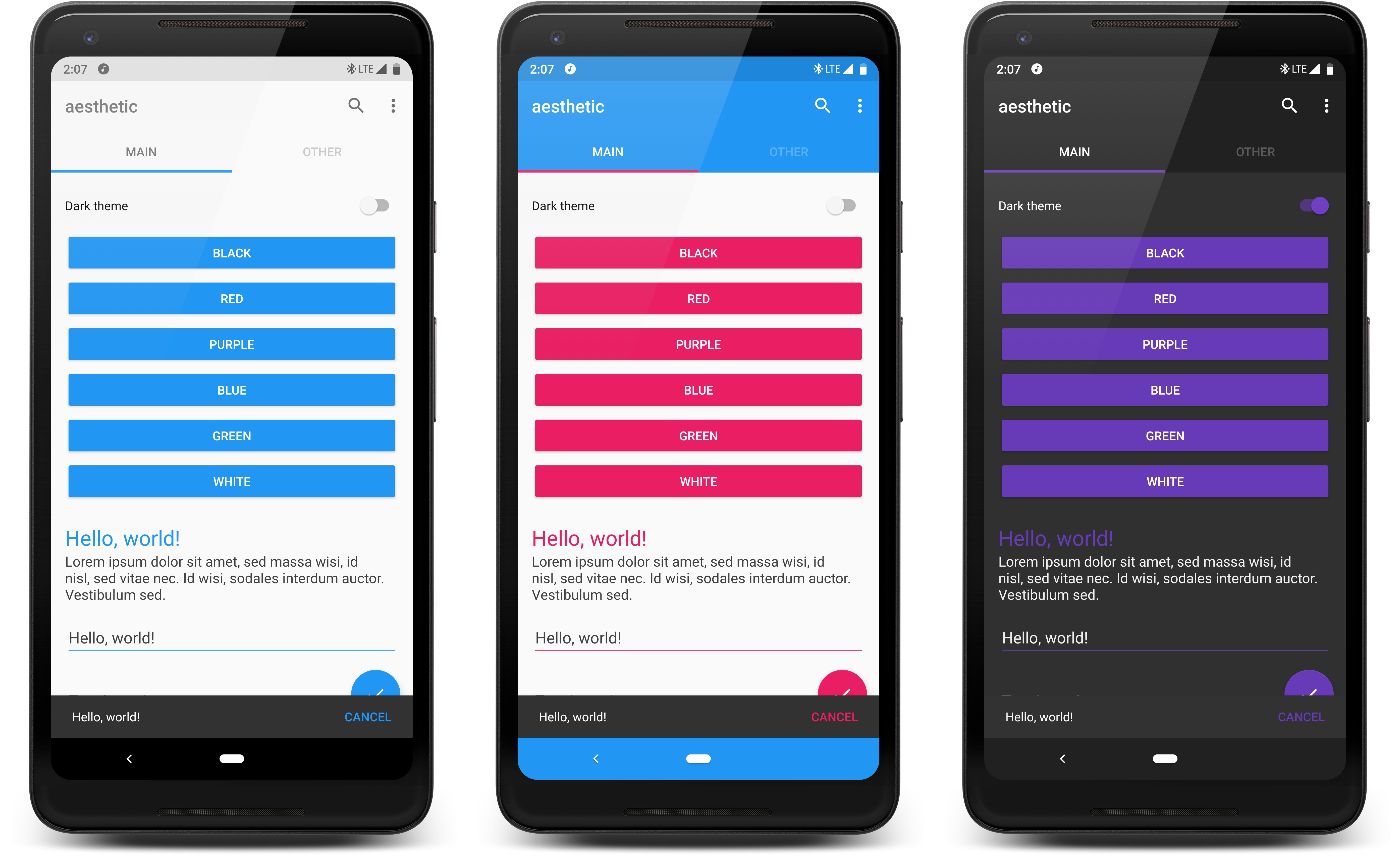
Aesthetic.config {
    snackbarTextColorRes(R.color.white)
    snackbarActionTextColorRes(R.color.md_blue)
}
By default, the text color will match textColorPrimary when isDark() is true, or textColorPrimaryInverse
when isDark() is false. By default, the action text color will match colorAccent().
Tab Layouts from the Design Support library are automatically themed. The main screen in the sample project is an example of this, you see the two tabs under the toolbar at the top.
You can customize background theming behavior:
// The background of the tab layout will match your primary theme color. This is the default.
Aesthetic.config {
    tabLayoutBackgroundMode(TabLayoutBgMode.PRIMARY)
}

// The background of the tab layout will match your accent theme color.
Aesthetic.config {
    tabLayoutBackgroundMode(TabLayoutBgMode.ACCENT)
}
And indicator (underline) theming behavior:
// The selected tab underline will match your primary theme color.
Aesthetic.config {
    tabLayoutIndicatorMode(TabLayoutIndicatorMode.PRIMARY)
}

// The selected tab underline will match your accent theme color. This is the default.
Aesthetic.config {
    tabLayoutIndicatorMode(TabLayoutIndicatorMode.ACCENT)
}
The color of icons and text in your tab layout will automatically be white or black, depending on what is more visible over the set background color.
When your Activity has a DrawerLayout at its root, your status bar color will get set to the
DrawerLayout instead of the Activity, and the Activity's status bar color will be made
transparent per the Material Design guidelines (so that the drawer goes behind the status bar).
If you use NavigationView, it will be themed automatically, also.
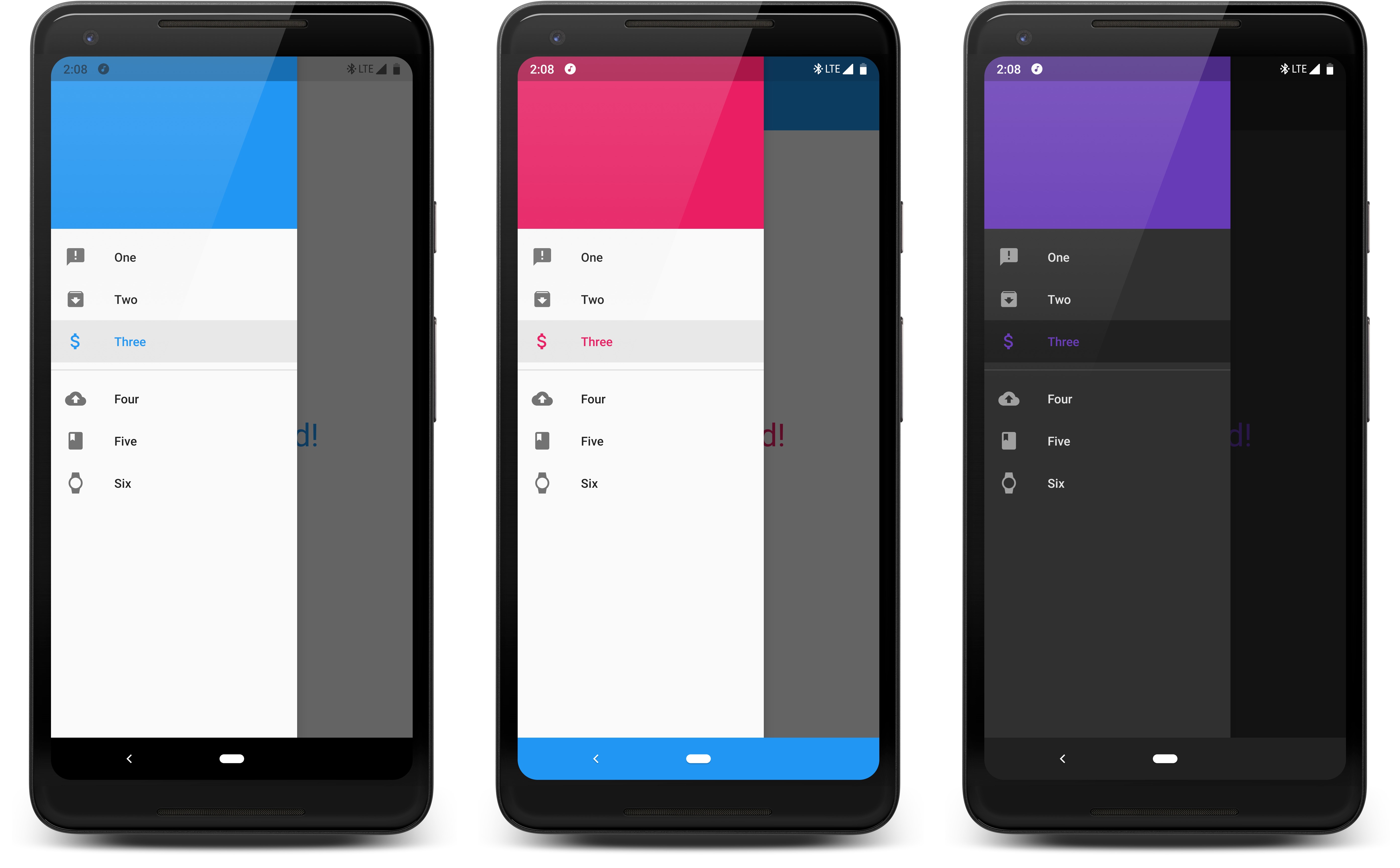
You can customize behavior:
// Checked nav drawer item will use your set primary color
Aesthetic.config {
    navigationViewMode(NavigationViewMode.SELECTED_PRIMARY)
}

// Or checked nav drawer item will use your set accent color
Aesthetic.config {
    navigationViewMode(NavigationViewMode.SELECTED_ACCENT)
}
In addition, unselected nav drawer items will be shades of white or black based on the set isDark value.
Bottom Navigation Views from the Design Support library are automatically themed.
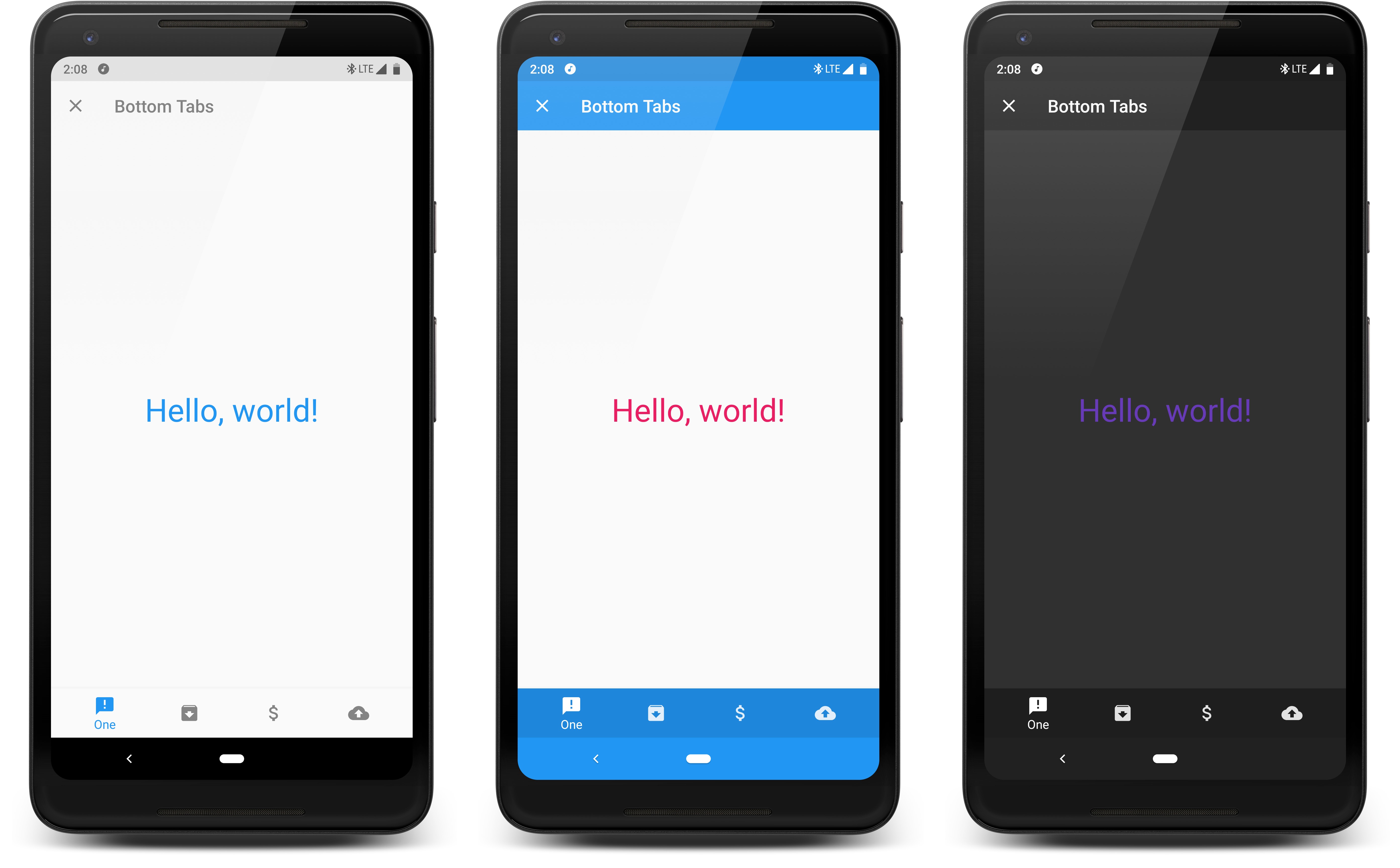
You can customize background theming behavior:
// The background of the bottom tabs will match your primary theme color.
Aesthetic.config {
    bottomNavigationBackgroundMode(BottomNavBgMode.PRIMARY)
}

// The background of the bottom tabs will match your status bar theme color.
Aesthetic.config {
    bottomNavigationBackgroundMode(BottomNavBgMode.PRIMARY_DARK)
}

// The background of the bottom tabs will match your accent theme color.
Aesthetic.config {
    bottomNavigationBackgroundMode(BottomNavBgMode.ACCENT)
}

// The background of the bottom tabs will be dark gray or white depending on the isDark() property.
// This is the default.
Aesthetic.config {
    bottomNavigationBackgroundMode(BottomNavBgMode.BLACK_WHITE_AUTO)
}
You can also customize icon/text theming behavior:
// The selected tab icon/text color will match your primary theme color.
Aesthetic.config {
    bottomNavigationIconTextMode(BottomNavIconTextMode.SELECTED_PRIMARY)
}

// The selected tab icon/text color will match your accent theme color. This is the default.
Aesthetic.config {
    bottomNavigationIconTextMode(BottomNavIconTextMode.SELECTED_ACCENT)
}

// The selected tab icon/text color will be black or white depending on which is more visible
// over the background of the bottom tabs.
Aesthetic.config {
    bottomNavigationIconTextMode(BottomNavIconTextMode.BLACK_WHITE_AUTO)
}
Collapsible Toolbar Layouts are automatically themed, as seen in the sample project.

In the sample layout, we automatically set the accent color to the expanded view. The collapsed toolbar color will match whatever color your toolbar uses, which is the primary theme color by default. You'll also notice that the icons and title color are updated to be most visible over the background color.
Swipe Refresh Layouts from the Design Support library are automatically themed.
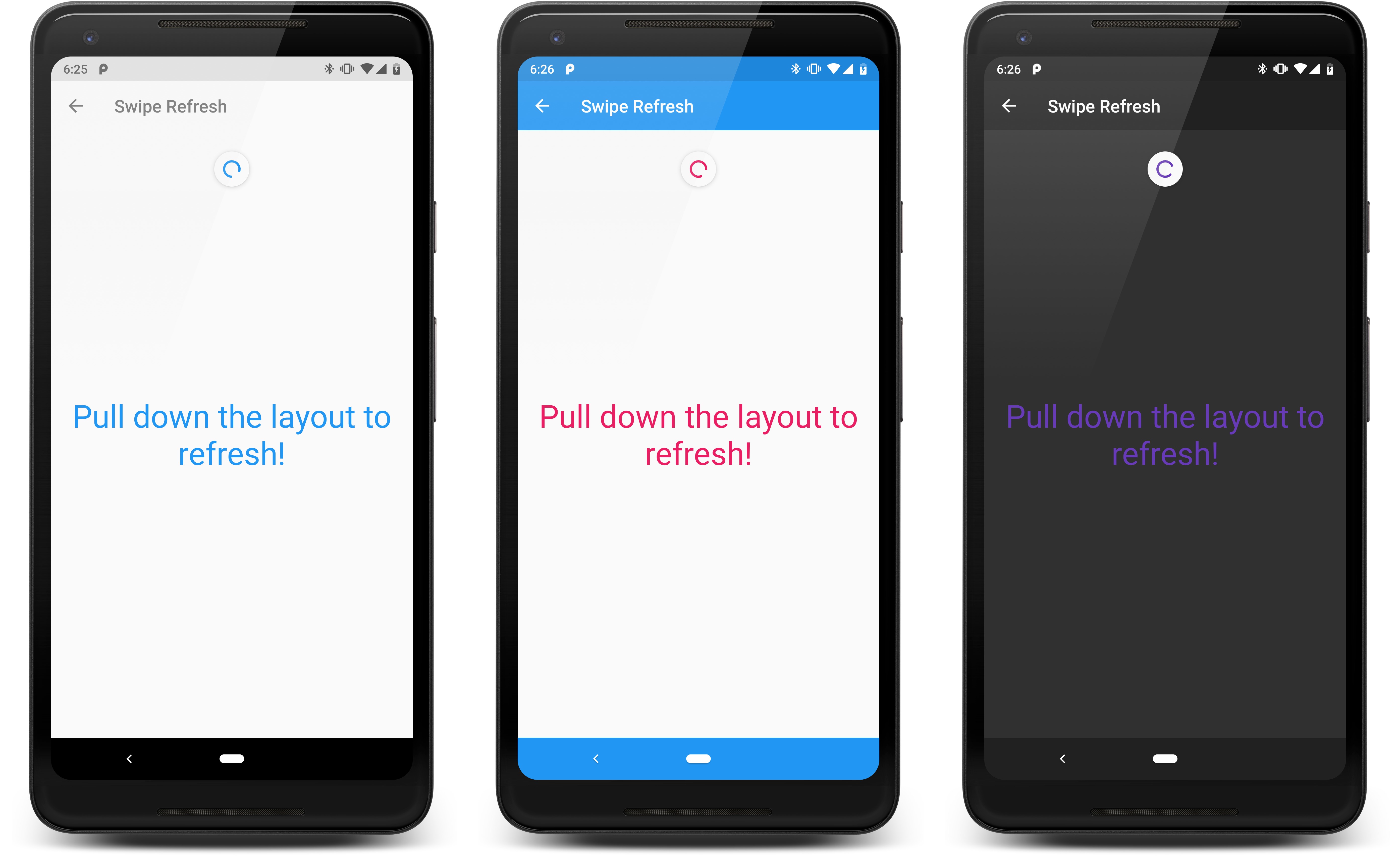
Aesthetic.config {
    swipeRefreshLayoutColorsRes(R.color.md_blue, R.color.md_blue_grey, R.color.md_green)
}
If you take the Res suffix off swipeRefreshLayoutColors, you can pass literal color integers.
You aren't limited to 3, you can pass as little as 1 or as many as you want.
By default, the accent color is used.
If you have custom view subclasses in your app, such as:
class MyCustomTextView : TextView() {
  ...
}
You may want your view to be themable. You can do so by swapping out TextView with AestheticTextView,
or any of Aesthetic's other view classes beginning with "Aesthetic". These views handle subscribing
and unsubscribing from theme property updates automatically; they also handle pulling out attributes
such as android:textColor. Note that all views support background color theming, you don't need to
extend any special views for background color support.
class MyCustomTextView : AestheticTextView() {
  ...
}
Otherwise, you can subscribe to theme properties (as seen in Retrieving Current Values)
such as Aesthetic.get().primaryColor() and manually update your custom view (text color or whatever else).
AestheticActivity has an optional override named key():
class MyActivity : AestheticActivity() {
    ...
    override fun key() {
      return "my_activity";
    }
}
You can return whatever you wish. If this key is specified, this specific Activity will save its
own version of the activityTheme(), colorStatusBar(), and colorNavigationBar() theme properties.
An example of where this can be useful: You have an Activity which displays a list of videos, this main activity has a colored status bar and navigation bar. When you tap a video, it brings you to a player Activity. This player Activity needs a different theme so that the status bar and nav bar are transparent and hidden. You can use a separate key for this player Activity so that it doesn't adopt the same window theme properties as the main activity.
If you do not use AestheticActivity, your custom Activity can implement the AestheticKeyProvider
interface.
In case you are using views from the support library (e.g. TextInputLayout & TextInputEditText), you will need to add the following to your proguard:
-keep class android.support.design.widget.** { *; }