RedBox screen is a bit scary #42
Comments
|
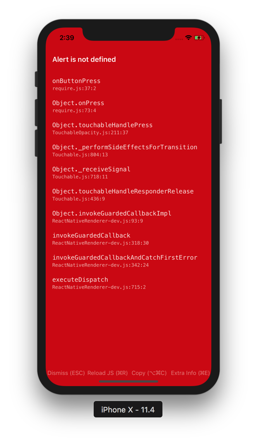
The RedScreen was inspired by Ruby on Rails's error screen:
The idea behind it is to provide high visibility to errors - no need to hunt through logs for the actual error. When the RedBox is contrasted with the RoR inspiration, I do see the RedBox screen could be made less jarring while still successfully displaying all the information we need. |

|
A dark mode would be great 😄 |
|
@hramos that's really interesting. Maybe we can use a different shade of red.. maybe more like a pastel red-color? I did this really quickly to get the ball rolling:
The one in the middle is the current red screen color. Maybe something closer to #E32D31 (the second one) would look better? ps. I am def not a designer so my color senses might be way off. Just a suggestion tho. |

|
One quick and easy way to do it would be to keep the red limited to a header/footer and make the body of the error something more muted. Here's a 30-second idea that might spark something.
|

+1 ! How about this? (new RedBox color is the right one)
|

|
I think a PR that implements something like #42 (comment) has a good chance of getting merged. |
|
@jamonholmgren I don't mean to steal your thunder, but I can take a stab at implementing your idea if you don't mind. I haven't contributed to RN core before and this seems like a fun one to tackle. |
|
@Monte9 go for it 🎉 And thanks for this conversation, I really think it could really help making the DX better :) |
|
I like the RN color 'tomato', it is a softer red but still dark enough to imply that you have an error!
|

|
@morishin - what are the next steps here ? I think everyone loves the idea, so lets see how we can implement it. |
|
@axe-fb I am working on this. It's currently WIP and this is what it looks like so far:
Still need to get Android working, but if that looks good I can submit a PR for it this weekend. |

|
@Monte9 nice job, looks better and less intimidating, can we just improve the color of the file location, it's a little hard to read, maybe use a color with a little more contrast. I can read |

I think the next step is Pull Request by @Monte9 ! 😍 @Monte9 Cool!! How about making the background red color softer? (like #42 (comment) or #42 (comment)) |
|
@morishin @AndreiCalazans for sure. I'll end up posting a few screenshots here with different variations of colors and you guys can let me know which one you prefer. I'll keep you posted. |
|
Alright, I have it working on both iOS & Android and have submitted a PR for it! 🎉 Also, as promised, here are a few variations side-by-side to help us decide which one looks better: Index:[1, 1] - Original iOS


Android


Bonus (Dark Mode)

|
|
Of all the reds I prefer Monte's red! |
|
Thank you for the screenshots! |
|
I like [2,1] myself, but they all look fine! |
|
i like the current red IMO |
|
Great improvements! I like [1,2] myself. One thing to keep in mind is consistency - introducing pastel colors for errors would mean we might need a pastel color for the warning which wouldn't look too nice. |
|
Thanks everyone for the thorough discussion. I'm glad that we are updating the redbox style. I'll close this discussion in favor of the PR that implements this change. Let's have further conversations there if necessary: facebook/react-native#22242 |
Summary:
[Re: RedBox screen is a bit scary - Discussions and Proposals](react-native-community/discussions-and-proposals#42)

Per hramos:
> The RedScreen was inspired by Ruby on Rails's error screen

> I do see the RedBox screen could be made less jarring while still successfully displaying all the information we need.

Hence jamonholmgren came up with the idea that only the header & footer of the RedBox screen could be red. This makes the content a bit more readable as well as makes the screen a little less intimidating.

Also frantic made the suggestion that since the bottom buttons are not as important, they don't need to stand out. Hence only the header of the RedBox screen which displays the error is made red.

Screenshots:
----------

<div style="flex-direction: row">
<img width="325" alt="orginal" src="https://user-images.githubusercontent.com/7840686/48322916-b4958b80-e5de-11e8-9276-33378d1b41c5.png">
<img width="320" alt="redbox_v2_ios" src="https://user-images.githubusercontent.com/7840686/48665300-cce32b80-ea60-11e8-8e8f-88f74bad30ca.png">

</div>

<div style="flex-direction: row">
<img width="300" alt="original_android" src="https://user-images.githubusercontent.com/7840686/48322958-d5f67780-e5de-11e8-891c-1b20bd00e67b.png">
<img width="300" alt="redbox_v2_android" src="https://user-images.githubusercontent.com/7840686/48665312-f13f0800-ea60-11e8-9fb6-47e03c809789.png">

</div>
Pull Request resolved: #22242

Reviewed By: hramos

Differential Revision: D13564287

Pulled By: cpojer

fbshipit-source-id: fcb6ba5e20d863f4b957d20f3787f5b7a365bfdb
Summary:
[Re: RedBox screen is a bit scary - Discussions and Proposals](react-native-community/discussions-and-proposals#42)

Per hramos:
> The RedScreen was inspired by Ruby on Rails's error screen

> I do see the RedBox screen could be made less jarring while still successfully displaying all the information we need.

Hence jamonholmgren came up with the idea that only the header & footer of the RedBox screen could be red. This makes the content a bit more readable as well as makes the screen a little less intimidating.

Also frantic made the suggestion that since the bottom buttons are not as important, they don't need to stand out. Hence only the header of the RedBox screen which displays the error is made red.

Screenshots:
----------

<div style="flex-direction: row">
<img width="325" alt="orginal" src="https://user-images.githubusercontent.com/7840686/48322916-b4958b80-e5de-11e8-9276-33378d1b41c5.png">
<img width="320" alt="redbox_v2_ios" src="https://user-images.githubusercontent.com/7840686/48665300-cce32b80-ea60-11e8-8e8f-88f74bad30ca.png">

</div>

<div style="flex-direction: row">
<img width="300" alt="original_android" src="https://user-images.githubusercontent.com/7840686/48322958-d5f67780-e5de-11e8-891c-1b20bd00e67b.png">
<img width="300" alt="redbox_v2_android" src="https://user-images.githubusercontent.com/7840686/48665312-f13f0800-ea60-11e8-9fb6-47e03c809789.png">

</div>
Pull Request resolved: facebook#22242

Reviewed By: hramos

Differential Revision: D13564287

Pulled By: cpojer

fbshipit-source-id: fcb6ba5e20d863f4b957d20f3787f5b7a365bfdb
Summary:
[Re: RedBox screen is a bit scary - Discussions and Proposals](react-native-community/discussions-and-proposals#42)

Per hramos:
> The RedScreen was inspired by Ruby on Rails's error screen

> I do see the RedBox screen could be made less jarring while still successfully displaying all the information we need.

Hence jamonholmgren came up with the idea that only the header & footer of the RedBox screen could be red. This makes the content a bit more readable as well as makes the screen a little less intimidating.

Also frantic made the suggestion that since the bottom buttons are not as important, they don't need to stand out. Hence only the header of the RedBox screen which displays the error is made red.

Screenshots:
----------

<div style="flex-direction: row">
<img width="325" alt="orginal" src="https://user-images.githubusercontent.com/7840686/48322916-b4958b80-e5de-11e8-9276-33378d1b41c5.png">
<img width="320" alt="redbox_v2_ios" src="https://user-images.githubusercontent.com/7840686/48665300-cce32b80-ea60-11e8-8e8f-88f74bad30ca.png">

</div>

<div style="flex-direction: row">
<img width="300" alt="original_android" src="https://user-images.githubusercontent.com/7840686/48322958-d5f67780-e5de-11e8-891c-1b20bd00e67b.png">
<img width="300" alt="redbox_v2_android" src="https://user-images.githubusercontent.com/7840686/48665312-f13f0800-ea60-11e8-9fb6-47e03c809789.png">

</div>
Pull Request resolved: facebook/react-native#22242

Reviewed By: hramos

Differential Revision: D13564287

Pulled By: cpojer

fbshipit-source-id: fcb6ba5e20d863f4b957d20f3787f5b7a365bfdb
Introduction
isn't it?
The Core of It
How about making it softer color?☺️
(like YellowBox)
These look like current implementations.
Discussion points
The text was updated successfully, but these errors were encountered: