Avoid horizontal scrolling in header for mobile devices #1751
Conversation
|
Hm. Looks like Dan merged something that touches this codepath already and we clashed. I think this approach is still worth consideration 😄I'll hold off on dealing with merge conflicts until/unless other people also think it's worthwhile. |
|
Deploy preview for reactjs ready! Built with commit 6c89800 |
|
The layout reflow is kind of unattractive imo. I think the current approach is still the nicest alternative to a hamburger menu, but with a modification to the gradient so when scrolled right to the left/right edge, it doesn't appear (maybe extra padding?) |
|
Sorry for the conflict, I just wanted to plug the visible scrollbar problem on Windows asap. I like that in this PR iPhone has a smaller font so everything fits by default. I'd like to see that change. However, I prefer the current search/top bar behavior that doesn't reflow elements. |
Edit Sorry! I just understood what you were referring to was the little animated recording. Yeah, I agree that's not great. Let me think on that part a bit. |
|
No. I tested a fluid range of size between the smallest size Firefox would go (it goes smaller than Chrome/Safari) to a full screen.
I like this suggestion. |
|
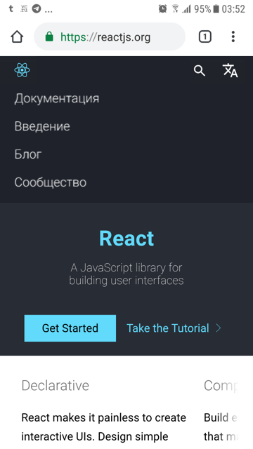
Please do something already, otherwise now the search overlaps last menu item, so generally looks awful...
|
|
@lex111 That seems to be what @sophiebits was talking about regarding adjusting the layout based around English wording. It's currently happening on the website, because "Docs" (English version) is much shorter, and the breakpoint assumes the English version's size. RE two line layout: would the increased height be a problem on mobile since it's a fixed nav? It would reduce the amount of vertical space for viewing content. Maybe when scrolling up it could expand open, when scrolling down to read content, it hides to be one line. |
|
Concept where long words fit well, from Russian translation for example: |
|
Would you like to revisit this? |
|
Hi @bvaughn! Thank you for your pull request. We require contributors to sign our Contributor License Agreement, and yours needs attention. You currently have a record in our system, but the CLA is no longer valid, and will need to be resubmitted. ProcessIn order for us to review and merge your suggested changes, please sign at https://code.facebook.com/cla. If you are contributing on behalf of someone else (eg your employer), the individual CLA may not be sufficient and your employer may need to sign the corporate CLA. Once the CLA is signed, our tooling will perform checks and validations. Afterwards, the pull request will be tagged with If you have received this in error or have any questions, please contact us at cla@fb.com. Thanks! |
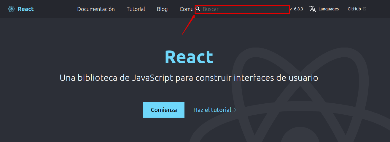
Wouldn't it be nice if the header didn't require horizontal scrolling on smaller devices? Here's one possible take.
cc @joecritch
Screenshots at various sizes
Possible pro (or con)?