

ThemeXpert is a highly customizable theme solution for Flutter apps, designed to make it easy to apply multiple themes in your app and to change your app's visual identity when needed.
- Easily support dark mode in your app.
- Fetch your main design tokens with ease.
- Apply specific themes to widgets to achieve great design and UX.
- Use more than one theme in the same page.
-
Add the
themexpertpackage to your pubspec dependencies. -
Create your own AppTheme class extending from BaseTheme making sure to pass the
context, and add your theme tokens to your theme class.class AppTheme extends BaseTheme { const AppTheme( super.context, ); Color get surfaceColor => darkMode ? const Color(0xFF0C152C) : Colors.white; Color get textColor => darkMode ? Colors.white : Colors.black; TextStyle get txBody => const TextStyle( fontSize: 20, fontWeight: FontWeight.w600, height: 1.5, leadingDistribution: TextLeadingDistribution.even, ).copyWith(color: textColor); }
-
In case you need a more specific theme, be sure to extend it from [AppTheme] so that you can easily override the necessary fields.
class BlueWidgetTheme extends AppTheme {
    const BlueWidgetTheme(
        super.context,
    );

    @override
    Color get surfaceColor => darkMode ? const Colors.black : Colors.blue;

    @override
    Color get textColor => Colors.white;
}
Note: Notice that you can override certain attributes of your theme, such as
surfaceColorandtextColorin the example above, and you don't need to change the txBody attribute, because it uses the overridden textColor. This is useful when you need to create a specific theme for a widget, but you don't want to create a whole new theme or override all the attributes.
-
To apply your themes, wrap your widget tree with a ThemeXWrapper and pass the desired theme to it.
    ThemeXWrapper(
        theme: SecondaryTheme(context),
        builder: (context) => Container(
            color: ThemeX.ofType<AppTheme>(context).primaryColor,
            child: Text(
                'Secondary Theme',
                style: ThemeX.ofType<AppTheme>(context).txBody,
            ),
        ),
    );
-
Using use your themes' tokens:
- If your token is an override of an AppTheme attribute, you can use
ThemeX.ofType<AppTheme>(context)to access it. - If your token is unique and not available in your general AppTheme, use
ThemeX.ofType<YourSpecificTheme>(context)to access them.
The example below shows both use cases, 1. on the Container's color attribute and 2. on the Text's style attribute:
ThemeXWrapper(
    theme: SpecificWidgetTheme(context),
    builder: (context) => Container(
        margin: const EdgeInsets.all(12),
        width: double.maxFinite,
        color: ThemeX.ofType<AppTheme>(context).primaryColor,
        child: Center(
            child: Text(
            'Specific widget Theme',
            style: ThemeX.ofType<SpecificWidgetTheme>(context)
                .txTitle,
            textAlign: TextAlign.center,
            ),
        ),
    ),
),
Note: Notice that you need to apply the
SpecificWidgetThemebefore using it withThemeX.ofType<SpecificWidgetTheme>(context). - If your token is an override of an AppTheme attribute, you can use
-
[optional] Add a standalone method as a top-level function to make it easy to access your theme's tokens. We reccomend creating it in your AppTheme class' file.
AppTheme themeOf(BuildContext context) {
  return ThemeX.ofType<AppTheme>(context);
}
With that, you can fetch your tokens like this:
    ThemeXWrapper(
        theme: SecondaryTheme(context),
        builder: (context) => Container(
            color: themeOf(context).primaryColor,
            child: Text(
                'Secondary Theme',
                style: themeOf(context).txBody,
            ),
        ),
    );
-
[optional] Add Dark Mode support to your app.
- Add ThemeXConfiguration to the root of your app or before the first occurrence of ThemeXWrapper. If you choose to use MaterialApp, the beginning of your widget tree would look like this:
    @override
    Widget build(BuildContext context) {
        return ThemeXConfiguration(
            darkMode: isDarkMode,
            builder: (context) => ThemeXWrapper(
                theme: AppTheme(context),
                builder: (context) => MaterialApp(
    // ...
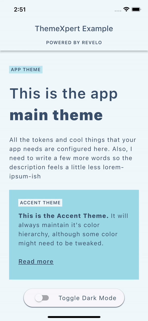
- To toggle dark mode, you should update ThemeXConfiguration's darkMode property. This will update all the themes in your app with the new dark mode configuration. There is a quick example on how to do that in the example app.
- Add ThemeXConfiguration to the root of your app or before the first occurrence of ThemeXWrapper. If you choose to use MaterialApp, the beginning of your widget tree would look like this: