This is a basic tool for visualizing one or more iperf3 log files using Vega-Lite and seaborn.
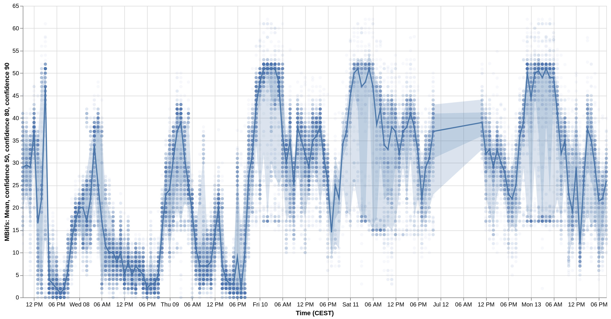
A ribbon plot (line with error bands and scattered raw data) for an iperf3 log folder containing a week of logs (60 second log every 10 Minutes over a period of roughly a week).
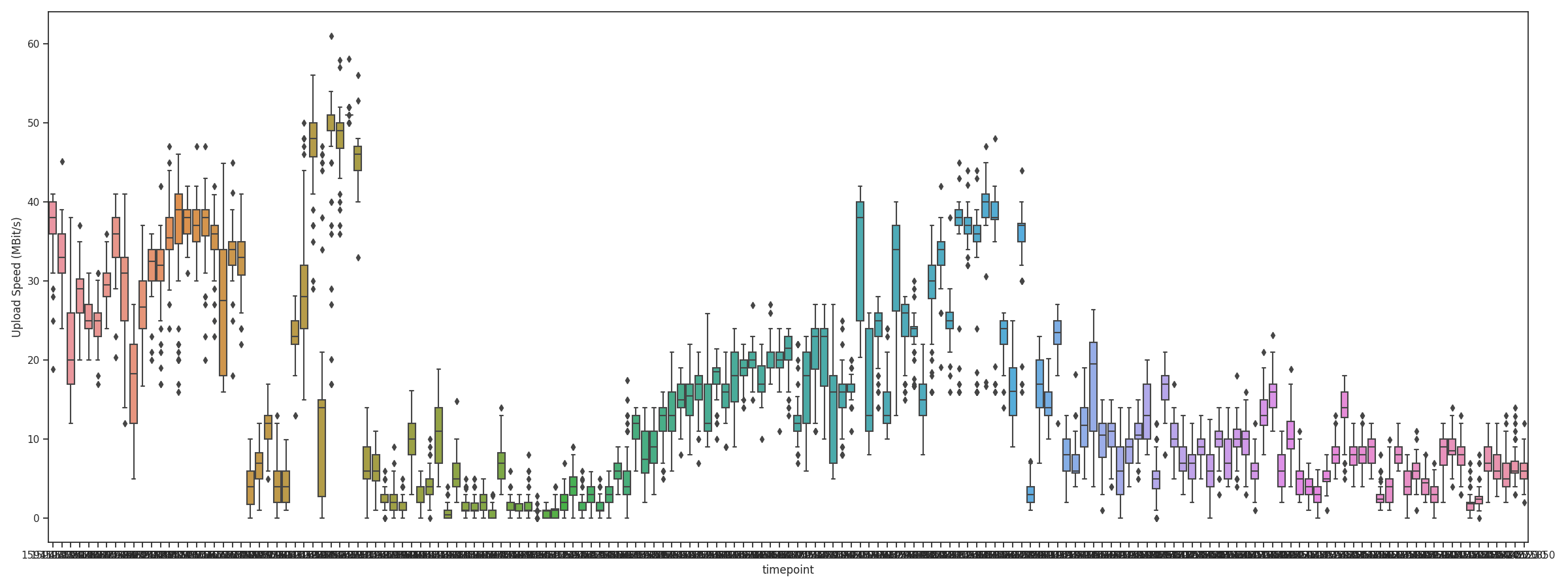
Each box plot represents one iperf log file (60 seconds of measurement per file) measured every 10ish minutes over a time period of roughly 24 hours.
Collect data using iperf3 and save it to any directory. Example: iperf3 -c server --json --logfile /path/to/data/file.json.
If you experience high deviation during the measurement, run iperf3 longer using -t SECS (e.g. 20).
Install the python requirements by pip install --upgrade -r pythonRequirements.txt.
Do yourself a favor and use a virtual environment for that.
Run run.py with arguments:
--data-directory /path/to/data/--output /path/to/output/plot.png(optional)--time-interval pandas_timeseries-offset-alias(optional, defaultH)--box-plot(optional)
To generate the example ribbon plot:
python src/run.py --data-directory /path/to/speedtests --output ~/visualization.png --time-interval 1h
Note that this tool will skip all json files that contain the "error" key.
Feel free to create issues or create pull requests. Clean-up, new features, bug fixes/reports welcome.
Thanks to @lassepe for implementing the Vega-Lite visualization in julia as a prototype.