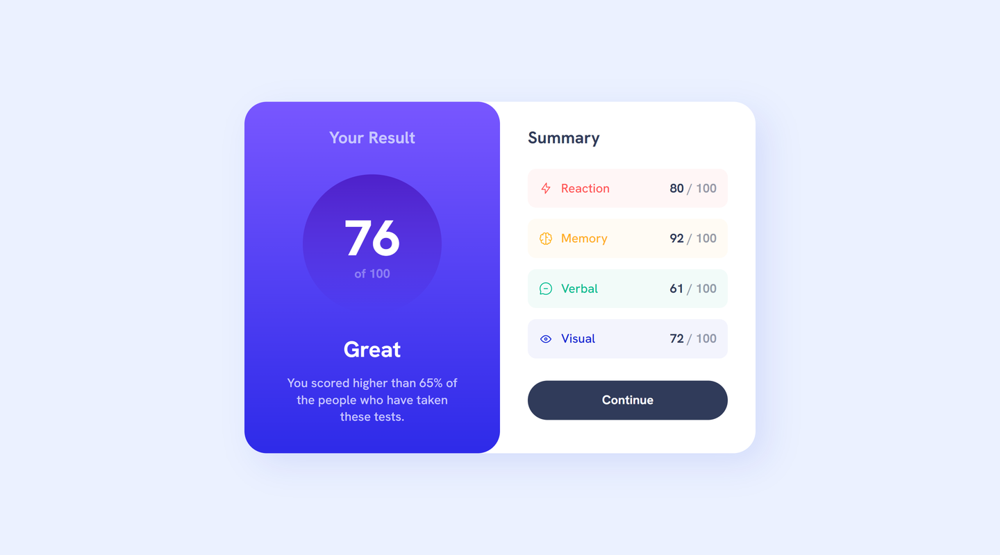
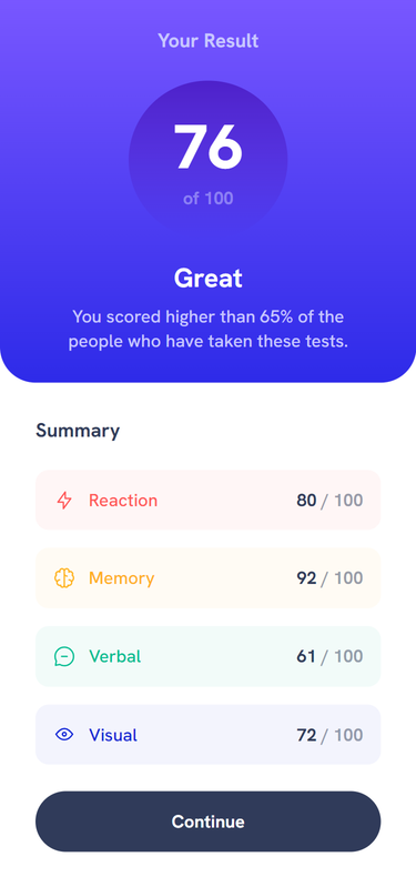
This is a solution to the Results summary component challenge on Frontend Mentor. Frontend Mentor challenges help you improve your coding skills by building realistic projects.
Users should be able to:
- View the optimal layout for the interface depending on their device's screen size
- See hover and focus states for all interactive elements on the page
- Solution URL: GitHub
- Live Site URL: GitHub Pages
- Semantic HTML5 markup
- CSS custom properties
- Flexbox
- CSS Grid
- Mobile-first workflow
This is another front-end challenge attempt.
Tried experimenting with clamp() to adjust various sizes, instead of using media queries.
Using clamp() was mostly trial and error. Would like to learn more about it, and how to use it more effectively.
- Kevin Powell's YouTube
Kevin is an amazing teacher, and I based my solution on his many excellent examples.
- GitHub - @robmeijer
- Frontend Mentor - @robmeijer
- Twitter - @robmeijerdev
The CSS reset I use is based on the one provided by Josh Comeau.

