Style iOS apps with a style sheet
NUI is a drop-in UI kit for iOS that lets you style UI elements using a style sheet, similar to CSS. It lets you style an entire app in minutes.
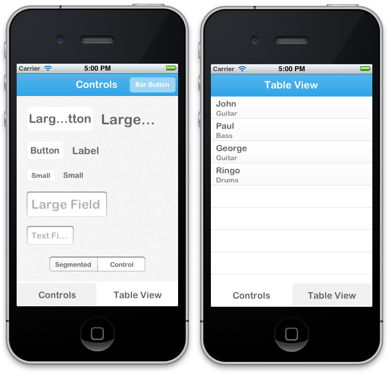
Out of the box, the styling looks like this:

It's easily modified, though. The styling above, for example, is declared like this. There are a couple other screenshots here and here.
The styling is declared using a CSS-like syntax that supports variables:
@primaryFontName: HelveticaNeue;
@secondaryFontName: HelveticaNeue-Light;
@primaryFontColor: #333333;
@primaryBackgroundColor: #E6E6E6;

Button {
    background-color: @primaryBackgroundColor;
    border-color: #A2A2A2;
    border-width: @primaryBorderWidth;
    font-color: @primaryFontColor;
    font-color-highlighted: #999999;
    font-name: @primaryFontName;
    font-size: 18;
    corner-radius: 7;
}
NavigationBar {
    background-tint-color: @primaryBackgroundColor;
    font-name: @secondaryFontName;
    font-size: 20;
    font-color: @primaryFontColor;
    text-shadow-color: #666666;
    text-shadow-offset: 1,1;
}
NUI lets you:
- Update the visual appearance of an entire application in minutes
- Save themes for use in multiple applications
- Set the styles of UI elements using simple rules, like setting
Button { border-color: #CCCCCC; } - Define variables like
@primaryFontNameor@myBackgroundColor(a la Sass/LESS) - Avoid digging through documentation to find how to change specific UI elements' styling
- Quickly create new, custom UI elements and define custom style classes for them
- Copy the NUI directory into your application
- Add the CoreImage and QuartzCore frameworks to your application if you haven't already (like this)
- Add
[NUIAppearance init];toapplication:didFinishLaunchingWithOptionsin AppDelegate.m (like this)
To make an element styled, make it an instance of or inherit from the relevant NUI class, which simply adds styling support to existing UIKit classes. If your button is a UIButton, for example, you'll want to set its class to NUIButton (in Identity Inspector > Custom Class). Please refer to Style Classes below to see the available classes.
If it isn't possible to change the inheritence of the element's class, you can also apply styling with NUIRenderer:
[NUIRenderer renderButton:myButton];
NUIStyle.nss contains all of the style rules. A rule like Button { font-name: Helvetica; } modifies the font name of every NUIButton, for example. (Please note that "NUI" is omitted in the style class for the simplicity's sake.)
The format should be self-explanatory, but here are some notes:
- Styling variables are defined at the top, but they can be added/modified/removed as you see fit.
- NUI subclasses inherit rules from their ancestors (e.g. LargeButton inherits from Button).
- Rules beginning with "UI" are applied via UIAppearance, and thus are applied to all elements of that class in the application, regardless of whether they inherit from a NUI class.
To see all of the available properties and values, see the Style Classes and Style Value Types lists below.
To create, for example, a new UIButton named MyButton, we would do this:
-
File > New > File...
-
Cocoa Touch > Objective-C class > Next
-
Set
ClasstoMyButtonandSubclass oftoNUIButton> Next > Create -
Add the following in MyButton.m:
- (void)initNUI { [super initNUI]; self.nuiClass = @"Button:MyButton"; }
You can now define style rules in NUIStyle.nss for MyButton (see the available properties for Button in Style Classes below). If you don't want MyButton to inherit style rules from NUIButton, set nuiClass to @"MyButton" instead of @"Button:MyButton".
If you've made an element that could be widely reusable, definitely let me know, and I'll likely be very happy to include it in this repo.
N.B. A style class can inherit from an indefinite number of style rules, so if you want to create groups of style rules, you can set nuiClass to something like @"MyStyleGroup1:MyStyleGroup2:MyButton".
Because all of the style rules are contained in NUIStyle.nss, it's easy to create an NUI theme that can be reused in other projects. If you make one you like, let me know, and I'll likely be very happy to include it in this repo.
Below are all of the currently available style classes, their corresponding UI element classes, and the properties they support.
NUIBarButtonItem
- background-color
- background-image
- background-tint-color
- font-color
- font-name
- font-size
- text-shadow-color
- text-shadow-offset
NUIButton
- background-color
- background-color-top/background-color-bottom
- background-image
- background-image-highlighted
- border-color
- border-width
- corner-radius
- font-color
- font-color-highlighted
- font-name
- font-size
- height
- text-alpha
- text-auto-fit
- text-shadow-color
- text-shadow-offset
NUILabel
- font-color
- font-color-highlighted
- font-name
- font-size
- text-alpha
- text-auto-fit
- text-shadow-color
- text-shadow-offset
NUINavigationBar
- background-color
- background-color-top/background-color-bottom
- background-image
- background-tint-color
- font-color
- font-name
- font-size
- text-shadow-color
- text-shadow-offset
NUISegmentedControl
- background-tint-color
- background-color
- font-color
- font-name
- font-size
- text-shadow-color
- text-shadow-offset
NUITabBar
- background-color
- background-color-top/background-color-bottom
- background-image
- background-tint-color
- font-color
- font-name
- font-size
- text-offset
- text-shadow-color
- text-shadow-offset
NUITableViewCell
- background-color
- background-color-top/background-color-bottom
- font-color
- font-color-highlighted
- font-name
- font-size
- text-alpha
- text-auto-fit
- text-shadow-color
- text-shadow-offset
The detail label of a NUITableViewCell
- font-color
- font-color-highlighted
- font-name
- font-size
- text-alpha
- text-auto-fit
- text-shadow-color
- text-shadow-offset
NUITextField
- border-style
- font-name
- font-size
- height
NUIView
- background-color
- background-image
- See Button
- See Button
- See Label
- See Label
- See TextField
These classes are applied via UIAppearance, so they are applied to all elements of that class in the application, regardless of whether they inherit from a NUI class.
- background-color
- background-image
- background-tint-color
- font-color
- font-name
- font-size
- text-offset
- text-shadow-color
- text-shadow-offset
A back button, inherits from UIBarButtonItem
- background-color
- background-image
- background-tint-color
- background-color
- background-image
- background-tint-color
- background-color - Color
- background-color-top/background-color-bottom - Gradient
- background-image - Image
- background-image-highlighted - Image
- background-tint-color - Color
- border-color - Color
- border-style - BorderStyle
- border-width - Number
- corner-radius - Number
- font-color - Color
- font-color-highlighted - Color
- font-name - FontName
- font-size - Number
- height - Number
- text-alpha - Number
- text-auto-fit - Boolean
- text-offset - Offset
- text-shadow-color - Color
- text-shadow-offset - Offset
- Boolean - A boolean (
trueorfalse) - BorderStyle - A border style, as rendered by a UITextBorderStyle. Accepted values are
none,line,bezel, androunded. - Color - A hex color (e.g.
#FF0000) orclearfor a[UIColor clearColor] - FontName - A font name (see available values here)
- Gradient - Two Colors that will create a vertical gradient. background-color-top and background-color-bottom need to be defined in separate .nss properties.
- Image - A name of an image, as used in
[UIImage imageNamed:name](e.g.MyImage.png). - Number - A number (e.g.
-1,4.5) - Offset - Two numbers comprising the horizontal and vertical values of an offset (e.g.
-1,1)
Absolutely! NUI covers a lot of ground, but there's still a large number of elements and properties that are still unsupported. If you've made a NUIStyle.nss theme that you really like, it'd be excellent to add it to this repo.
NUI has been tested on both iOS 5.1 and iOS 6.0.
UIAppearance is great, but it doesn't allow for the granularity that NUI does, and it doesn't support as many styling modifications as NUI. For example, NUI lets you create multiple classes for a single UI element (e.g. NUIButton, NUILargeButton, NUISmallButton), and it lets you easily add gradients to many elements.
Yep! It's unclear when it will be launched, it won't be free (in either meaning of the word, likely), and the jury is still out on how good of a product it'll be. I prefer free, lightweight solutions.
"New-ee". (It rhymes with "GUI", of course.)