As part of the Roku OS 10.0 release, Roku's standard dialog framework enables developers to use new pre-built modal pop-up dialogs and build custom ones. Dialogs are used to display information to users that require their immediate attention (for example, selecting a subscription product, entering credentials or account information, informing the user that a screen is loading, and so on).
This sample channel includes examples for the built-in standard keyboard, PINpad, and message dialogs, and custom dialogs featuring the standard dialog building blocks such as the keyboard, text and bullet text, and progress loaders.
To run this sample channel, follow these steps:
-
Download and extract the sample channel.
-
Follow the steps in Development environment setup to enable developer mode on your device, archive the files, and then sideload the archive to your Roku device.
-
In the UI of the sample channel, select a keyboard from the list.
These new pre-built and custom standard keyboards are summarized as follows:
-
New pre-built message, keyboard, pin pad, and progress dialogs. These new dialogs feature updated graphics and color palette support that enable developers to provide a consistent user experience across the dialogs in their channel (and across the Roku platform as developers can easily adopt the new design of Roku OS system dialogs). In addition, the keyboard and pin pad dialogs include voice entry support for faster customer sign-ups and sign-ins. These new dialog nodes deprecate the legacy versions.
-
Developer-defined custom dialogs. Developers can design custom dialogs that may include a combination of text, buttons, bulleted lists, keyboards, loading indicators, and other building blocks. Custom dialogs also include all the features provided by the pre-built dialogs (voice, custom layout, and graphics). This provides developers with the flexibility to build and configure dialogs to meet their channel's requirements.
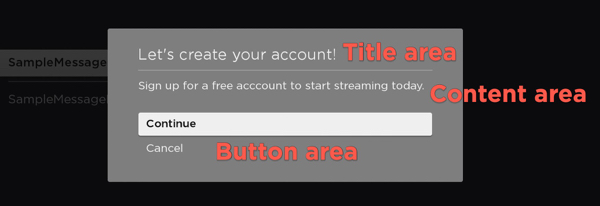
A StandardDialog contains a background image drawn under the dialog contents. The dialog contents include a vertical column containing the following areas (from top to bottom): title area, content area, button area. Each area is optional, which means a dialog may contain one to all three areas. A dialog may only have a single title area and button area, but it may have multiple content areas. The width of the title area, button area, and the sum of the widths of the content areas are always equal.
-
Title Area. The title area is drawn at the top of the dialog. It always contains a primary title that consists of a single line of text that briefly describes the purpose of the dialog. The title area may also include optional icons that appear left or right justified. A dialog may only have a single title area, and the title area is optional.
-
Content Area. A content area is a vertical column of content items. The Content Items may include static information, such as a block of text, a bullet list or a progress indicator, or dynamic objects such as a pin pad or a keyboard. A dialog may only have a single content area, and the content area is optional.
-
Button Areas. The button area contains a vertical-arranged set of buttons. Buttons in a dialog are typically used to confirm or cancel the dialog's operation or to advance forward/backward through a multistep process. A dialog may only have a single button area, and the button area is optional.
The pre-built message, keyboard, pin pad, and progress dialogs inherit their basic properties from the StandardDialog node class, which extends the Group node. The following table summarizes the standard dialog nodes and their hierarchy:
| Node | Description | Example |
|---|---|---|
| Group | ||
| ++ StandardDialog | Defines the width, height, color palette, button selected, and button focused fields that are inherited by its child nodes. | |
| ++++ StandardMessageDialog | Displays a message to the user. |  |
| ++++ StandardKeyboardDialog | Enables text and voice entry of strings consisting of alphanumeric characters as well as many commonly used symbols. |  |
| ++++ StandardPinPadDialog | Enables text and voice entry of numeric digits—typically, short numeric PIN codes. | 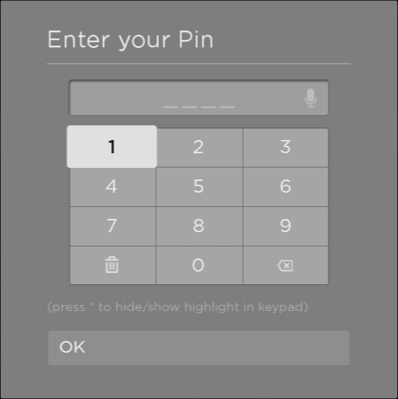 |
| ++++ StandardProgressDialog | Displays a spinning progress indicator that includes a short progress message to the user. |  |
As described in the dialog structure overview, a dialog contains three areas: title, content, and button. Additionally, a custom dialog may include a side card, which is a freeform area to the right or left side of the dialog that is used for displaying decorative images or annotative text.
Each of these areas has a corresponding node for building a custom dialog: StdDlgTitleArea, StdDlgContentArea, StdDlgButtonArea, and StdDlgSideCardArea. Each of these nodes inherits its functionality from the StdDlgAreaBase node, which extends the Group node.
-
The StdDlgTitleArea node does not contain any child nodes. It displays the title and/or icons at the top of the dialog.
-
The StdDlgContentArea node may contain a number of content items such as a block of text, a bullet list or a progress indicator, or dynamic objects such as a pin pad or a keyboard. Each of these content items has a corresponding node that inherits its basic functionality from the StdDlgItemBase node. For example, the text block has a StdDlgTextItem node, the keyboard has a StdDlgKeyboardItem node, and so on.
-
The StdDlgButtonArea node may contain a single StdDlgButton node.
-
The StdDlgSideCardArea node may contain one or SceneGraph nodes (for example, a Poster node for displaying an image or a Label node for displaying text).
The following table summarizes the standard dialog nodes used to build custom dialogs and their hierarchy. For completeness, the content items and buttons that may be included in the StdDlgContentArea and StdDlgButtonArea nodes are listed; however, they do not inherit any properties from the nodes.
| Node | Description |
|---|---|
| Group | |
| ++ StdDlgAreaBase | Provides common functionality for the StdDlgTitleArea, StdDlgContentArea and StdDlgButtonArea classes. |
| ++++ StdDlgTitleArea | Contains the title information and/or icons at the top of the dialog. |
| ++++ StdDlgContentArea | Contains the main body of the dialog, which may include zero to multiple content area items (StdDlgItemBase nodes), which are as follows: ${std-dlg-items-table} |
| ++++ StdDlgButtonArea | Contains any buttons (StdDlgButton nodes) in the button area located at the bottom of the dialog: |
| ++++ StdDlgSideCardArea Available since Roku OS 11.0 |
A freeform area to the right or left side of a custom standard framework dialog that contains decorative images or annotative text. |
{#std-dlg-items-table}
| Node | Description | Example |
|---|---|---|
| StdDlgItemBase | Provides common functionality for all content area items. | |
| ++StdDlgItemGroup Available since Roku OS 11.0 |
Visually groups a set of StdDlgAreaBase child nodes in a custom dialog | |
| ++StdDlgActionCardItem Available since Roku OS 11.0 |
Highlights the StdDlgItemBase child nodes in the content area of a custom dialog. | 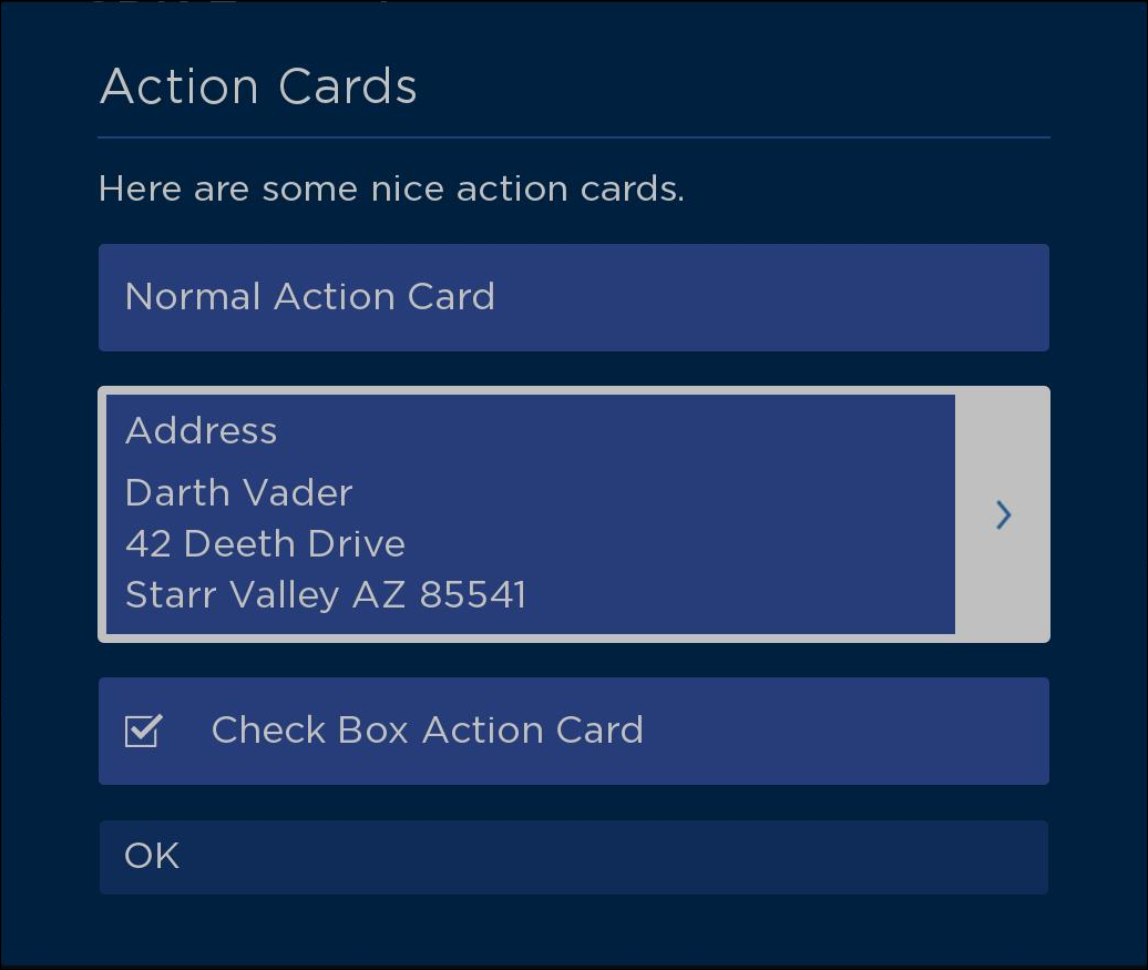 |
| ++ StdDlgBulletTextItem | A bulleted list of text. | 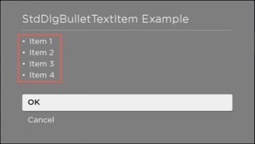 |
| ++ StdDlgDeterminateProgressItem | A progress indicator that represents the percentage of the progress that has been completed. | 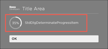 |
| ++ StdDlgGraphicItem | An image with an optional text label. | 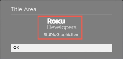 |
| ++ StdDlgKeyboardItem | Either a keyboard or PIN pad for the text and voice entry of alphanumeric/symbol strings or numeric digits (typically, short numeric PIN codes), respectively. | 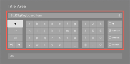 |
| ++ StdDlgMultiStyleTextItem Available since Roku OS 11.0 |
A line of text with multiple styles (for example, plain and bold characters, different fonts, multiple colors, and/or emojis). | 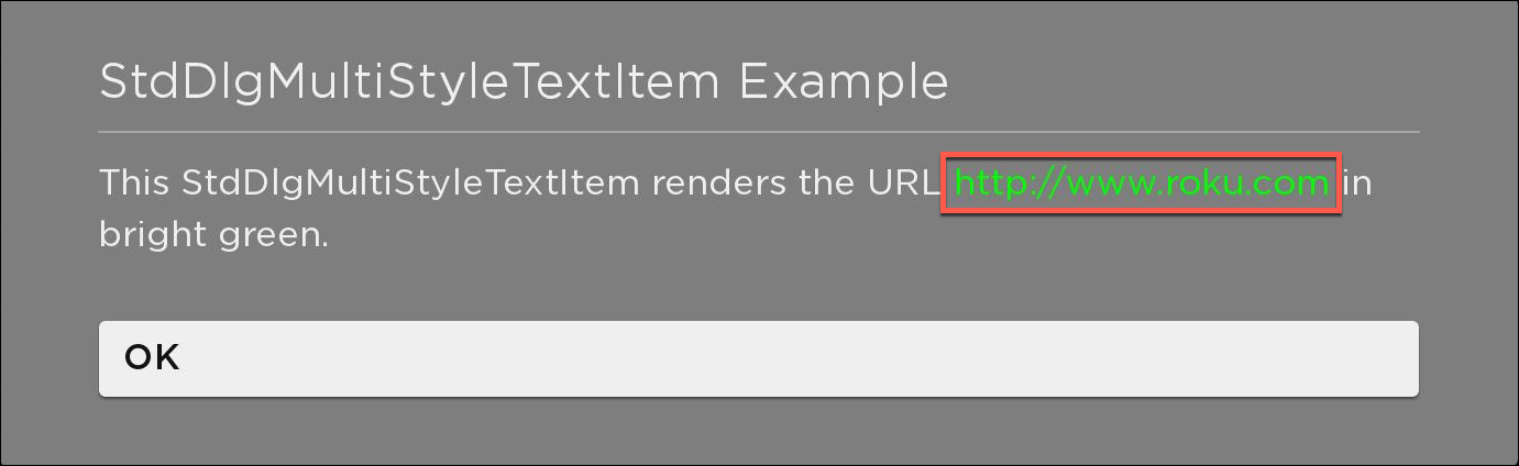 |
| ++ StdDlgProgressItem | A spinning progress indicator for tasks that take an indeterminate amount of time. | 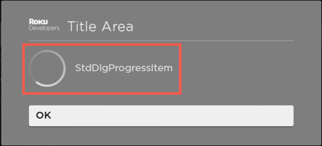 |
| ++ StdDlgTextItem | A block of text. | 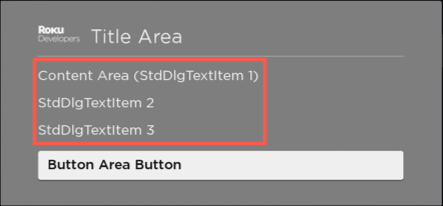 |
| ++ StdDlgCustomItem Available since Roku OS 11.0 |
A free-form custom item. | 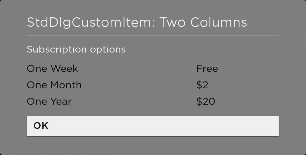 |