Add Tiles component #1787
Closed
Add Tiles component #1787
Conversation
This file contains bidirectional Unicode text that may be interpreted or compiled differently than what appears below. To review, open the file in an editor that reveals hidden Unicode characters.
Learn more about bidirectional Unicode characters
|
Initial thoughts:
There is an existing record detail label/content prop in https://react.lightningdesignsystem.com/components/page-headers/ It's more of a collection/options array. I will come back to this and look at it more later this week. |
interactivellama
requested changes
May 19, 2019
|
@tanhengyeow Based on our LinkedIn messaging, I'm going to close this pull request. Feel free to re-open at any time. |
Sign up for free
to join this conversation on GitHub.
Already have an account?
Sign in to comment
Add this suggestion to a batch that can be applied as a single commit.
This suggestion is invalid because no changes were made to the code.
Suggestions cannot be applied while the pull request is closed.
Suggestions cannot be applied while viewing a subset of changes.
Only one suggestion per line can be applied in a batch.
Add this suggestion to a batch that can be applied as a single commit.
Applying suggestions on deleted lines is not supported.
You must change the existing code in this line in order to create a valid suggestion.
Outdated suggestions cannot be applied.
This suggestion has been applied or marked resolved.
Suggestions cannot be applied from pending reviews.
Suggestions cannot be applied on multi-line comments.
Suggestions cannot be applied while the pull request is queued to merge.
Suggestion cannot be applied right now. Please check back later.
Fixes #1363
Hi @interactivellama ! Feedback for the initial draft would be appreciated :)
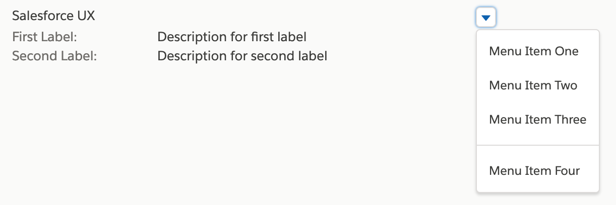
Tiles:
TileMediaBody:
TileMediaFigure:
An example that incorporates all the sub components can be seen here.
Some screenshots for reference below.
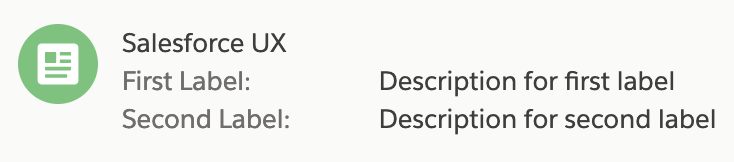
Default:

Default with actions:
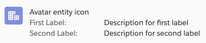
Icon:
Avatar:
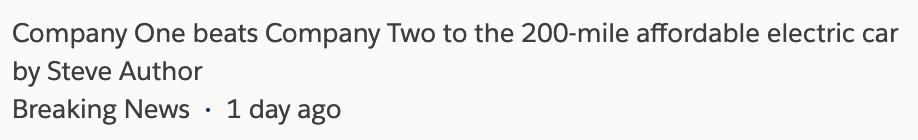
Task:

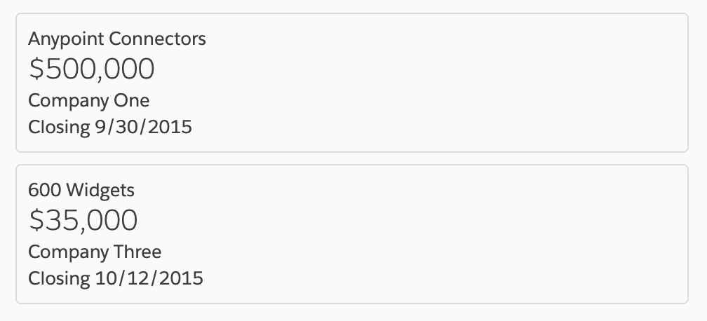
Article:
Board:
Additional description
CONTRIBUTOR checklist (do not remove)
Please complete for every pull request
npm run lint:fixhas been run and linting passes.components/component-docs.jsonCI tests pass (npm test).REVIEWER checklist (do not remove)
components/component-docs.jsontests.Required only if there are markup / UX changes
last-slds-markup-reviewinpackage.jsonand push.last-accessibility-review, topackage.jsonand push.npm run local-updatewithin locally cloned site repo to confirm the site will function correctly at the next release.