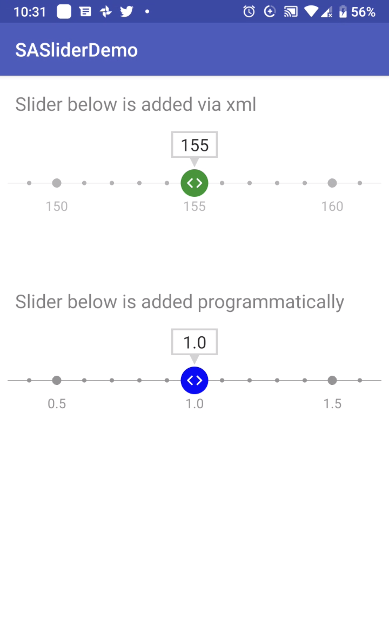
SASlider is lightweight cool looking custom slider control which enables the user to input integer or decimal values with high customizeability. User can select values by inputting in text field above slider, slide the control or tap anywhere on the slider to move it.
Multiple ways to input values into the slider.

SASlider can be installed using Maven, Gradle, or manually.
Step 1. Add the JitPack repository to your build file
<repositories>
    <repository>
        <id>jitpack.io</id>
        <url>https://jitpack.io</url>
    </repository>
</repositories>
Step 2. Add the dependency
<dependency>
    <groupId>com.github.salmaanahmed</groupId>
    <artifactId>SASlider</artifactId>
    <version>0.1</version>
</dependency>Step 1. Add the JitPack repository to your build file
allprojects {
    repositories {
      ...
      maven { url 'https://jitpack.io' }
    }
}
Step 2. Add the dependency
dependencies {
  compile 'com.github.salmaanahmed:SASlider:0.1'
}If you prefer not to use either of the above mentioned dependency managers, you can integrate SASlider into your project manually by adding the files contained in the java folder to your project.
You can use SASlider in XML as following
<sasliderdemo.salmaan.ahmsal.com.saslider.SASlider
    android:layout_width="match_parent"
    android:layout_height="100dp"
    android:layout_marginBottom="50dp"
    app:layout_constraintTop_toTopOf="parent"
    app:circleColor="@android:color/darker_gray"
    app:defaultValue="150"
    app:editTextBorderColor="@color/colorGrey"
    app:isDecimal="false"
    app:maxValue="300"
    app:minValue="0"
    app:criticalColor="@color/darkRed"
    app:upperThreshold="200"
    app:lowerThreshold="100"
    app:sliderColor="@color/darkGreen" />
High customizeability allows developers to have desired color of circles, slider thumb, edit text border and color of thumb when slider value is critical i.e. beyond the defined thresholds. Developers can set the slider type to decimal or integer. Set min max range and also the critical thresholds of both upper and lower bounds.
You can create the slider programatically as well, see the example below.
  val slider = SASlider(this@MainActivity)
  slider.sliderColor = Color.BLUE
  slider.min = 0.0
  slider.max = 50.0
  slider.criticalColor = Color.BLACK
  slider.isDecimal = true
linearLayout.addView(slider)Developers can query the current value anytime in the slider using the following variable.
slider.selectedIndexSASlider is available under the MIT license. See the LICENSE file for more info.
Pull requests are welcome! The best contributions will consist of substitutions or configurations for classes/methods known to block the main thread during a typical app lifecycle.
I would love to know if you are using SASlider in your app, send an email to Salmaan Ahmed