
Fl - Bindings for the Stable 1.3.x Branch of the Fast Light Toolkit
use Fl qw[:event :label :box :font];
my $window = Fl::Window->new(100, 100, 300, 180);
my $box = Fl::Box->new(FL_UP_BOX, 20, 40, 260, 100, 'Hello, World');
$box->labelfont(FL_BOLD + FL_ITALIC);
$box->labelsize(36);
$box->labeltype(FL_SHADOW_LABEL);
$window->end();
$window->show();
exit run();
The Fl distribution includes bindings to the stable 1.3.x branch of the Fast Light Toolkit; a cross-platform GUI toolkit compatible with Microsoft Windows, MacOS X, and Linux/Unix platforms with X11. It was designed to be small, quick and comes with a very simple yet complete API.
Many widgets come with Fl but we'll cover just the basics here.
Fl provides many types of buttons:
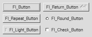
- Fl::Button - A standard push button
- Fl::CheckButton - A button with a check box
- Fl::LightButton - A push buton with a light
- Fl::RepeatButton - A push button that continues to trigger its callback when held
- Fl::ReturnButton - A push button that is activated by the Enter key
- Fl::RoundButton - A button with a radio circle (See also Fl::RadioRoundButton)
The constructor for all of these buttons takes the bounding box of the button and an optional label string:
my $fl_btn = Fl::Button->new($x, $y, $width, $height, "label");
my $fl_lbtn = Fl::LightButton->new($x, $y, $width, $height);
my $fl_rbtn = Fl::RoundButton->new($x, $y, $width, $height, "label");
Each button has an associated type() which allows it to behave as a push
button, toggle button, or radio button.
$fl_btn->type(FL_NORMAL_BUTTON);
$fl_lbtn->type(FL_TOGGLE_BUTTON);
$fl_rbtn->type(FL_RADIO_BUTTON);
For toggle and radio buttons, the value() method returns the current button
state (0 = off, 1 = on). The set() and clear() methods can be used on
toggle buttons to turn it on or off. Radio buttons can be turned on with the
setonly() method; this will also turn off other radio buttons in the same
group.
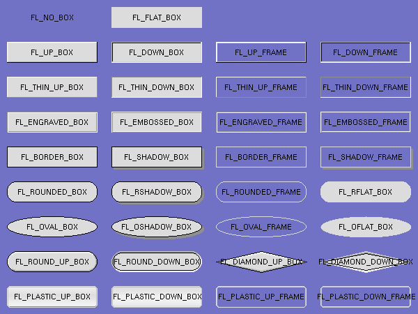
Widgets are drawn on screen according to their box types. The full list of
these may be found in ":box" in Fl::Enumerations and may be imported into your
namespace with the :box tag.
FL_NO_BOX means nothing is drawn at all, so whatever is already on the screen remains. The FL_..._FRAME types only draw their edges, leaving the interior unchanged.
The label(), align(), labelfont(), lablesize(), labeltype(),
image(), and deimage() methods control labeling of widgets.
The label() method sets the string that is displayed for hte label. Symbols
can be included withthe label string by escaping them with the @ symbol.
@@ displays a single at symbol.
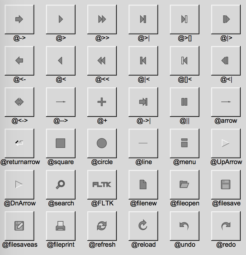
The @ sign may also be followed by the following optional "formatting"
characters, in this order:
- '#' forces square scaling, rather than distortion to the widget's shape.
- +[1-9] or -[1-9] tweaks the scaling a little bigger or smaller.
- '$' flips the symbol horizontally, '%' flips it vertically.
- [0-9] - rotates by a multiple of 45 degrees. '5' and '6' do no rotation while the others point in the direction of that key on a numeric keypad. '0', followed by four more digits rotates the symbol by that amount in degrees.
Thus, to show a very large arrow pointing downward you would use the label string "@+92->".
The align() method positions the label. The following constants are imported
with the :align tag and may be OR'd together as needed:
- FL_ALIGN_CENTER - center the label in the widget.
- FL_ALIGN_TOP - align the label at the top of the widget.
- FL_ALIGN_BOTTOM - align the label at the bottom of the widget.
- FL_ALIGN_LEFT - align the label to the left of the widget.
- FL_ALIGN_RIGHT - align the label to the right of the widget.
- FL_ALIGN_LEFT_TOP - The label appears to the left of the widget, aligned at the top. Outside labels only.
- FL_ALIGN_RIGHT_TOP - The label appears to the right of the widget, aligned at the top. Outside labels only.
- FL_ALIGN_LEFT_BOTTOM - The label appears to the left of the widget, aligned at the bottom. Outside labels only.
- FL_ALIGN_RIGHT_BOTTOM - The label appears to the right of the widget, aligned at the bottom. Outside labels only.
- FL_ALIGN_INSIDE - align the label inside the widget.
- FL_ALIGN_CLIP - clip the label to the widget's bounding box.
- FL_ALIGN_WRAP - wrap the label text as needed.
- FL_ALIGN_TEXT_OVER_IMAGE - show the label text over the image.
- FL_ALIGN_IMAGE_OVER_TEXT - show the label image over the text (default).
- FL_ALIGN_IMAGE_NEXT_TO_TEXT - The image will appear to the left of the text.
- FL_ALIGN_TEXT_NEXT_TO_IMAGE - The image will appear to the right of the text.
- FL_ALIGN_IMAGE_BACKDROP - The image will be used as a background for the widget.
Please see the :align tag for more.
The labeltype() method sets the type of the label. The following standard
label types are included:
- FL_NORMAL_LABEL - draws the text.
- FL_NO_LABEL - does nothing.
- FL_SHADOW_LABEL - draws a drop shadow under the text.
- FL_ENGRAVED_LABEL - draws edges as though the text is engraved.
- FL_EMBOSSED_LABEL - draws edges as thought the text is raised.
- FL_ICON_LABEL - draws the icon associated with the text.
These are imported with the :label tag. Please see
Fl::Enumerations for more.
Callbacks are functions that are called when the value of a widget is changed. A callback function is sent the widget's pointer and the data you provided.
sub xyz_callback {
    my ($widget, $data) = @_;
    ...
}
The callback(...) method sets the callback function for a widget. You can
optionally pass data needed for the callback:
my $xyz_data = 'Fire Kingdom';
$button->callback(&xyz_callback, $xyz_data);
You can also pass an anonymous sub to the callback(...) method:
$button->callback(sub { warn 'Click!' });
Normally, callbacks are performed only when the value of the widget changes. You can change this using the when() method:
$button->when(FL_WHEN_NEVER);
$button->when(FL_WHEN_CHANGED);
$button->when(FL_WHEN_RELEASE);
$button->when(FL_WHEN_RELEASE_ALWAYS);
$button->when(FL_WHEN_ENTER_KEY);
$button->when(FL_WHEN_ENTER_KEY_ALWAYS);
$button->when(FL_WHEN_CHANGED | FL_WHEN_NOT_CHANGED);
These values may be imported with the :when tag. Please see
Fl::Enumerations for more.
A word of caution: care has been taken not to tip over when you delete a widget inside it's own callback but it's still not the best idea so...
$button->callback(
    sub {
        $button = undef; # Might be okay. Might implode.
    }
);
Eventually, I'll provide an explicit delete_widget() method that will mark
the widget for deletion when it's safe to do so.
Shortcuts are key sequences that activate widgets such as buttons or menu
items. The shortcut(...) method sets the shortcut for a widget:
$button->shortcut(FL_Enter);
$button->shortcut(FL_SHIFT + 'b');
$button->shortcut(FL_CTRL + 'b');
$button->shortcut(FL_ALT + 'b');
$button->shortcut(FL_CTRL + FL_ALT + 'b');
$button->shortcut(0); # no shortcut
The shortcut value is the key event value - the ASCII value or one of the special keys described in Fl::Enumerations combined with any modifiers like Shift, Alt, and Control.
These values may be imported with the :keyboard tag. Please see
Fl::Enumerations for an expansive lis
=head1 Other Classes
Fl contains several other widgets and other classes including:
- Fl::Box
- Fl::Input - Simple text input widget
- Fl::SecretInput - Think 'password field'
- Fl::FloatInput
- Fl::IntInput
- Fl::Chart
- Fl::Valuator
- Fl::Adjuster
- Fl::Group
- Fl::Window
This is the current list and will expand as the distribution develops.
You may import these constants by name or with the given tag.
These constants define values which can effect how the application functions.
They are used by Fl::option( ... )
-
OPTION_ARROW_FOCUSWhen switched on, moving the text cursor beyond the start or end of a text in a text widget will change focus to the next text widget.
(This is considered 'old' behavior)
When switched off (default), the cursor will stop at the end of the text. Pressing Tab or Ctrl-Tab will advance the keyboard focus.
-
OPTION_VISIBLE_FOCUSIf visible focus is switched on (default), FLTK will draw a dotted rectangle inside the widget that will receive the next keystroke.
If switched off, no such indicator will be drawn and keyboard navigation is disabled.
-
OPTION_DND_TEXTIf text drag-and-drop is enabled (default), the user can select and drag text from any text widget.
If disabled, no dragging is possible, however dropping text from other applications still works.
-
OPTION_SHOW_TOOLTIPSIf tooltips are enabled (default), hovering the mouse over a widget with a tooltip text will open a little tooltip window until the mouse leaves the widget.
If disabled, no tooltip is shown.
-
OPTION_FNFC_USES_GTKWhen switched on (default),
Fl::NativeFileChooserruns GTK file dialogs if the GTK library is available on the platform (linux/unix only).When switched off, GTK file dialogs aren't used even if the GTK library is available.
-
OPTION_LASTFor internal use only.
The Fl namespace containins state information and global methods for the current application.
abi_check( FL_ABI_VERSION );
Returns whether the runtime library ABI version is correct.
This enables you to check the ABI version of the linked FLTK library at runtime.
Returns 1 (true) if the compiled ABI version (in the header files) and the linked library ABI version (used at runtime) are the same, 0 (false) otherwise.
abi_check( 10303 );
Argument $val can be used to query a particular library ABI version. Use for
instance 10303 to query if the runtime library is compatible with FLTK ABI
version 1.3.3. This is rarely useful.
abi_check( );
The default $val argument is FL_ABI_VERSION, which checks the version
defined at configure time (i.e. in the header files at program compilation
time) against the linked library version used at runtime. This is particularly
useful if you linked with a shared object library, but it also concerns static
linking.
abi_version( );
Returns the compiled-in value of the FL_ABI_VERSION constant.
This is useful for checking the version of a shared library.
add_awake_handler_( sub { warn 'awake! } );
Adds an awake handler for use in Fl::awake().
add_awake_handler_( sub { warn 'awake! }, $data );
You may also store userdata which will be passed along to the callback.
add_check( sub { warn 'awake! } );
FLTK will call this callback just before it flushes the display and waits for events.
This is different than an idle callback because it is only called once, then FLTK calls the system and tells it not to return until an event happens.
This can be used by code that wants to monitor the application's state, such as to keep a display up to date. The advantage of using a check callback is that it is called only when no events are pending. If events are coming in quickly, whole blocks of them will be processed before this is called once. This can save significant time and avoid the application falling behind the events.
add_check( sub { warn 'awake! }, $data );
You may also store userdata which will be passed along to the callback.
Here's a usage example:
    my $state_changed; # anything that changes the display turns this on

    sub callback {
            return if !$state_changed;
            $state_changed = 0;
            # do_expensive_calculation();
            $widget->redraw();
    }

    Fl::add_check(\&callback);
    Fl::run();
    add_fd( $fh, $when, sub { warn 'awake! }  ); # Kindly gets the fileno for you
    add_fd( fileno($fh), $when, sub { warn 'awake! }  );
Adds file descriptor fd to listen to.
When the fd becomes ready for reading, Fl::wait() will call the callback and
then return. The callback is passed the fd and the arbitrary void* argument.
This version takes a when bitfield, with the bits FL_READ, FL_WRITE, and
FL_EXCEPT defined, to indicate when the callback should be done.
There can only be one callback of each type for a file descriptor.
Fl::remove_fd() gets rid of all the callbacks for a given file descriptor.
Under UNIX/Linux/MacOS any file descriptor can be monitored (files, devices, pipes, sockets, etc.). Due to limitations in Microsoft Windows, Windows applications can only monitor sockets.
    add_fd( $fh, $when, sub { warn 'awake! }, $data  ); # Kindly gets the fileno for you
    add_fd( fileno($fh), $when, sub { warn 'awake! }, $data  );
You may also store userdata which will be passed along to the callback.
    add_fd( $fh, sub { warn 'awake! }, $data  ); # Kindly gets the fileno for you
    add_fd( fileno($fh), sub { warn 'awake! }, $data  );
    add_fd( $fh, sub { warn 'awake! } ); # Kindly gets the fileno for you
    add_fd( fileno($fh), sub { warn 'awake! } );
You may listen to a file descriptor without a R/W/Err bitfield as well.
my $enabled = Fl::option( OPTION_ARROW_FOCUS );
Returns a boolean value.
Fl::option( OPTION_ARROW_FOCUS, 1 );
Enables or disables global FLTK options.
See the :option import tag in Fl::Enumerations.
Schedules a widget for deletion at the next call to the event loop.
Use this method to delete a widget inside a callback function.
To avoid early deletion of widgets, this function should be called toward the
end of a callback and only after any call to the event loop (Fl::wait(),
Fl::flush(), Fl::check(), fl_ask(), etc.).
When deleting groups or windows, you must only delete the group or window widget and not the individual child widgets.
The object reference is undefined after calling this.
Copyright (C) 2020 Sanko Robinson
This library is free software; you can redistribute it and/or modify it under the same terms as Perl itself.
Sanko Robinson sanko@cpan.org